4 ways to add character to a new room
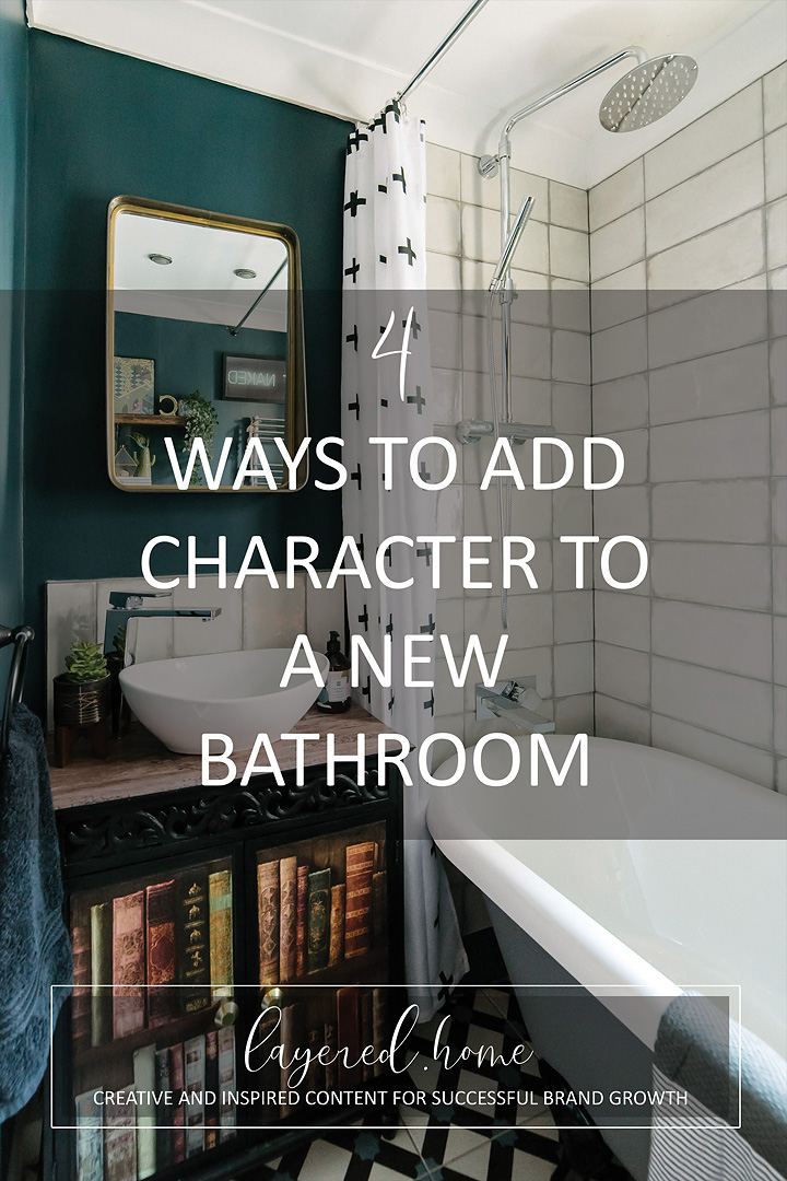
I know the title isn’t great but I can’t think of a better one that expresses the gist of this post, so please bear with me!
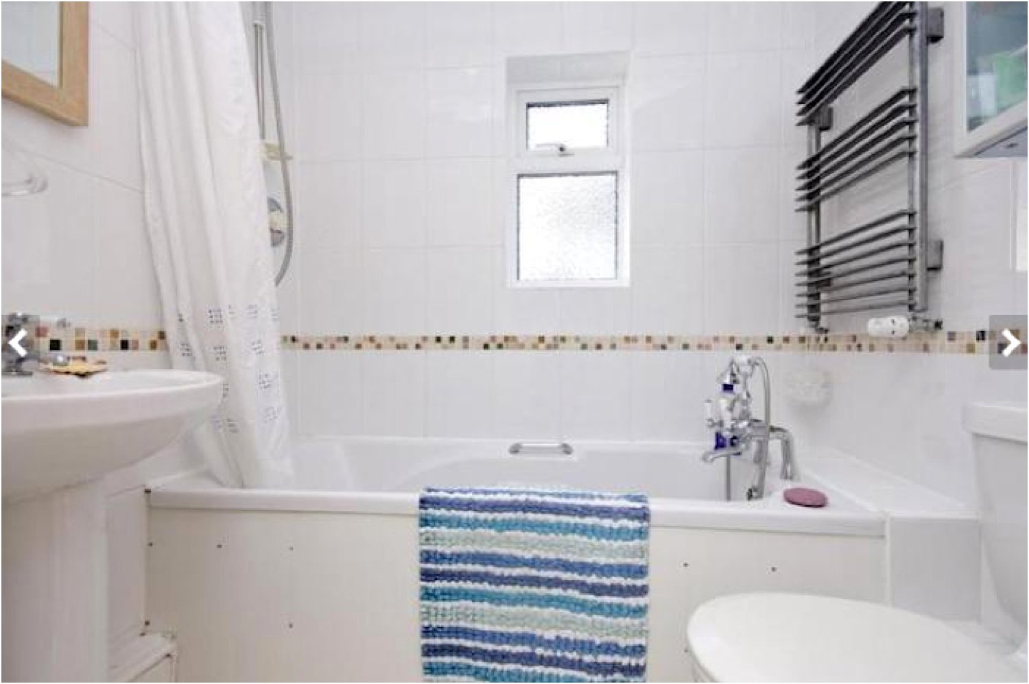
Above is what the bathroom looked like when we moved in 5 years ago. (Photo courtesy of the estate agent’s website.)
It was clinical, all four walls tiled in cheap white tiles and it stank! The side of the bath was a thin cardboard with about 50 screws holding it in place (not kidding!). For 5 years we endured it despite the smell and hardly used it for baths (only the children bathed in it).
Whilst we waited for when we could completely revamp it, I added greenery to soften the starkness of the tiles. I also covered the side of the bath with marble contact paper to make it look slightly decent and put in reclaimed shelving with vintage cast-iron brackets for decorative display. Below is a photo of what it looked like with the above patch-up jobs.
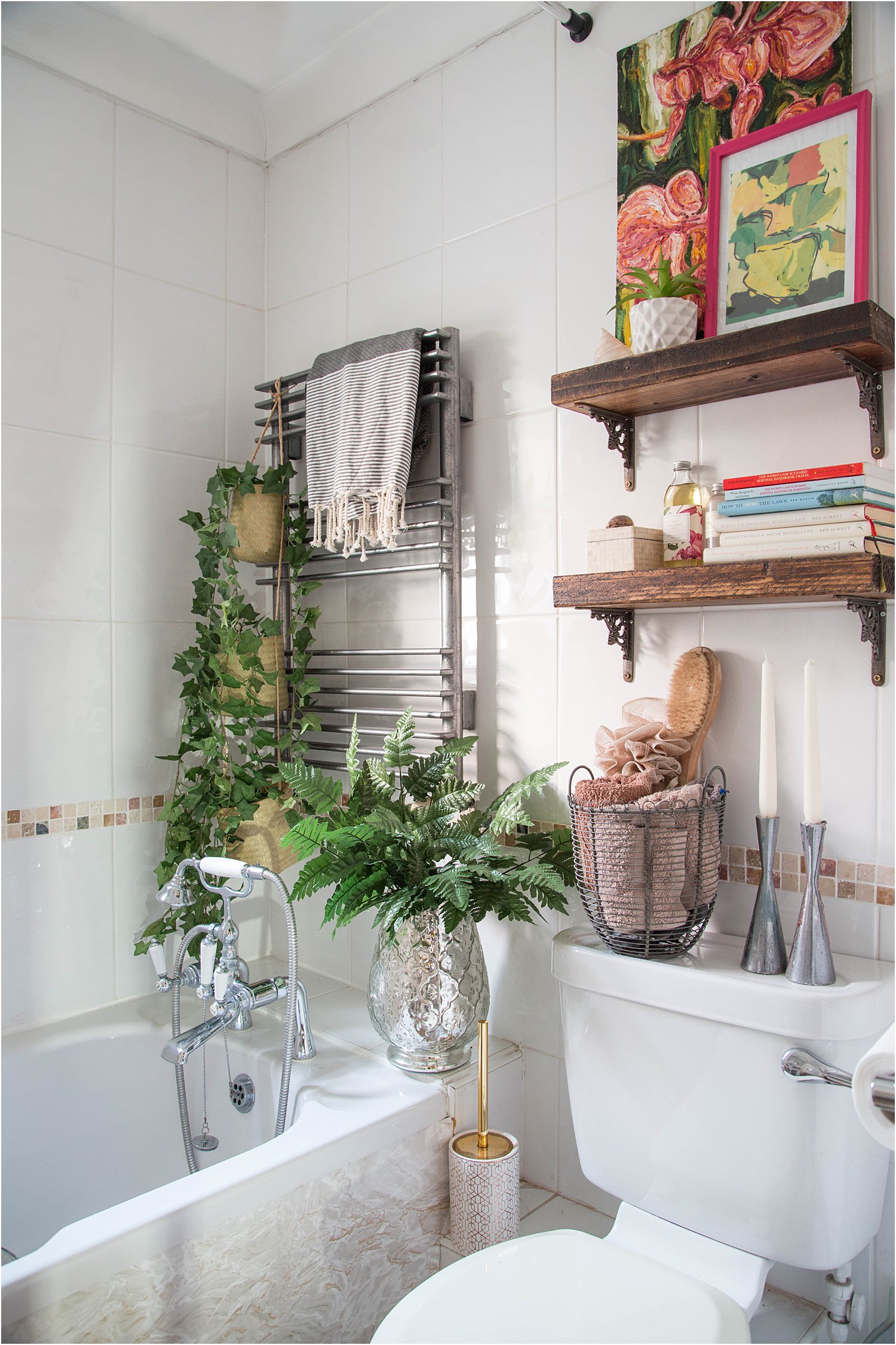
Photo above courtesy of Georgia Burns for Reclaim Magazine
Finally we were able to renovate completely. Isn’t it ironic that the one thing I did not want my new bathroom to look like was new!
I was really worried that it would look too new and would not have any character to it. There’s was nothing more that I disliked other than a room filled with things that have just been bought from a shop. In one day. This is entirely possible for a bathroom as usually, which in my case was true, the fitters wanted everything ready for installation.
I didn’t have much time to think all this through but did my best and here are the 4 things I did to avoid making my new bathroom look too new. By the way, don’t forget to download my free resources that will help you design your own interiors and grow your Instagram account!
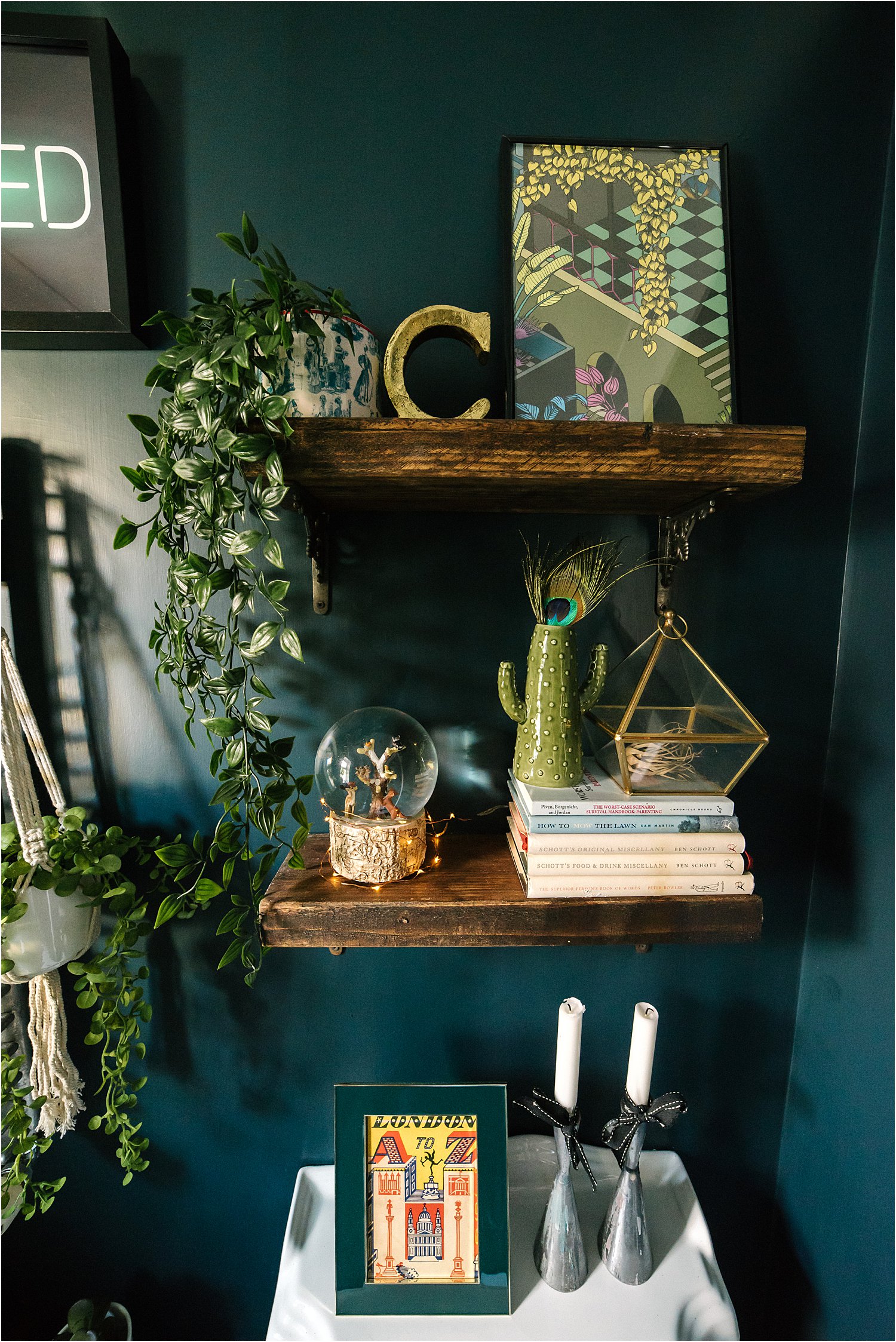
1. Re-use and Upcycle
I kept the reclaimed shelving with vintage brackets as I liked them and they added character to the walls. My original idea was to get a mid-century wooden cabinet and use it as the cupboard underneath the sink. However, after much searching, I could not find the right size. They were either too long at 80cm or too small 60cm and my fitter was very strict. I was only allowed up to 74cm!
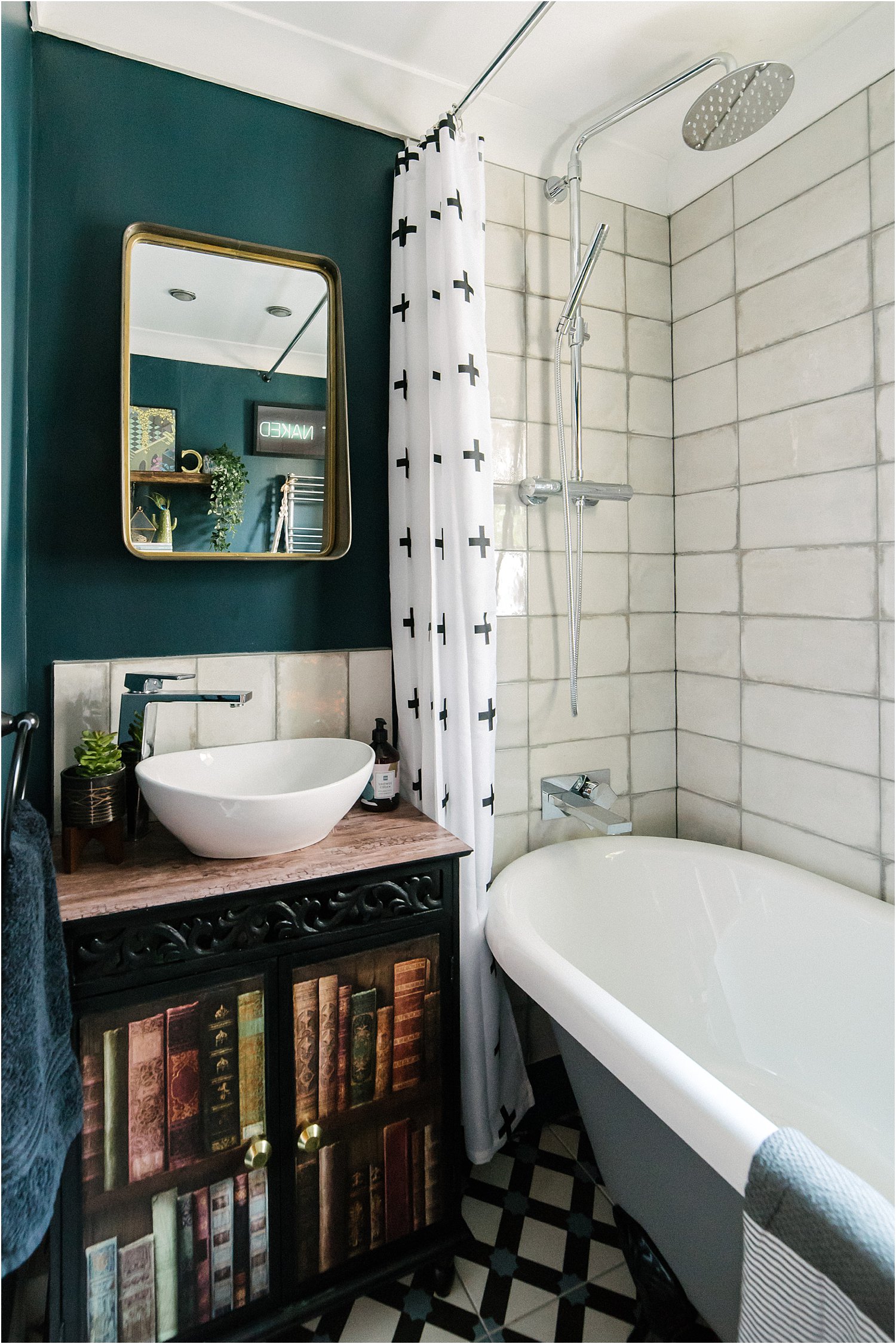
Amazon offered a shabby chic cabinet which was the perfect size but totally not the style I was after. I had to have something for the fitter so I bought it and had him install it. I then upcycled it by painting it black and covering the top with contact paper with a vintage wooden design. Contact paper is great actually as it’s waterproof and heatproof.
In order to satisfy my vintage yearnings, I then proceeded to paper the doors with a vintage bookcase paper and seal it with dark wax afterwards. You can see some before and after photos of this cabinet on my Instagram page Instagram layered.home.
2. Juxtapose old and new
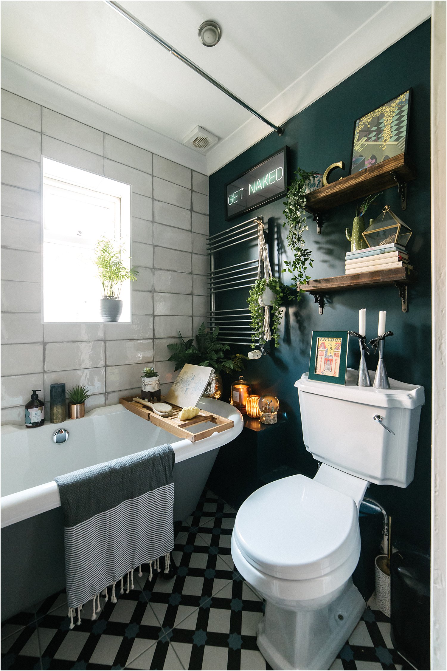
When I was did my MA in Fine Art, I vividly remember my tutor always praising paintings that were “unnerving”. I’ve always wondered why a disconcerting feeling made a piece of art strong. It was only years later that I understood. Juxtaposing old and new often has an unsettling effect. It’s unexpected, radical and surprising. And it often works.
In my efforts to be unnerving, I chose scrappy old-looking tiles with cracks (intentional) on the glazing and juxtaposed them against a strong dark colour – Hague Blue Farrow and Ball. I left the industrial looking radiator as it felt raw unpainted. The toilet itself is the traditional type with the long projection (I had no other choice here) set on a white contemporary design floor tiles. The roll top bath is in grey juxtaposed with chrome fittings with square edges to contrast the curves of the bath and the circular sink. Brass was my dream finish but again I had no time. I was planning to order them from Ebay China (don’t judge – bathroom revamps are expensive!) which was impossible given I had a day to order everything!
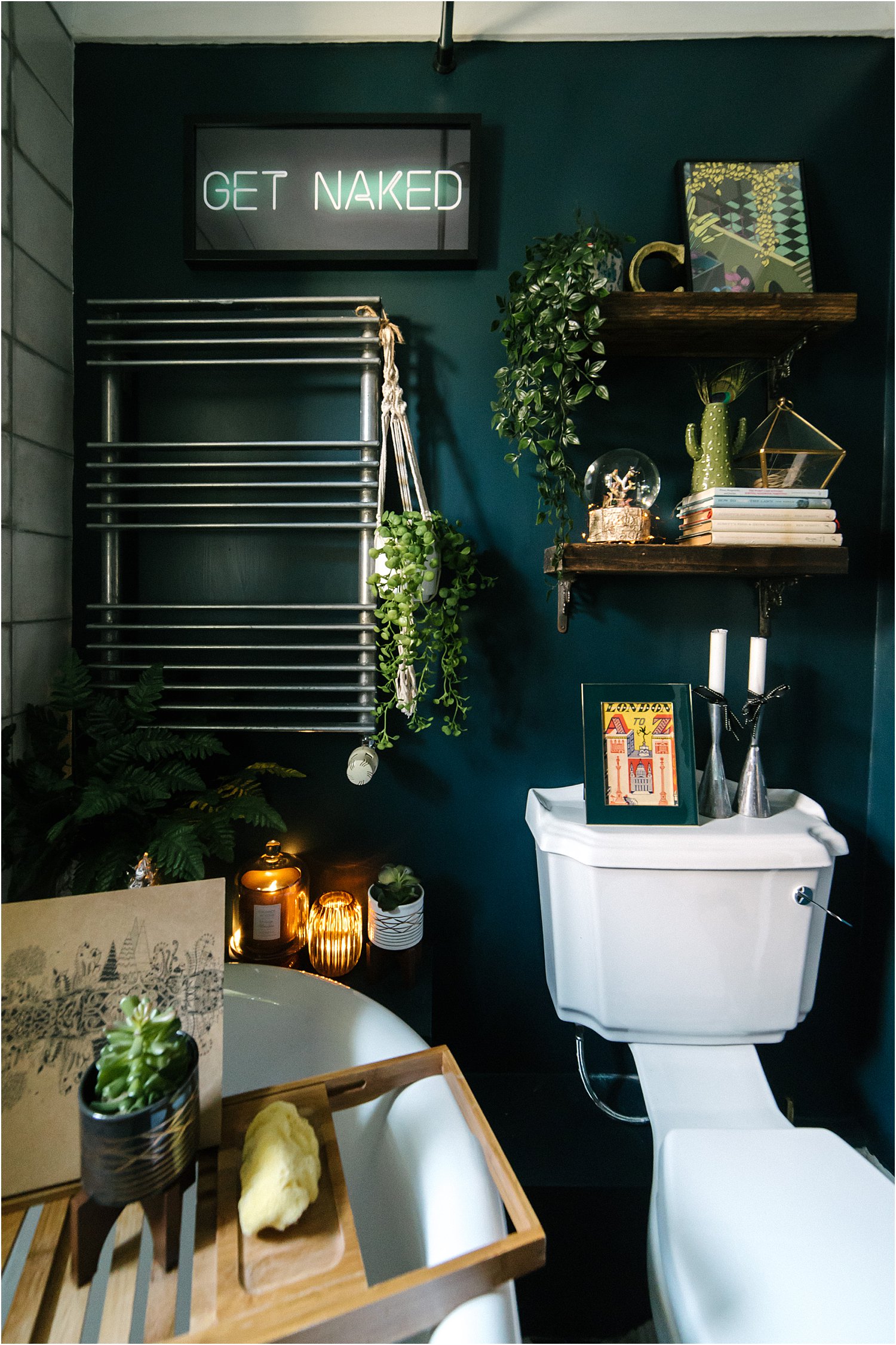
I also chose an ultra contemporary neon print from Maria at House of Neon and rectangular mirror (both with a nod to retro) from Dunelm. The neon print was the perfect solution to not having to deal with wires and batteries to get that neon effect! Don’t be afraid to mix styles that normally aren’t expected to go together.

3. Add black and white
For me, the strongest colour combination to not only ground a room but also to add that disconcerting element in a colourful space is to inject strong black and whites. It took me a while to fine this curtain but I persevered and went with my gut. I’m so glad I did as it felt like it has transformed the space twice over.
One of the Instagram bathrooms that greatly inspired me is Ruthie’s designsodaruthie. It’s also Hague Blue (a colour which I happened to have left-over from my kitchen renovation), though it looks bluer in her home whilst it’s look greener in mine. Check her inspiring feed out.
4. Create ambience
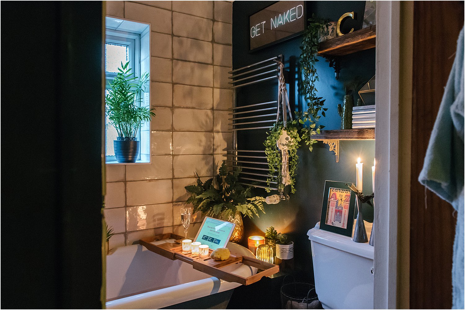
This is a no-brainer. A bath is meant to be relaxing so how best to create a relaxing ambience other than plenty of candles, fairy lights and tealights! My husband actually loves having a bath in here now. I set up all the candles for him though otherwise he just plonks himself in the bath with an iPad on the bathboard and the bright lights on.
I have since added 2 framed prints on the wall to the left of the mirror. One is a vintage floral print and the other is a contemporary typography print that says MAKE IT HAPPEN.
I know this style isn’t for everyone but I’m pleased with it. Sure I had to make compromises (if only money was no object) but now we all use it and happily so. Don’t forget to download my free resources that will help you design your own interiors and grow your Instagram account!
I hope this post on 4 ways to add character to a new room has inspired you in some way or given you useful tips. Do share your thoughts on Instagram layered.home and I’d love it if you would follow me on there too! And please share on your stories or repost on Instagram, I’d be forever grateful!

I’m on love with the your bathroom and the neon print. Is it neon print transparent and you stuck it to the mirror? Were you nervous the bathroom would feel dark. I’m sorry but totally going to try and replicate your bathroom. Feeling very excited!
Thanks Natasha. The neon is a print from House of Neon. My house is pretty dark so no I wasn’t nervous! There is a newer version of this bathroom on my Instagram page! Lx