Maximalism without the clutter featuring Claire Elsworth
What comes into your mind when you hear the word maximalist? I bet that includes the following descriptions: packed to the brim, excess of patterns and styles, lack of empty spaces and places, extremely busy space, eclectic mix of colours and styles, dynamic and ever-evolving, and, this is what I’d like to talk about today – cluttered!
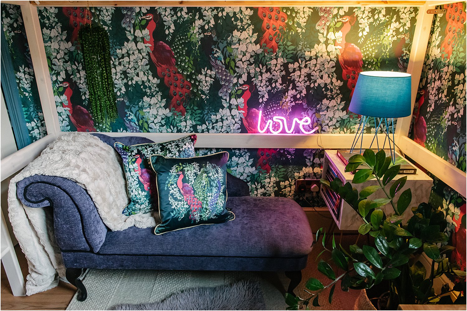
Agreed. All those descriptions of maximalism are valid. But, maximalism doesn’t have to be synonymous with clutter! In the context of interiors, here’s how I endeavour be a maximalist in style but minimalist in clutter.
Images featured on this blogpost contain gifted wallpaper and cushions from the uber talented maximalist designer Claire Elsworth. You need to check her out. Her designs are opulent and dynamic, full yet balanced and certainly far from boring! Claire’s designs are inspired by her concept stories about a Duchess and her old beautiful house.
1. ARRANGEMENTS AND VIGNETTES
A maximalist tends to have collections of things: a myriad cushions, vases, pictures, trinkets, fabrics, throws, books, rugs, accessories, occasional furniture. The challenge is to keep what you love and arrange them in such a way that still makes the space a haven for you, after all, you live in the space.
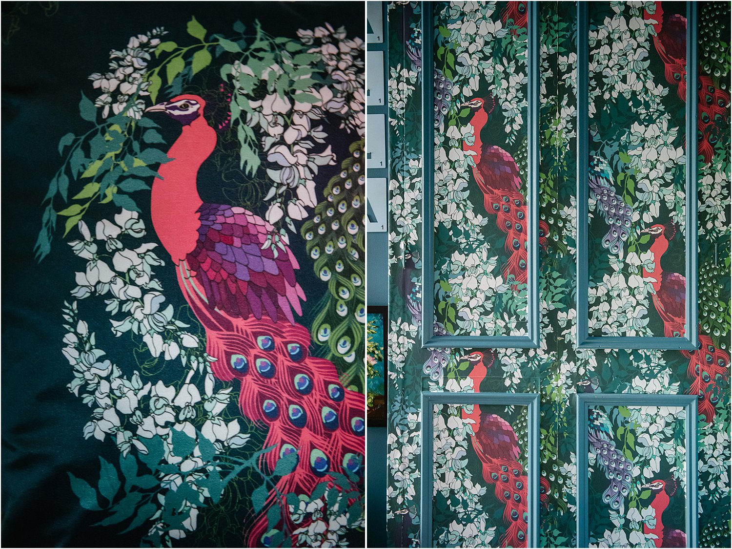
In Grids
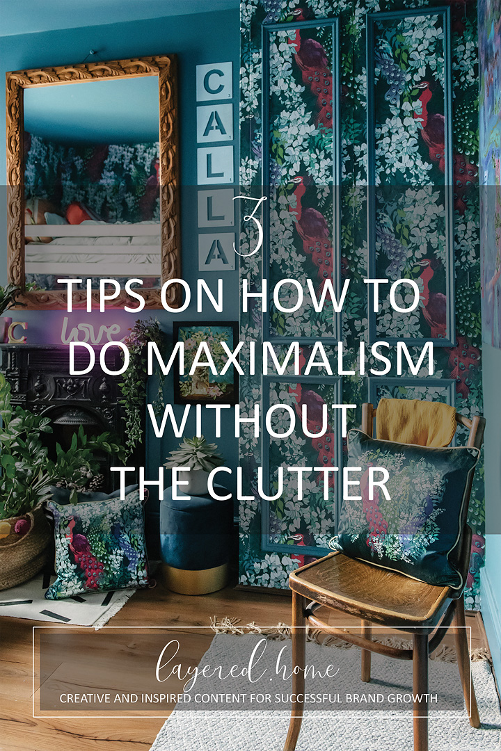
Arrangement in a grid pattern helps anchor things and give them uniformity. When the eyes see a grid pattern, suddenly there is structure. Where the eye darts backwards and forwards in a cluttered space, when there is a grid, the eye rests. Can you feel this in the image above on the right with the rectangular panelling on the wallpapered wardrobe doors?
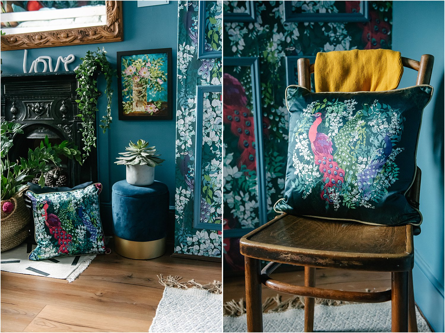
In Groups
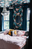
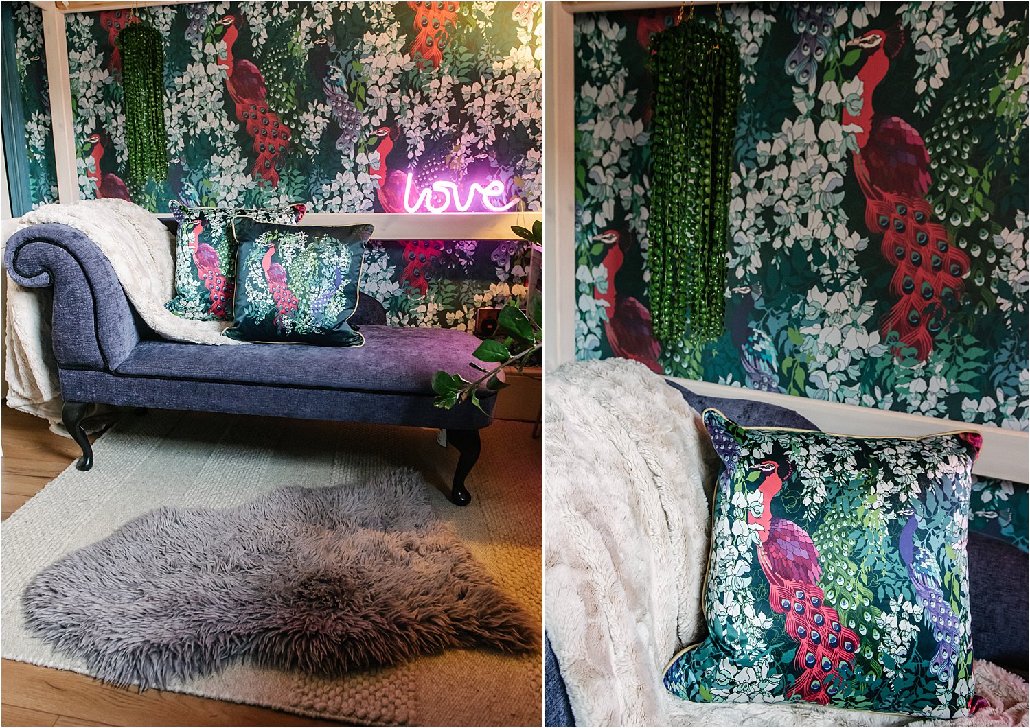
Grouping objects especially into smaller collections such as on the images above injects a sense of rhythm in a space. When the eye travels around a space, a group of objects become punctuation that invites the eye to pause. A series of these punctuations can have a rhythmic and calming effect. One way of grouping objects is having a focal point or dominant subject in the collection such as on the two images above, the focus being the peacock maximalist cushion.
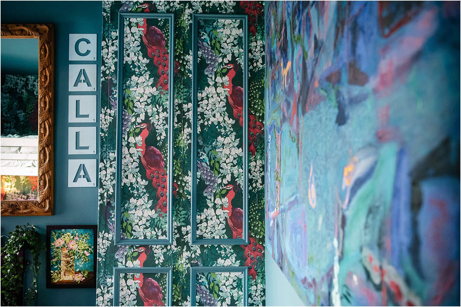
In Rows
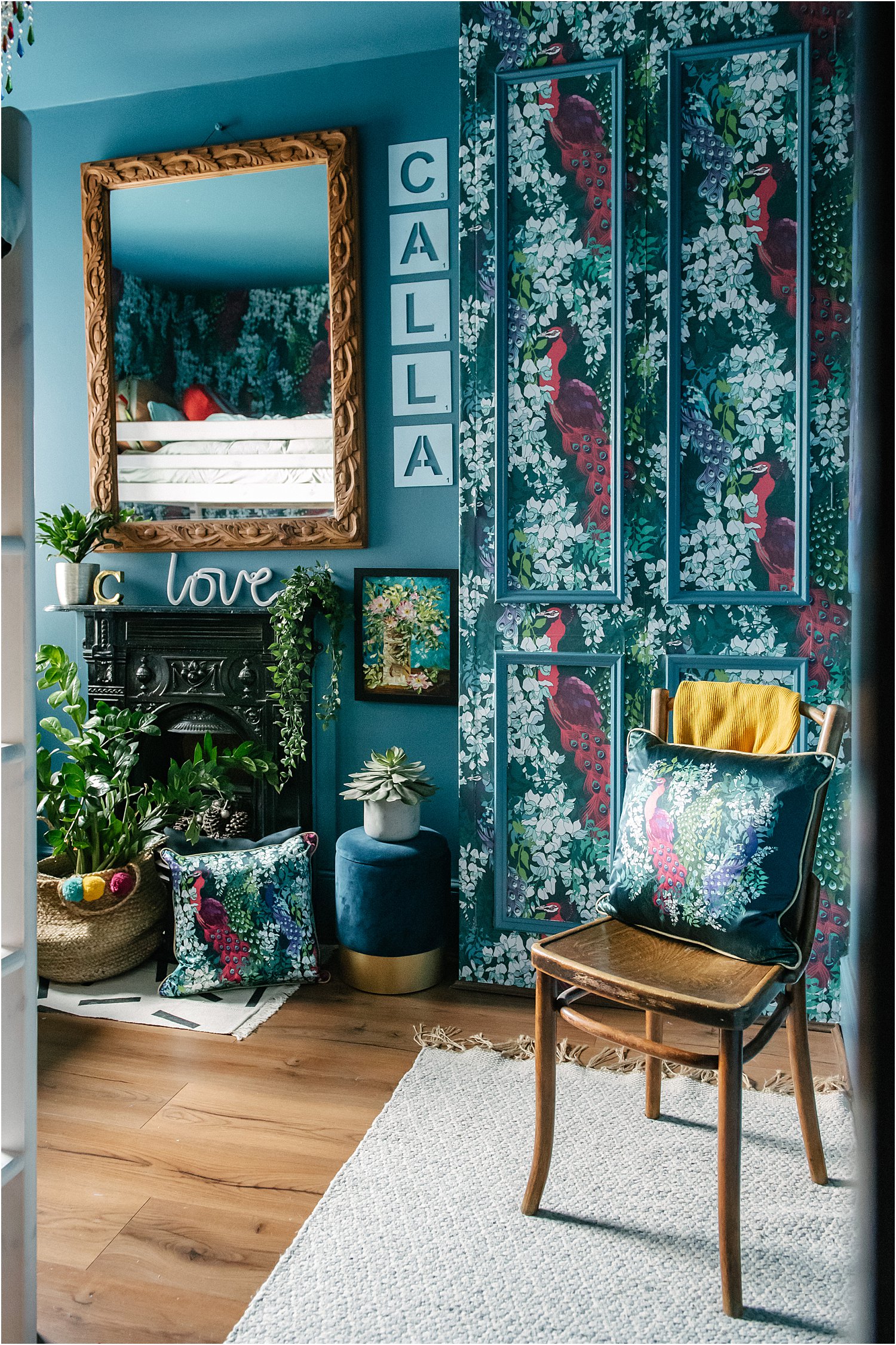
Rows create straight lines and straight lines give a sense of orderly fashion. Rows also provide a sense of perspective when viewed from an angle, thus accentuating depth of a space. The image above shows the metal scrabble tiles echoing the line of the wardrobe, the panelling and the mirror.
2. COMPOSITION OF OBJECTS IN THE SPACE
When designing a space, composition is in the forefront of my mind. Much like a painting, I think of a space as a flat canvas where I decide on what composition to use.
Rule of Thirds
This is a visual composition where the most important object is placed a little off to one side, usually a third or two thirds from the edge. The result is that the viewer’s eye is invited to explore the entire space, not just what’s in the middle. This composition is known to be pleasing and easy on the eye too.
The image above embraces this rule of thirds in terms of the wallpapered wardrobe taking up a third of the entire wall on that side of the room. The rug follows the line on the floor and as you walk into the room you get a sense of depth and perspective. The line of the rug acts a a leading line that guides the eye to the patterned wardrobe door.
Centred
As the term suggest, a centred composition is where the most important object sits right in the middle of the space and draws the eye directly to it. It can be a very strong composition and assumes that the subject the middle is sufficient enough to hold the viewer’s attention and the space together.
3. BALANCE
Absolutely key to an uncluttered maximalist space is balance. More specifically, a balance of textures, contrasts, colours, patterns. Getting the balance right prevents the space from becoming too overwhelming or overpowering.
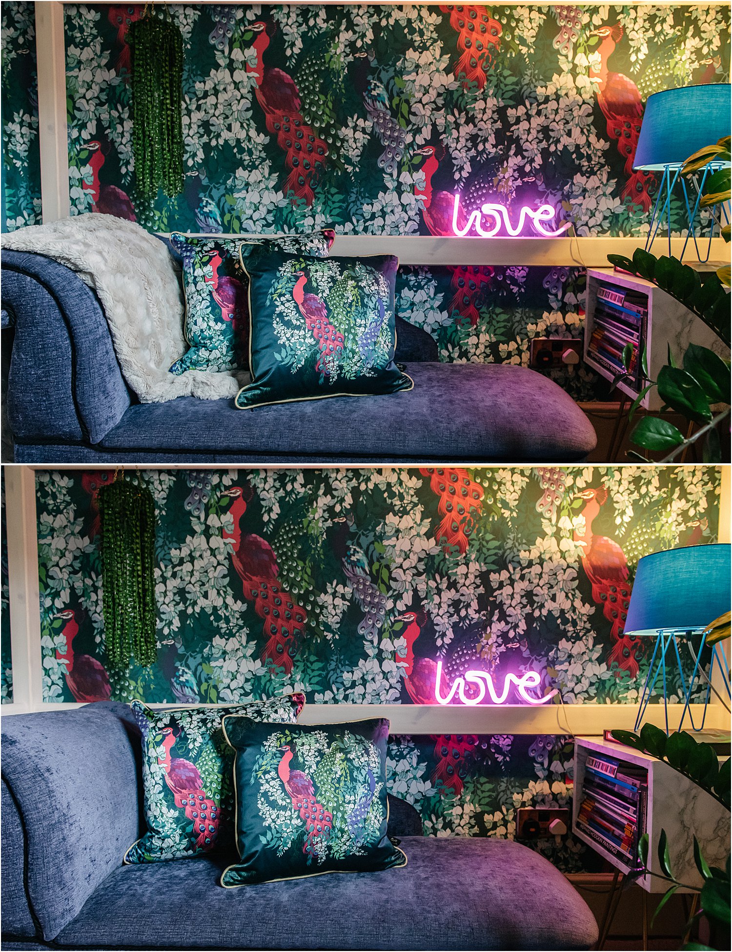
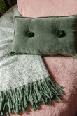
Look at both images above. Do you prefer the one with the light coloured mink throw next to the peacock cushions or the one without? The addition of the throw adds a different feeling to the space: more cosy and comfortable and the contrast makes the cushions pop out more. The photo without the throw feels cleaner in comparison.
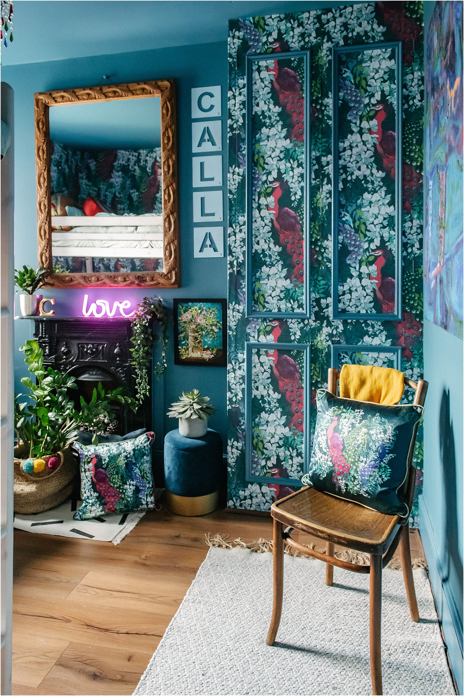
Contrasting and juxtaposing the following help achieve this:
Flat and plain against pattern and textures:
*this cushion which is silk on the printed side, velvet on the back and has a gold piping for more contrast
*the all-over pattern of the wallpaper against the plain blue wall
*natural fibres of the belly basket next to the satin cushion and against the black glossy fireplace
*the plain-ish rug against the patterned wardrobe
Old and vintage against new and contemporary
*this old worn out rattan chair against the silky satin cushion
*the wooden mirror frame against the contemporary peacock wallpaper pattern
Having the above contrasts juxtaposed next to each other can create a sense of friction – the good kind of friction – that makes a space interesting. It gives a space something unexpected, elevating creativity at the same time.
THE BETTER QUESTION
I think the better question we should be asking ourselves is not so much to do with what we have and what we display but whether we love them, whether we love our home and we enjoy being in it. Does your home make your happy? Does it bear the stamp of your personality? Does it reflect your style? Does it tell your story?
Like me, if you have answered yes to the above and still feel you could improve on things as they are especially on the issue of clutter, then I hope the tips I’ve written here help in some way. Ultimately, the way we see and style our homes is a journey and it evolves over time. Let’s enjoy the journey and make it part of our story and our home’s history.
Claire Elsworth has gifted me this wallpaper and cushion as part of our collaboration which includes this blogpost.
If you know someone you think would find this article on Maximalism without the clutter featuring Claire Eslworth helpful, would you mind sharing it to them? I’d be grateful if you would share on your stories too or mention or tag me Instagram layered.home on your posts. I’d love it if you would follow me on there. Thank you for reading!
Don’t forget to download my free resources that will help you design your own interiors and grow your Instagram account! Let’s chat on Instagram and follow me on layered.home for more inspiration.
