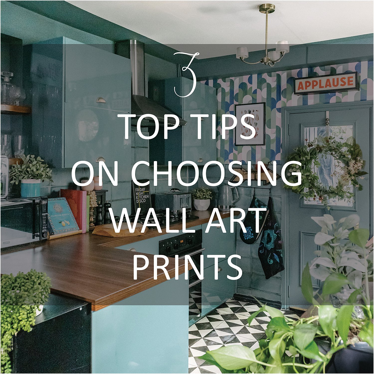
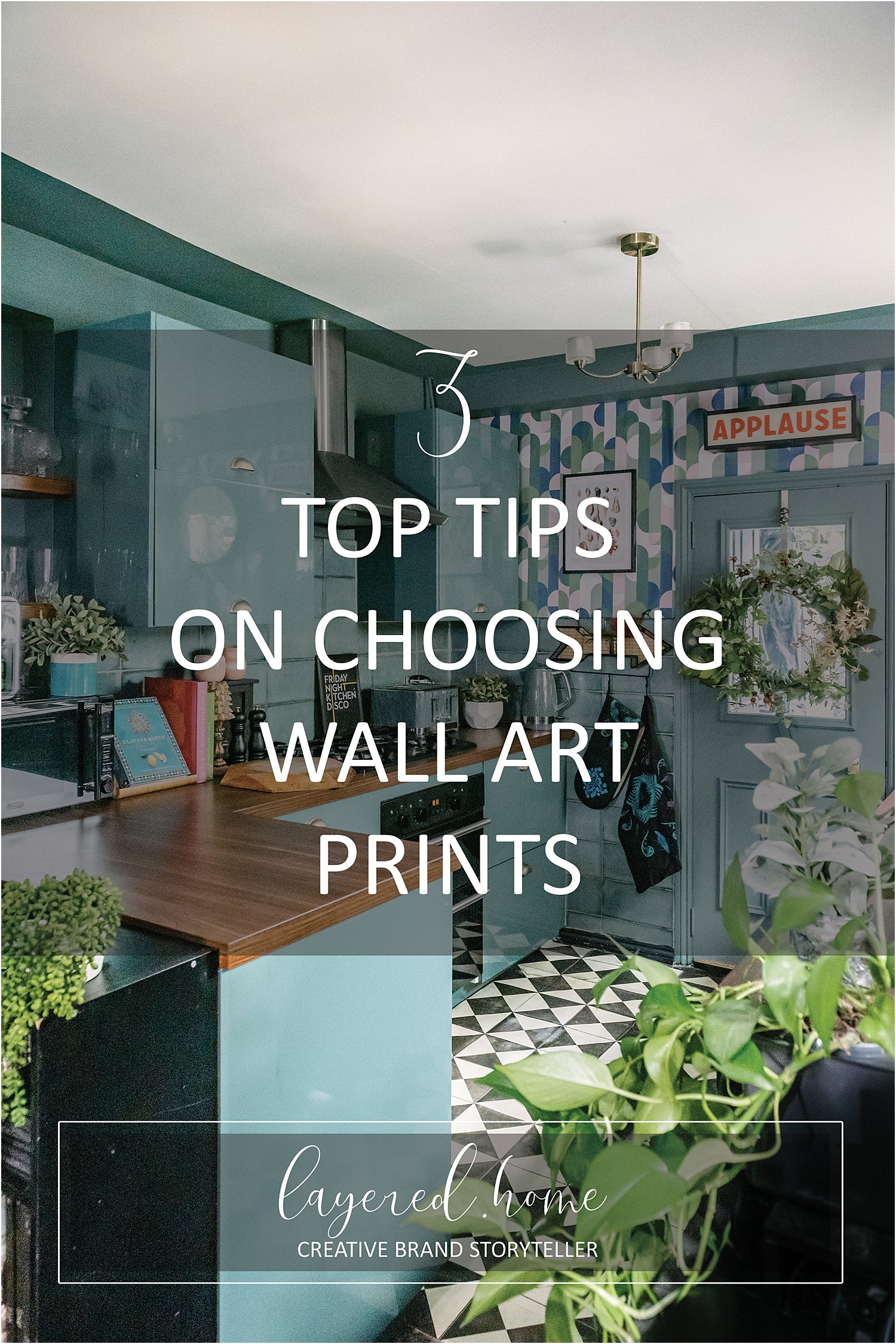
With the plethora of prints now available out there, how do you choose the right ones for your space? Here are my 3 top tips on choosing wall art prints for your gallery wall.
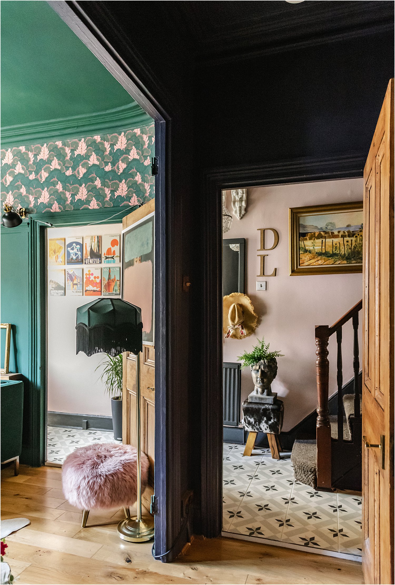
My home has evolved so much over the years for a couple of reasons. First, I am always on a journey, finding out what I love as time goes on. Second, I am always rethinking my spaces and working on making them right.
That said, the concept of “right” is very personal and can only mean it has to be right for you. It doesn’t have to be right for others but in my home, it has to be right for me. This rightness is intrinsically linked to my own taste and style and personality.
In this blogpost I am narrowing down how I choose my wall art and prints. I will be showing you examples of my wall spaces that have changed over the years as I journey on to the search for “rightness” through various phases of life and the passing of time.
3 Top tips on choosing wall art prints for your gallery wall
1. Reflect on what you love
When I pause and reflect on the things that bring me joy, it’s always a mixture of florals, nature, some specific animals and a few select geometric patterns. I am quite particular with the latter two.
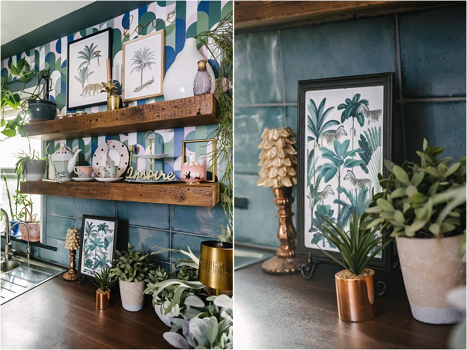
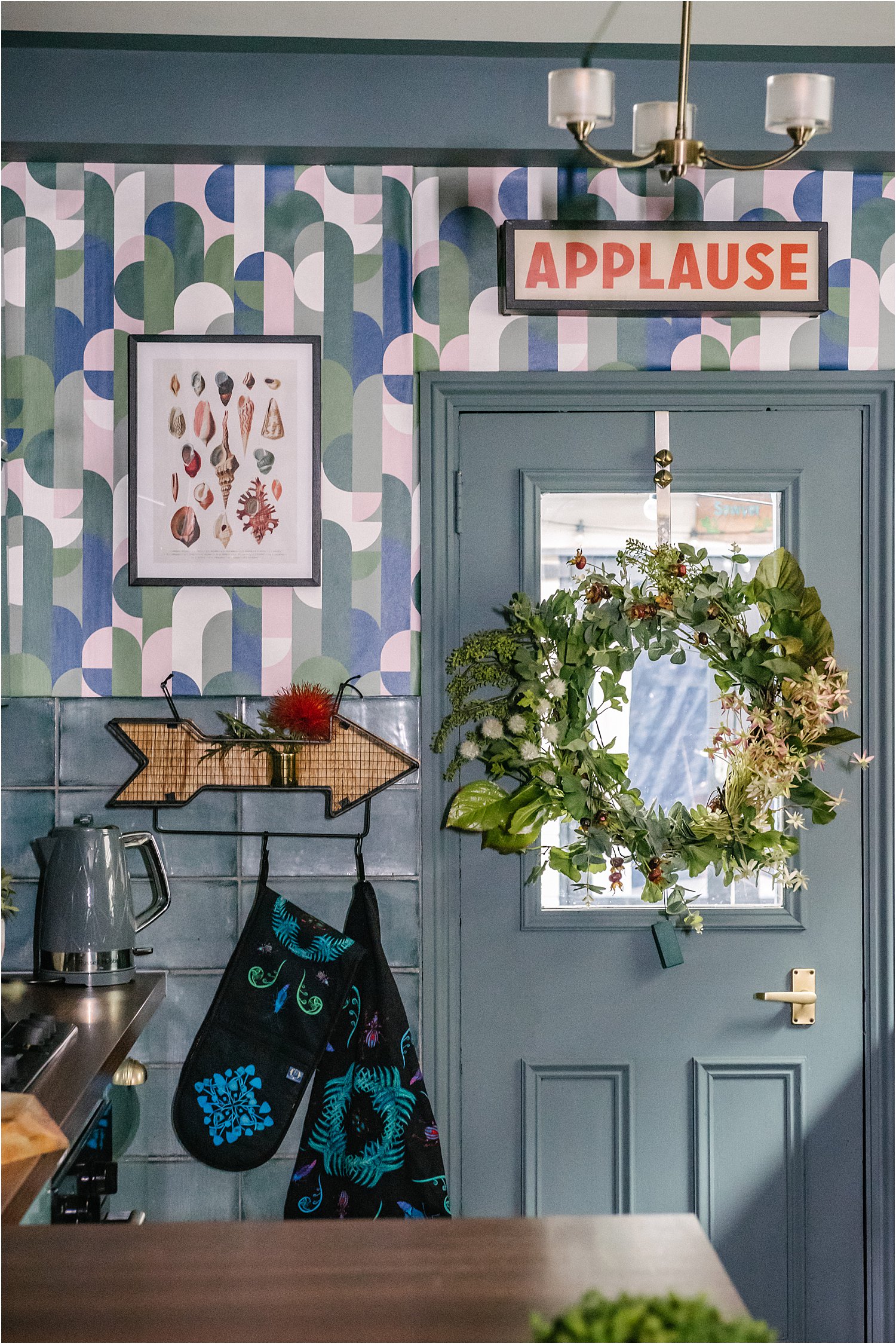
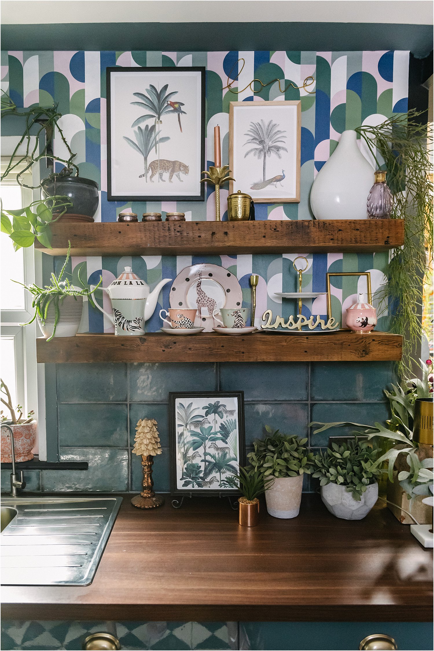
There are only a few of animals I like to be part of my home decor and that includes tigers, zebra, peacocks as shown on these Royal Botanical prints set from Desenio. When it comes to geometric I lean towards retro and contemporary as shown above on this wallpaper.
I feel strongly that it’s important to edit down my choices so there is a coherence to my decor story rather than a total unedited mish-mash of whatever I fancy. This is a personal choice especially because I like an eclectic collection but with some restraint.
2. Curate your colours
Curating and editing colours is crucial for a successful gallery wall design.
Whether you coordinate or or blend or contrast, one of my rules is to rein in your colour palette to a maximum of 4. This would allow room for colour pops and textures like brass or gold which help move the viewers eye around the whole space.
Here I have chosen Desenio Royal Botanical prints to coordinate with the background wallpaper. The white and greens in the these prints pick out the whites and greens in the wallpaper making it all feel cohesive but not necessarily blend into the wall. The white background of the prints give them clear definition and separates them from the wall.
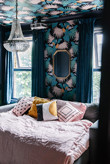
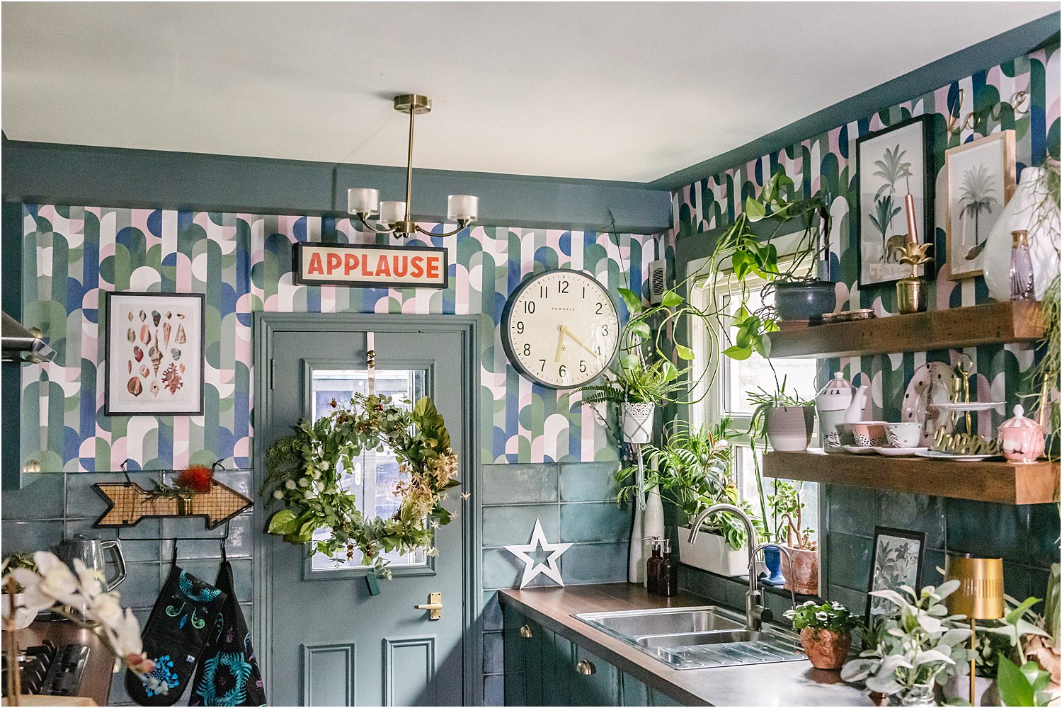
Here below I chose this Desenio Vintage Seashell No 1 print that has tones of warm pinks and reds in them to pick out the red text from the Applause sign. This pulls the scheme together as otherwise the Applause sign would look quite isolated being the only bold item with red tones in this space.
If you decide to go for contrast, don’t be shy about it. Use contrast as the thread that pulls the eye around the space keeping the interest high at all times.
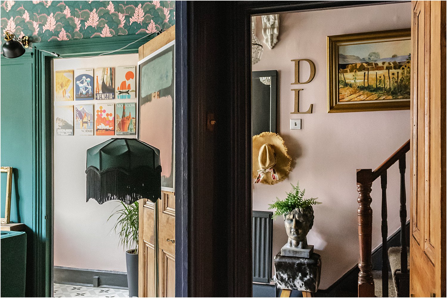
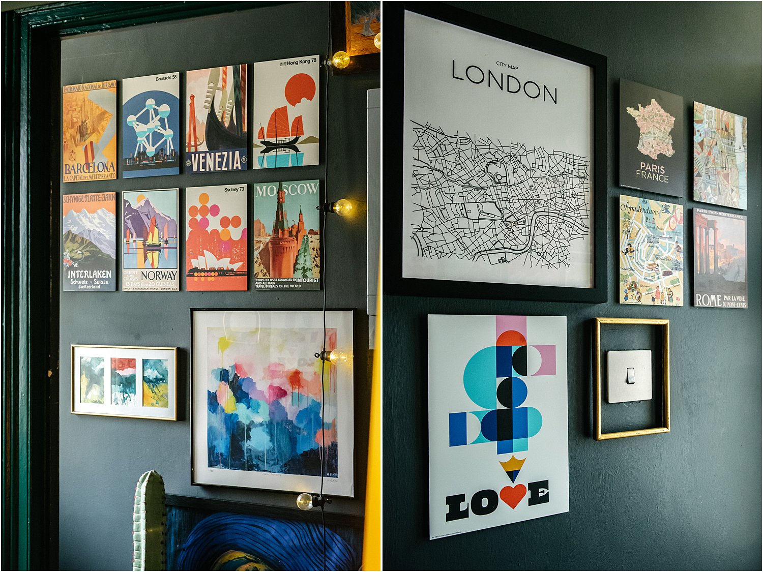
I have tried to achieve this here below in my entrance hall using strong oranges against a dark grey wall. The deep dark colour of the wall is strong enough to hold all the bright and solid colours in the prints and provides a backdrop that unifies the numerous prints in this maximalist wall.
Another way of curating colours is blending prints into the background so that it either doesn’t stand out so much or so that it mirrors the background in a big way as shown on these prints below.
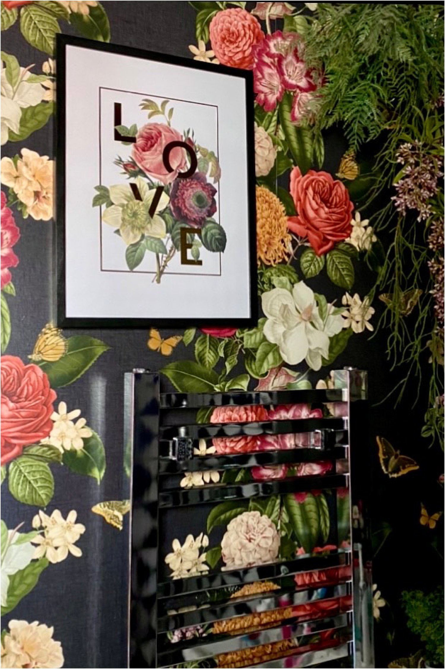
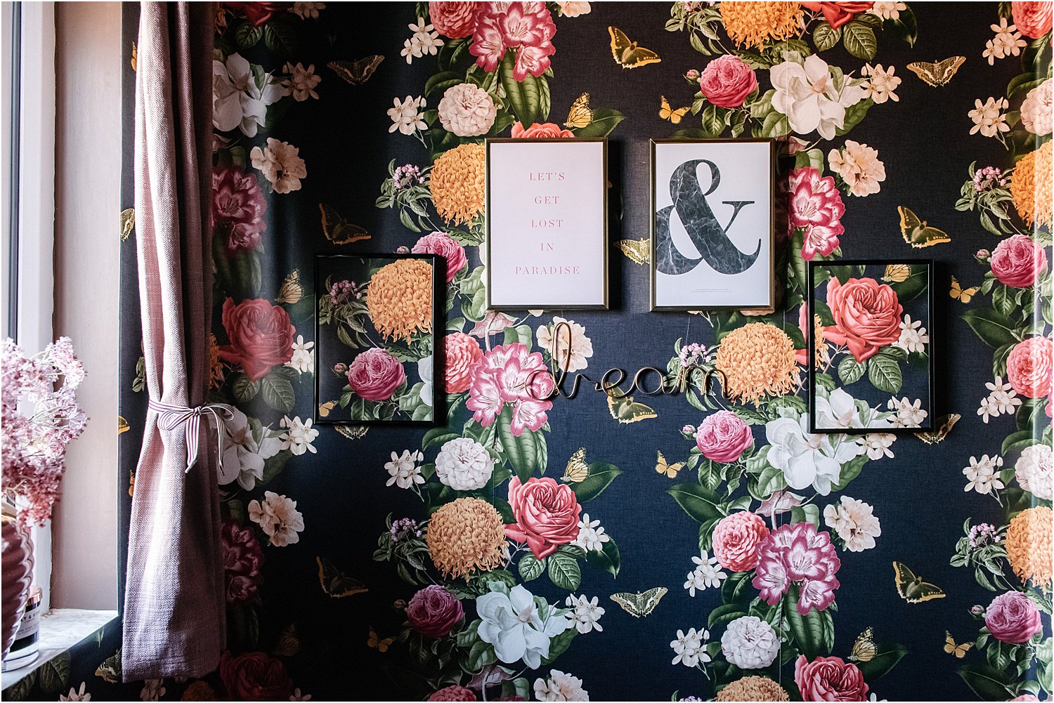
This Desenio Love Flowers floral and typography print combo mirrors the background wallpaper which I thought suited this space perfectly. The white background defines it away from the wall, but the florals in the middle tie it back into the wallpaper. The LOVE typography woven into the florals gives it a contemporary feel.
Compare this to the display below where I decided to frame the actual wallpaper. There is no white background to separate them from the wall. The only thing that defines the wallpaper prints are the black frames. They blend in nicely and as a collection is a statement in itself. However, I personally feel that it lacks contrast.
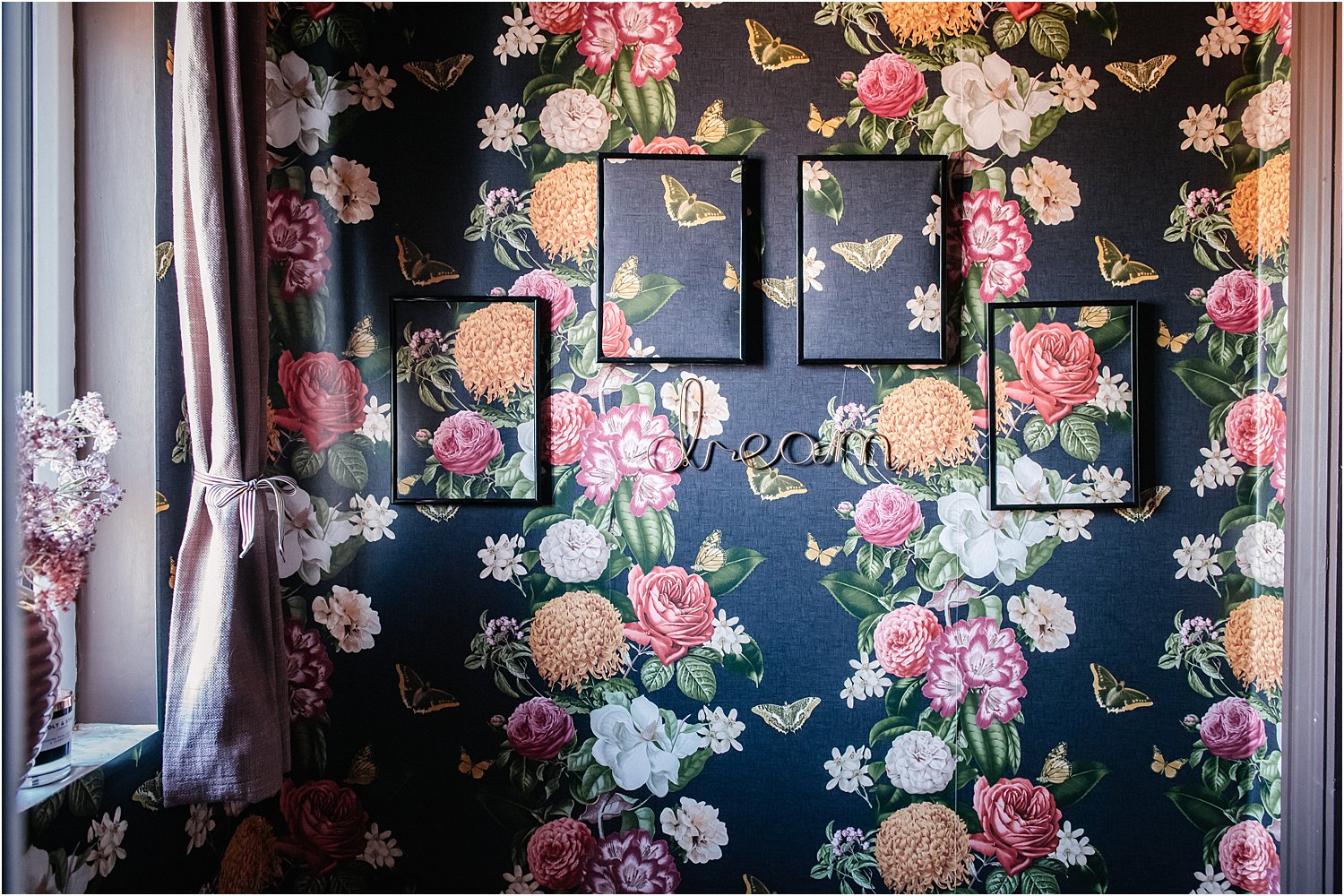
Here below is the same wall but this time with two contrasting prints instead of all 4 blended prints. Personally, I think this is a better balance of contrast and blend.
3. Consider the type of art or prints
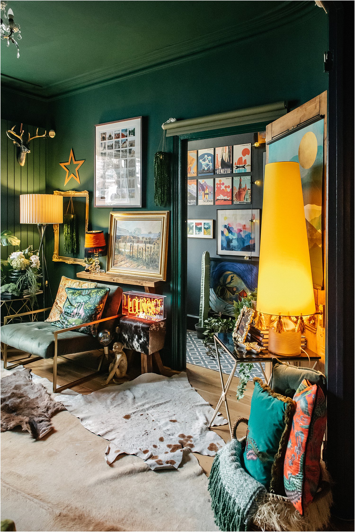
The type of prints can also be a determining factor of how you choose art and prints for your gallery wall. You can go for a wide variety – mixture of prints, typography, paintings, neon, framed, unframed, empty frames, letters, vintage style, contemporary style etc… all arranged on the same wall space. This will have a homely vibe that exudes story and journey experienced over the years.
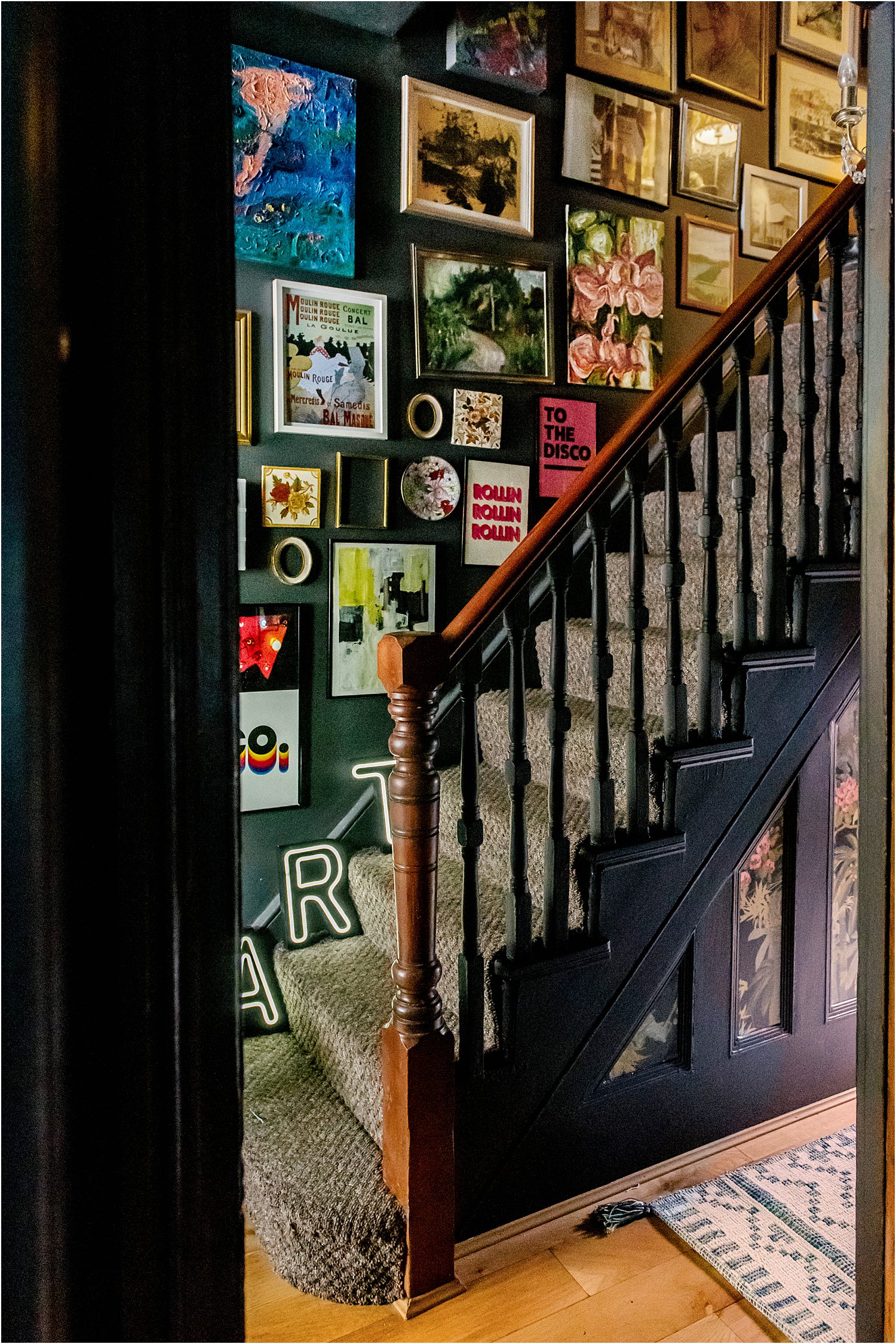
You can go for a higgledy-piggledy arrangement for an extra lived-in vibe like the eclectic mixture on the wall above. If you want to take the edge off this type of feel, you can do so by either arranging art and prints in rows or by using a theme like the way I did the shelf display below with 3 Desenio Royal Botanical prints.
These latter two arrangements make a maximalist wall feel organised and orderly whilst remaining complex.
Lastly, picking out hero pieces so that they take all or most of the attention is another way of displaying art and prints that you love as shown on the right wall in the photo below.
I hope this article has given you ideas on how to choose wall art and prints for your gallery wall.
This blogpost is sponsored by Desenio in a paid partnership. The Royal Botanical Leopard, Royal Botanical Zebras, Royal Botanical Peacock, Love Flowers and Vintage Seashells No 1 were all provided by Desenio and came with frames that fit them perfectly.
Shopping is easy and quick with Desenio as various frames are suggested for your print as you shop and choose. All you have to do is to tick some boxes and off you go!
Don’t forget to download my free resources that will help you design your own interiors and grow your Instagram account! Let’s chat on Instagram Layered.Home and together get inspired!