3 Ways to style your dining table for Christmas with Sotti & Co
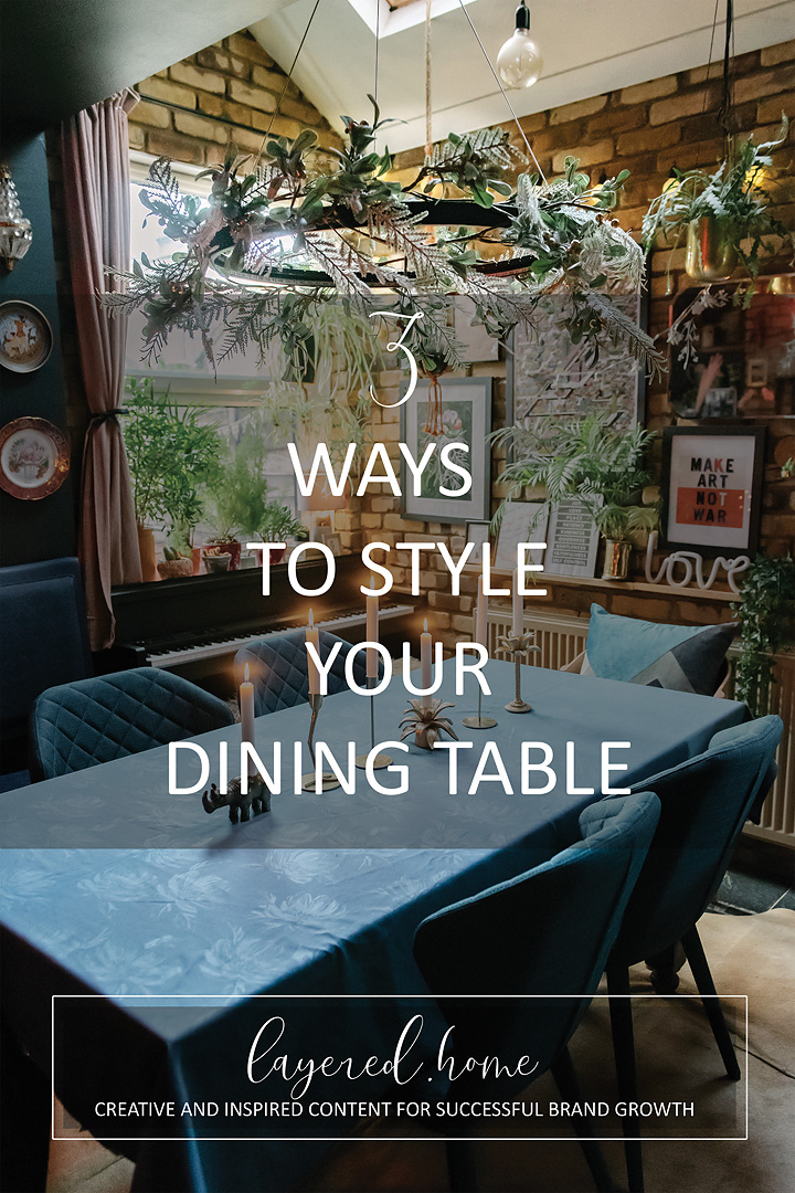
Christmas is my favourite time of year. There are numerous excuses and opportunities to style and decorate your house and Christmas table. I love really going all out maximalist! Styles can include Scandi, eclectic, colour-coordinated, maximalist, minimalist, nostalgic, you name it it’s a style. You can totally make your own style up; it’s so much fun! Foliage, lights, baubles, wreaths – it’s a stylist’s haven.
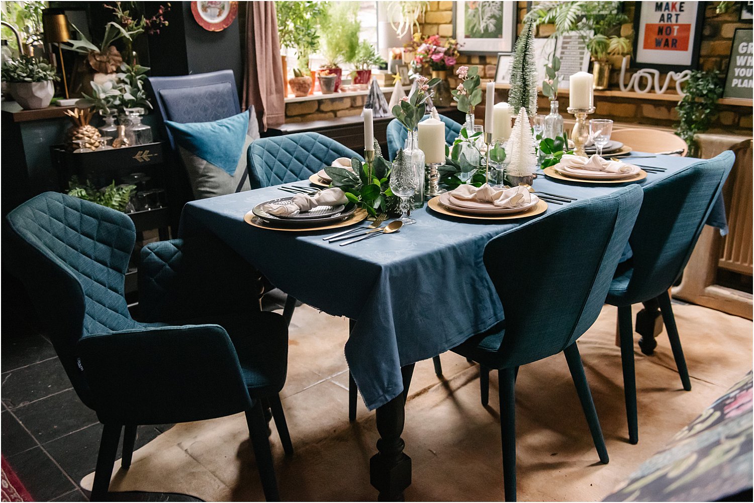
I like to faff with tables during Christmas and annually I do various ways of styling my dining Christmas table over the 4 weeks of December. This year I am styling my table in 3 ways with the help of Sotti & Co blue Bona dining chairs as my anchor colour and style inspiration base. By the way, Sotti & Co have given me a code LILY30 to give you 30% off your purchase. Sotti & Co are focused on form and function of their fine handcrafted home furniture. They ensure that the final product reflect the beauty of the original material – wood, metal, linen- and that they shine through and are as much appreciated aesthetically as they are enjoyed practically.
3 WAYS TO STYLE YOUR CHRISTMAS TABLE
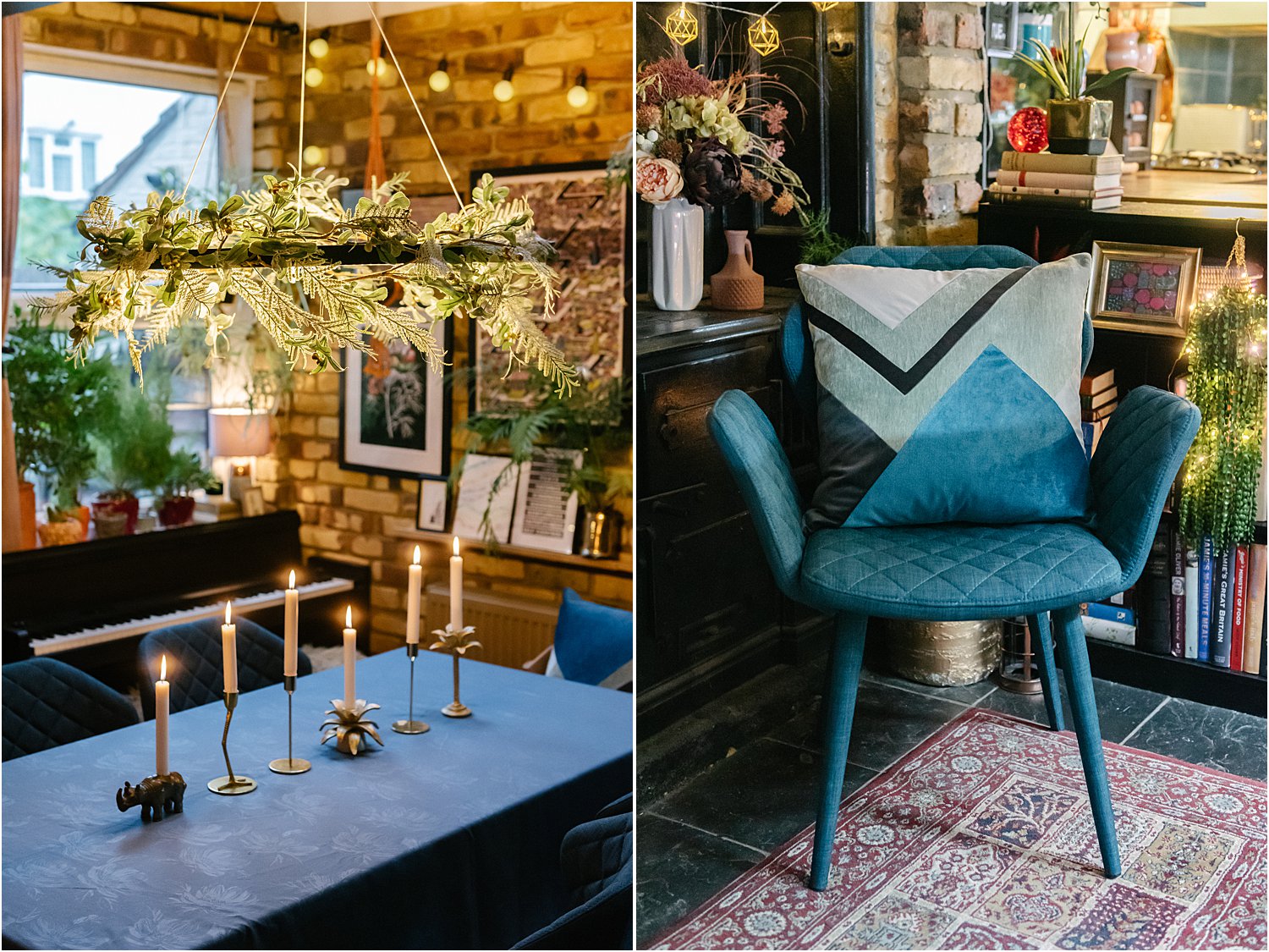
1. MONOCHROME
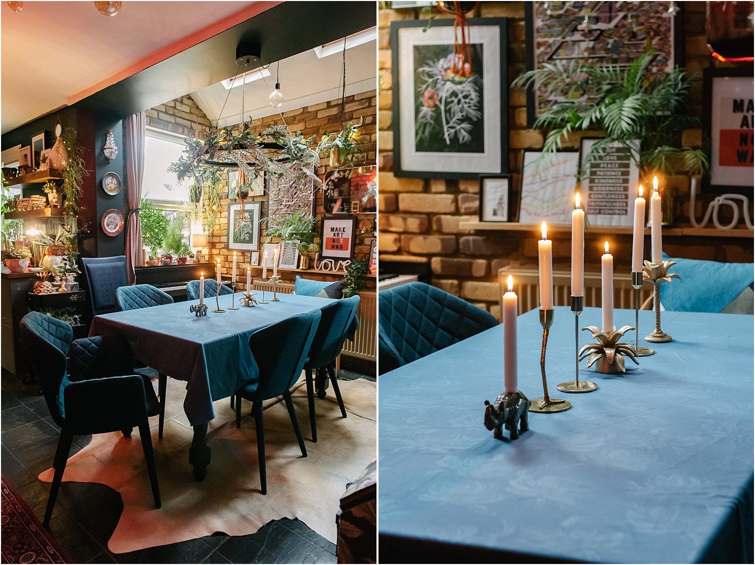
Technically speaking, monochrome is the use of purely black and white or one colour of varying tones, the white being the “lightener” of the colour to make tonal variations. For my version of monochrome, I went with blue on blue – blue being the dominant colour from the Bona chairs and a blue tablecloth of the same tone, with only the candles providing the lighter tones. The focus is on the main colour and the result is a classic, clean look, pared back and elegant.
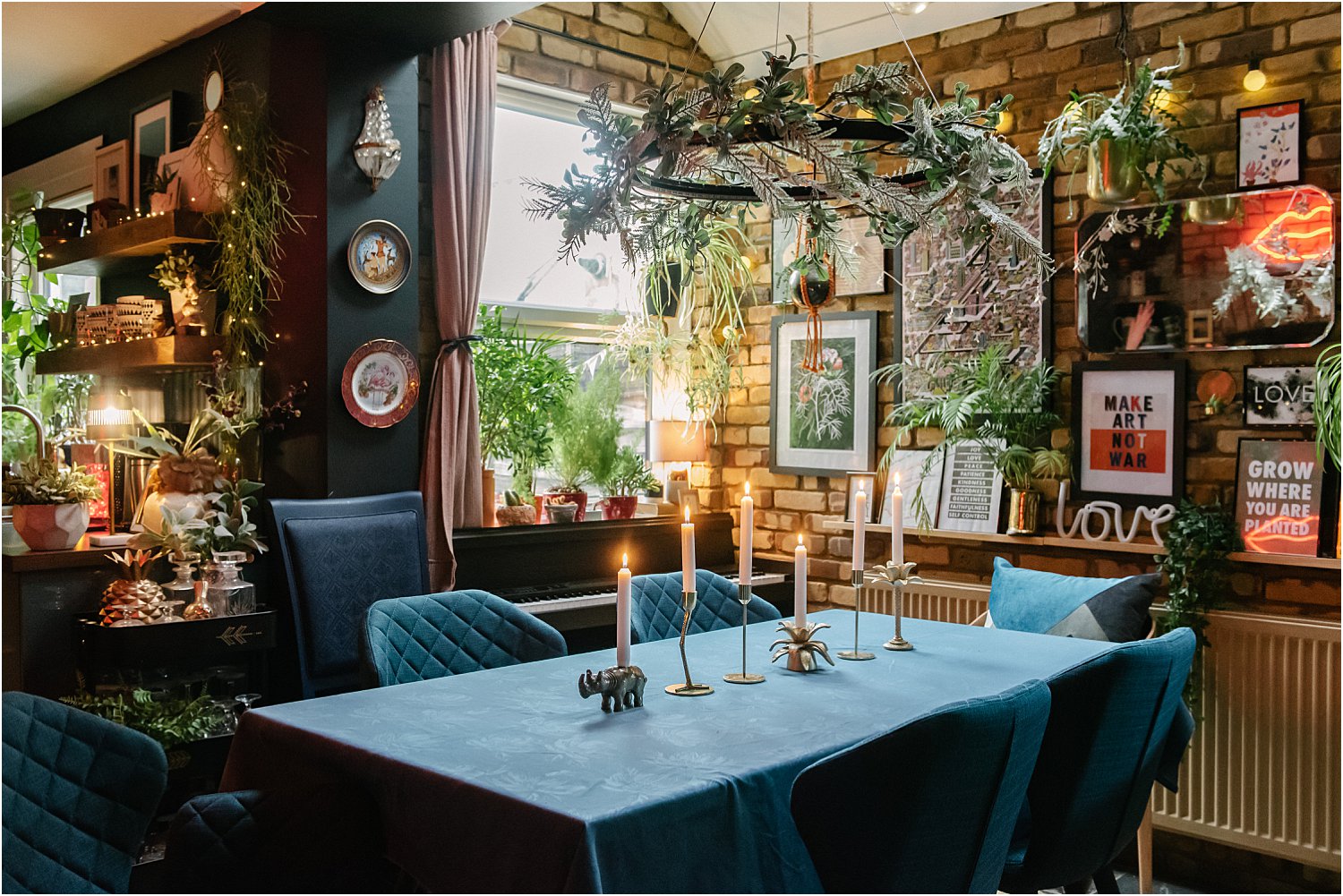
I was aiming for a rich minimalist ambience if there’s such a thing. To continue with the monochrome theme, you can add crockery in blue hues and black cutlery or even white plates, with white being the other end of the monochrome spectrum of tonal values.
2. HIGH CONTRAST
Where tonal values in a monochromatic range usually have graduating tones, high contrast doesn’t. It’s a play between very light and very dark. Here you can see I have continued my blue on blue but added bright warm candles and fairy lights for extreme contrast against the cool blue tablecloth and chairs.
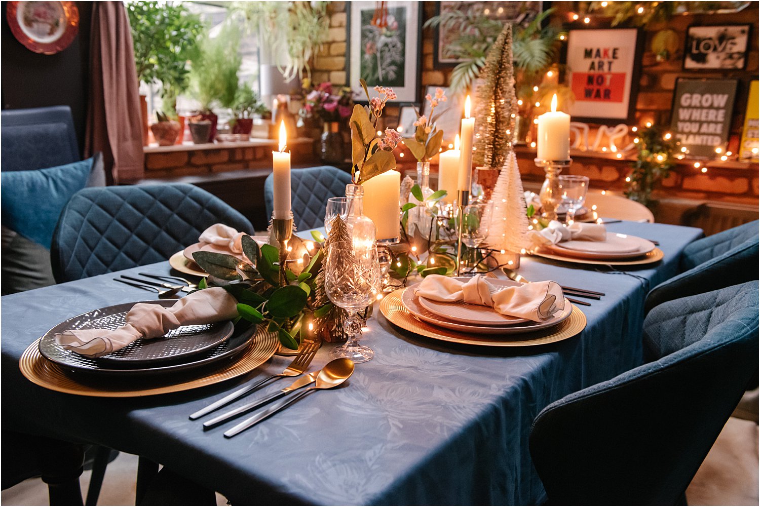
I also added foliage to create texture contrast. Other textures that I’ve layered and juxtaposed here are: rough cut crystal glasses against plain candlesticks, matt tablecloth against shiny plate chargers, plain napkins against patterned geometric plates, sharp tree bristles against smooth candles. By layering and juxtaposing the above elements, you are creating instant visual impact and maximum interest to the viewer’s eye.
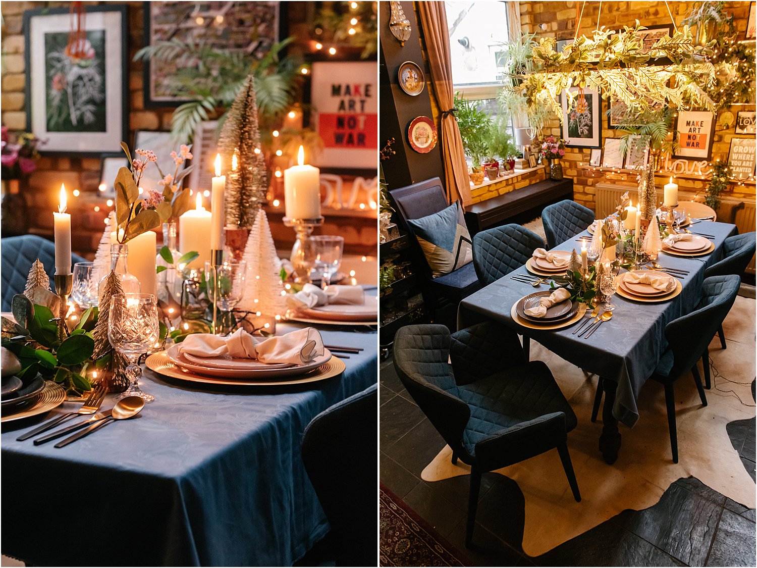
High contrast is further emphasised by using a variety of heights on the table – high bristle trees, mid-height candles, low-height foliage. This makes the eye not only travel around but up and down the tablescape adding more interest to the overall design.
3. COLOUR PLAY
My third table is a play on colours. The blue Bona chairs are now the backdrop of a variety of colours in focus. Here I have a three main colours at play: pink, mustard and blue-green. I added gold as the accent colour.
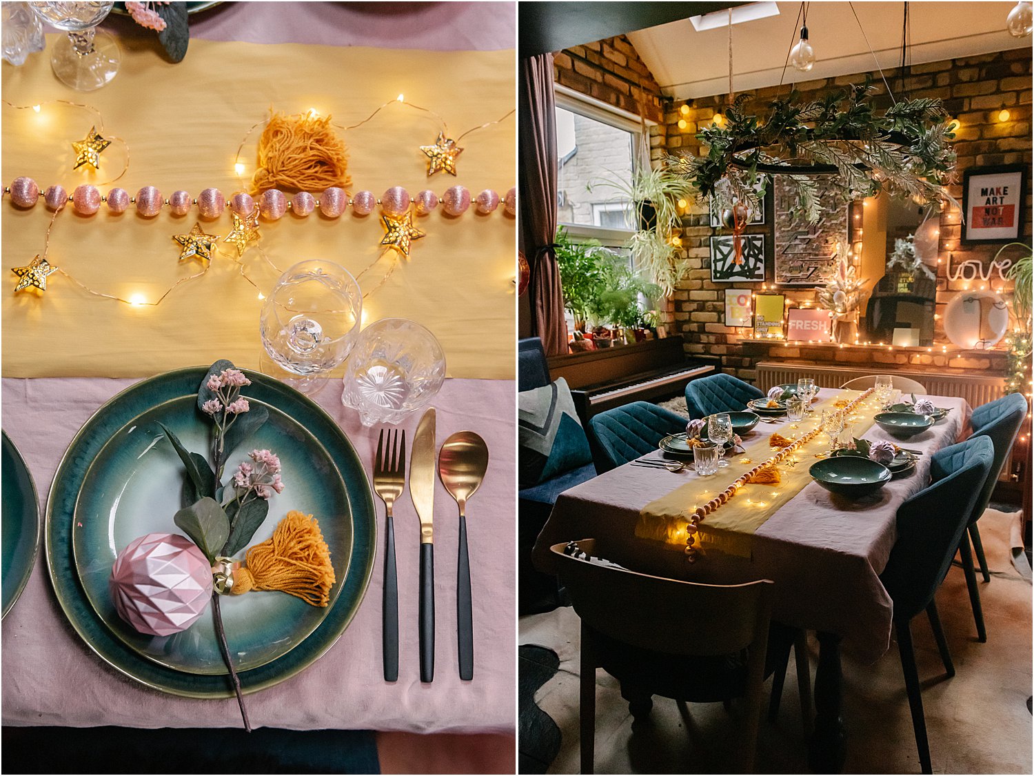
Where height was an element on the high contrast styling, here I decided to go flat on the levels and really make the colours work hard to move the viewers’ eye around. This was helped by adding fairly lights and gold stars which are similar in warmth to the mustard runner.
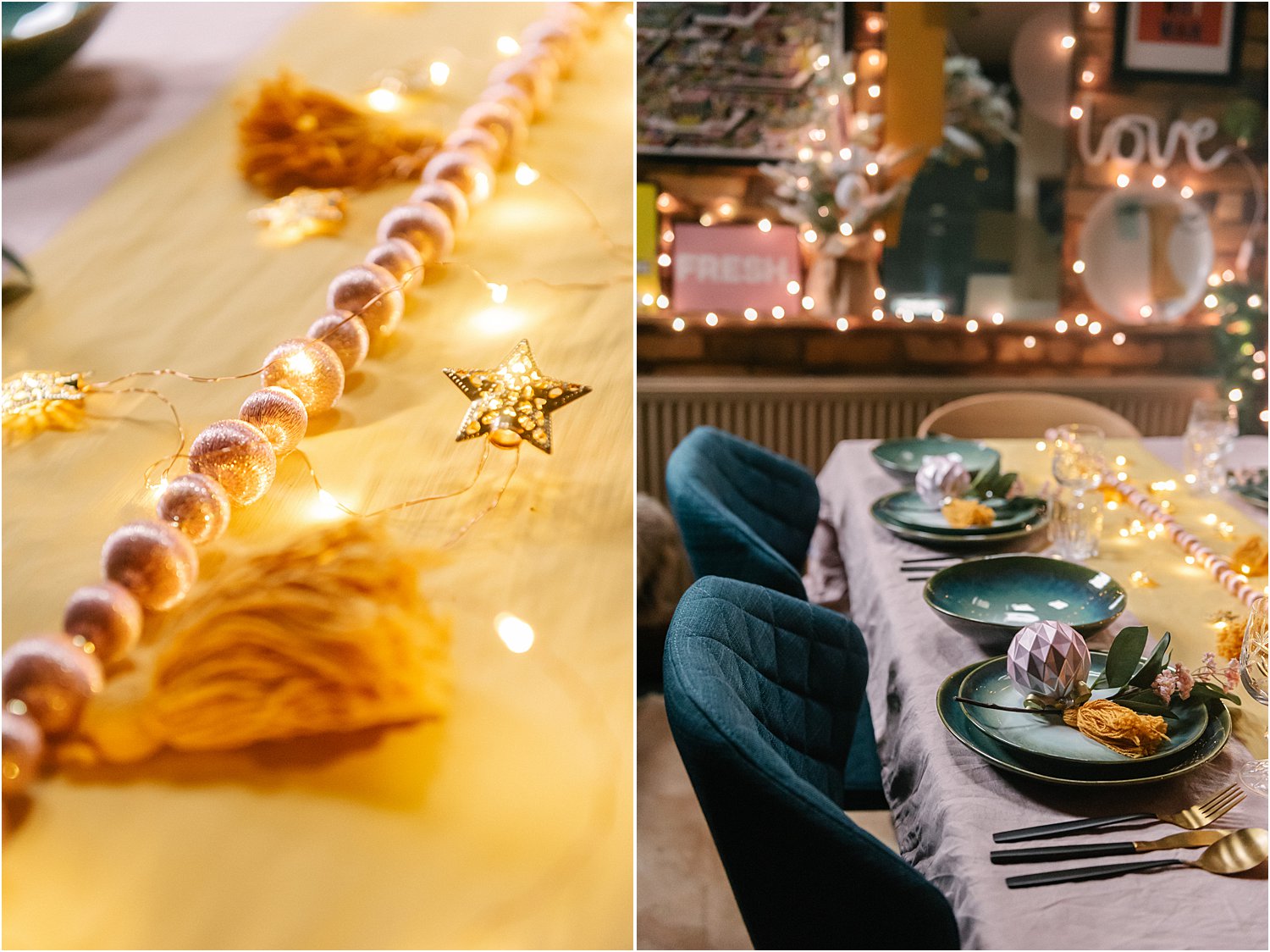
Another thing that I maximised to compensate for lack of height was the use of unexpected materials normally not used on a Christmas tablescape. I used some cotton mustard tassles, pink silk garland, reactive glazed ceramics, geometric contemporary baubles from my tree and some faux foliage and flowers.
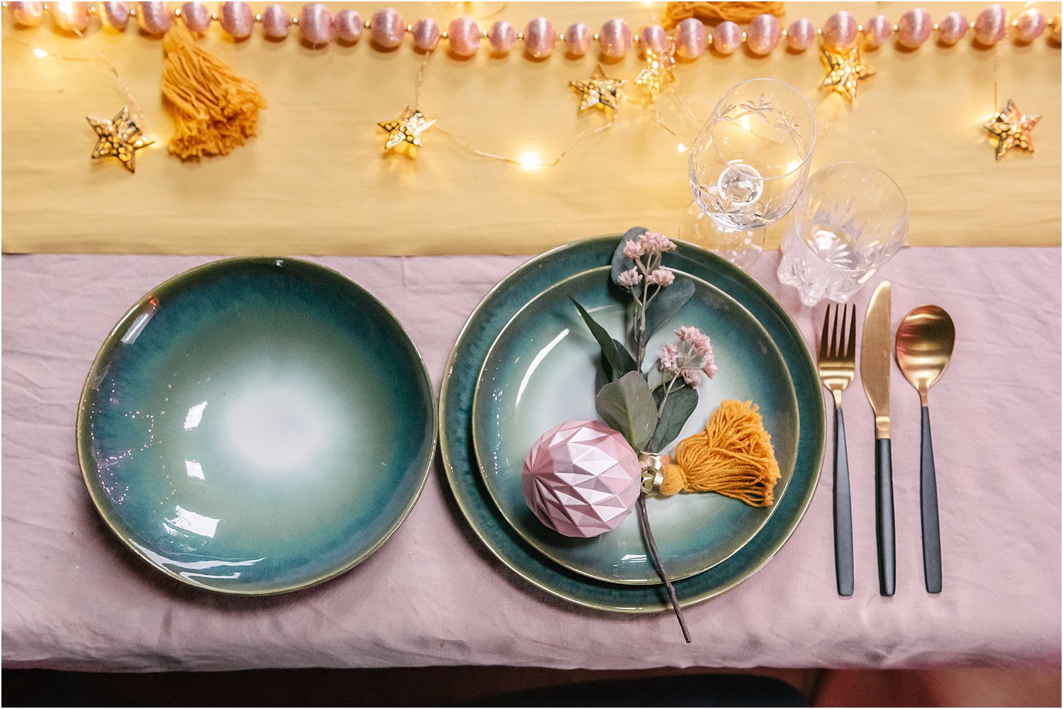
This is an eclectic collection of vintage, contemporary and natural greenery all mashed-up in one tablescape. I think the trick in making this look cohesive despite so many things going on is to limit the colour palette to 4 and that means considering the surrounding colour palette too.
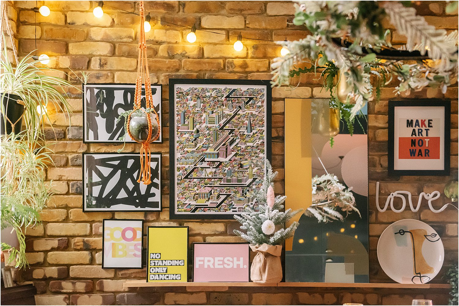
The pinks and mustards here have been inspired by the mirror, platter and Fresh print on my brick gallery wall. I took from the existing scheme and carried these through the table instead of introducing new colours.
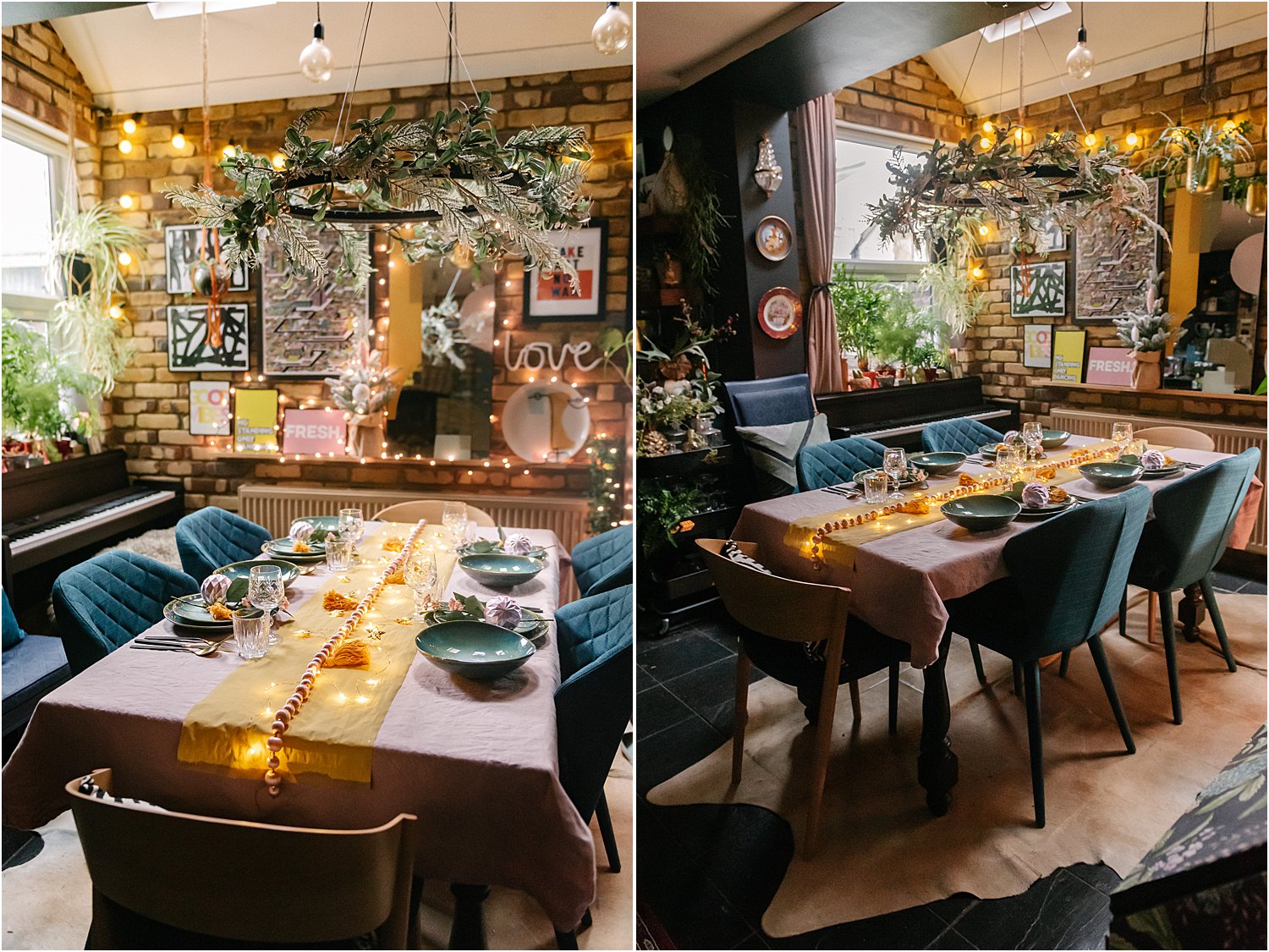
There you have it, 3 ways to style your Christmas table this year in case you are on the lookout for ideas!
Sotti & Co have gifted me these chairs and geometric cushion cover. They have given me a code LILY30 to give you 30% off your purchase. These chairs are now 20% off and you will get a further 30% with my code giving you a whopping 50%. These chairs are sturdy, solid and absolutely beautiful. At less than £80 per chair using the code, it’s a steal!!!
Other gifted items here include Made.Com mirror and glazed dinner set and a Fresh print from Nanas of Anarchy.
If you know someone you think would find this article on 3 Ways to style your dining table for Christmas with Sotti & Co helpful, would you mind sharing it to them? I’d be grateful if you would share on your stories too or mention or tag me Instagram layered.home on your posts. I’d love it if you would follow me on there and all the brands mentioned in this article as well. Thank you for reading!
