First off, please forgive me – it’s actually a shower room, not a bathroom (bathroom is just better for SEO.) So from here on, my 3 Steps to a Dreamy Scandi Bathroom actually refers to my tiny loft shower room.
The backstory
This shower room is located in the loft, in between two bedrooms. I initially painted it brown and installed brown tiles on the floor and in the shower. Big mistake. I didn’t really know what I was doing and what I wanted. I love dark rooms and walls but in this instance I chose a warm brown – the wrong kind of brown. Perhaps if it was more of a cool brown or earth brown, it would have worked.
But I wanted to keep to the dark hues so I wallpapered it in a floral noir design, painted the door pink for a pop of colour and stuck black and white stickers to the tiles for contrast. And it was great. For a few years. Until the stickers started to peel off, the shower broke (with constant complaining from my family) and lockdown made me want to go lighter.
So here we are, going from black and pink to light and airy. As always, I start with a moodboard.
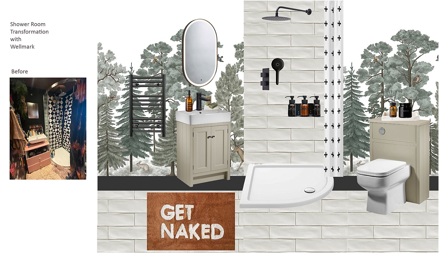
Without further ado, here are my 3 steps to a dreamy Scandi bathroom
3 Steps to a Dreamy Scandi Bathroom
1. GO EARTHY
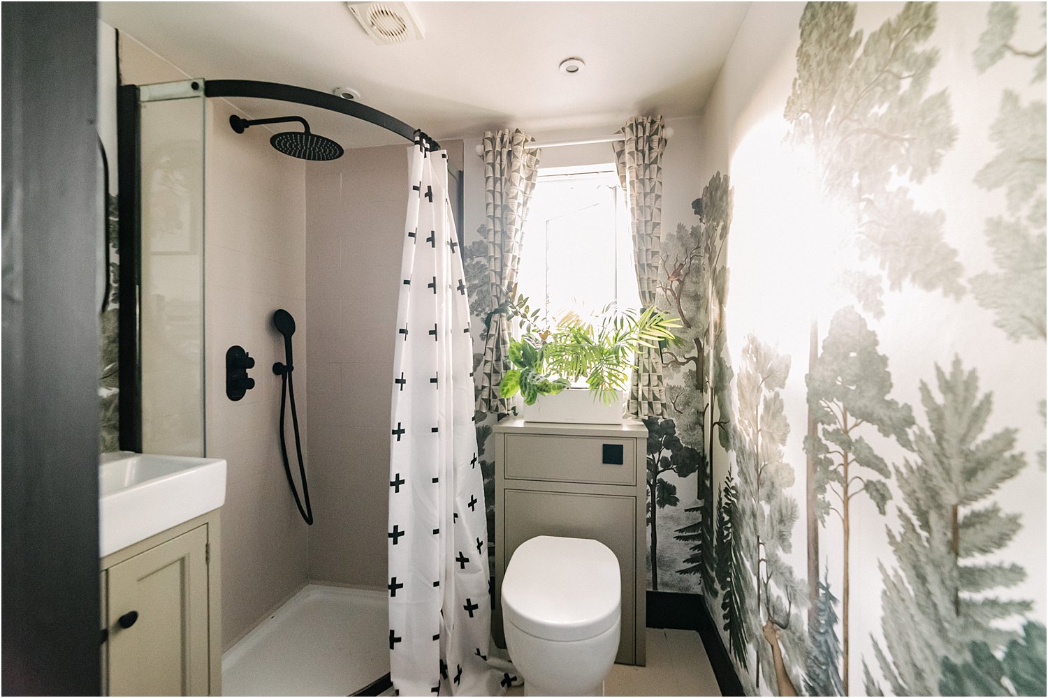
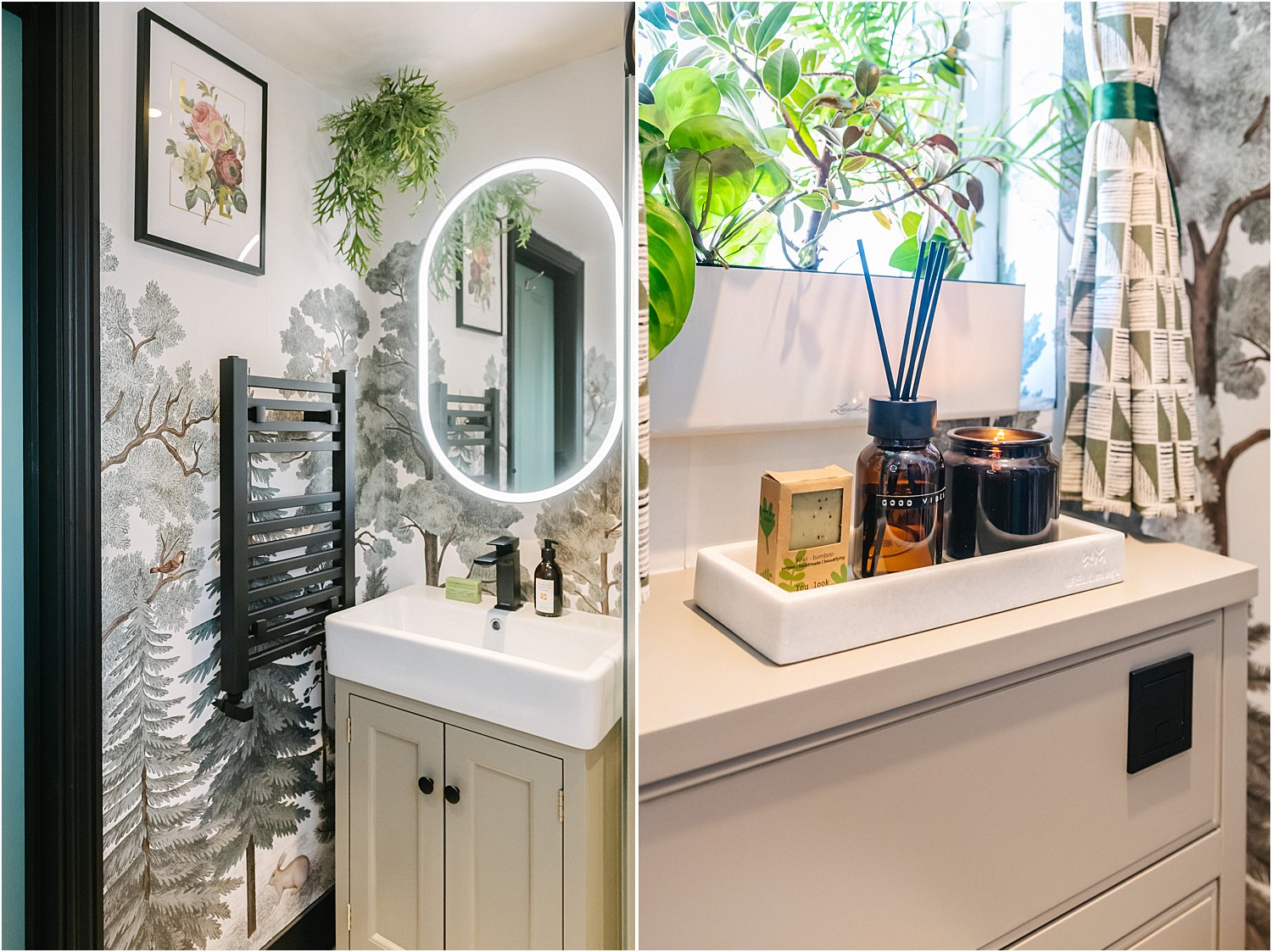
Scandi doesn’t have to be just white and black. I went for earth colours: clay, mocha, amber, rust, sage green and black and white accents.
For the units, I went for the spacious Roper Rhodes Hampton Vanity in mocha and a matching back to wall unit for the toilet to hide the cistern. Bearing in mind this space is only about 1.3m x 1.7m in size – it is really tiny, it was paramount to maximise storage in the vanity. And this Hampton unit did not disappoint. In fact, it went beyond my expectations. It is super spacious!
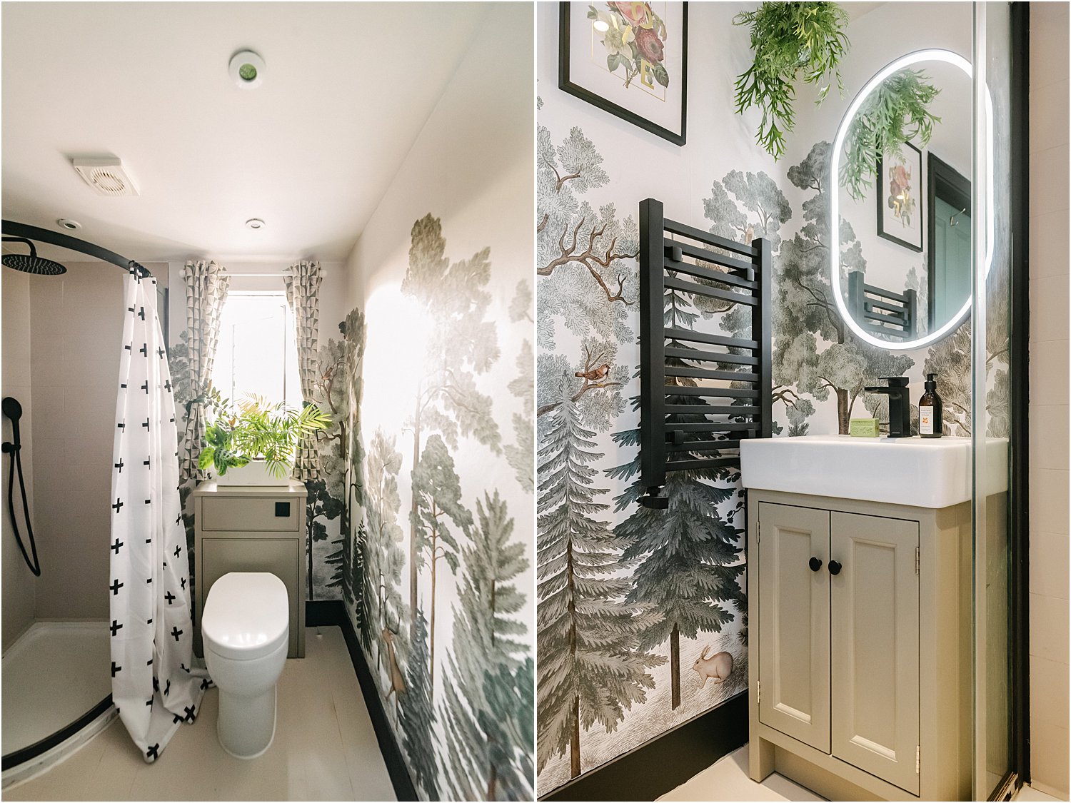
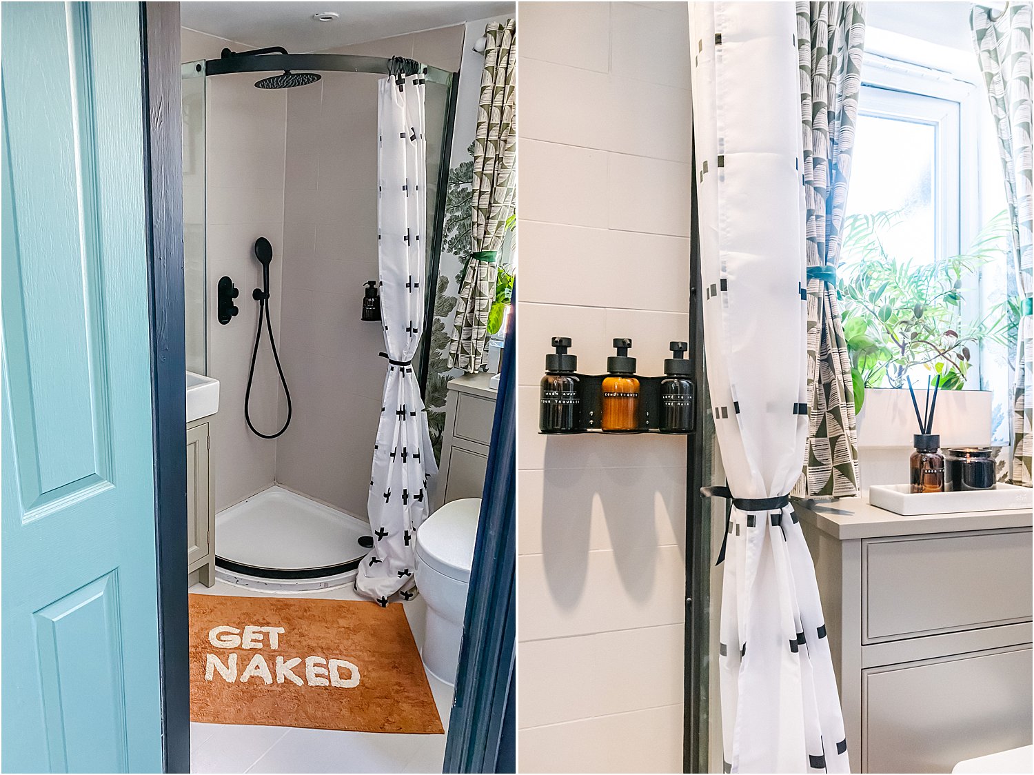
I also opted for a matt black tap, the Metric basin mixer with click waste, which is small and sleek. For the shower, I went for the Unity concealed shower system for an uncluttered look in the same matt black finish. What a wonder this Unity shower system is! The handheld shower has a button that changes the spray type and strength and the control knobs are so easy to use. It has a thermostatic valve for precise and safe temperature control.
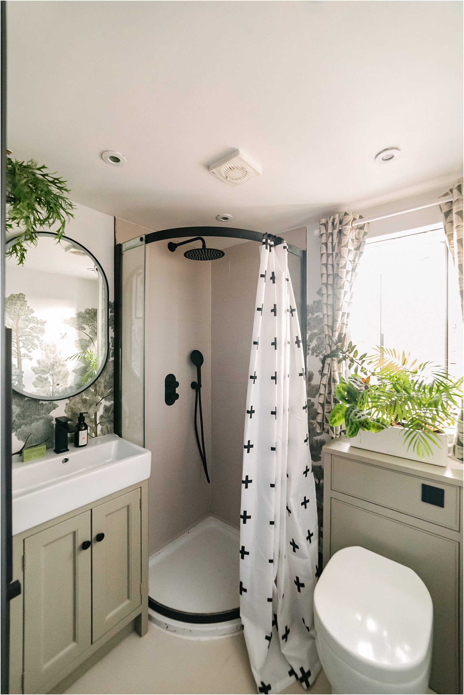
What’s a shower room or bathroom without a mirror? And not just a normal mirror but a dimmable, illuminated mirror that never steams up! Here below is the magic Frame Illuminated mirror in pill shape. It’s so clever and responsive you don’t even have to touch it to turn it on and off.
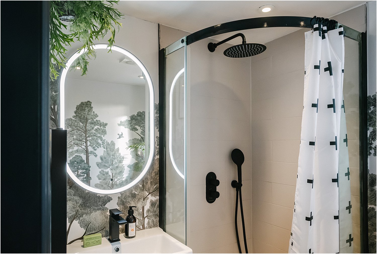
You can also change the colour temperature of the light from warm to cool. Located behind the centre of the mirror is a demister pad that ensures this part of the mirror never steams up so you have an uninterrupted view even in the steamiest of showers. It is a wonder mirror worth checking out if you’re in the market for a new one. They come in circular, oval, pill, and square shapes.
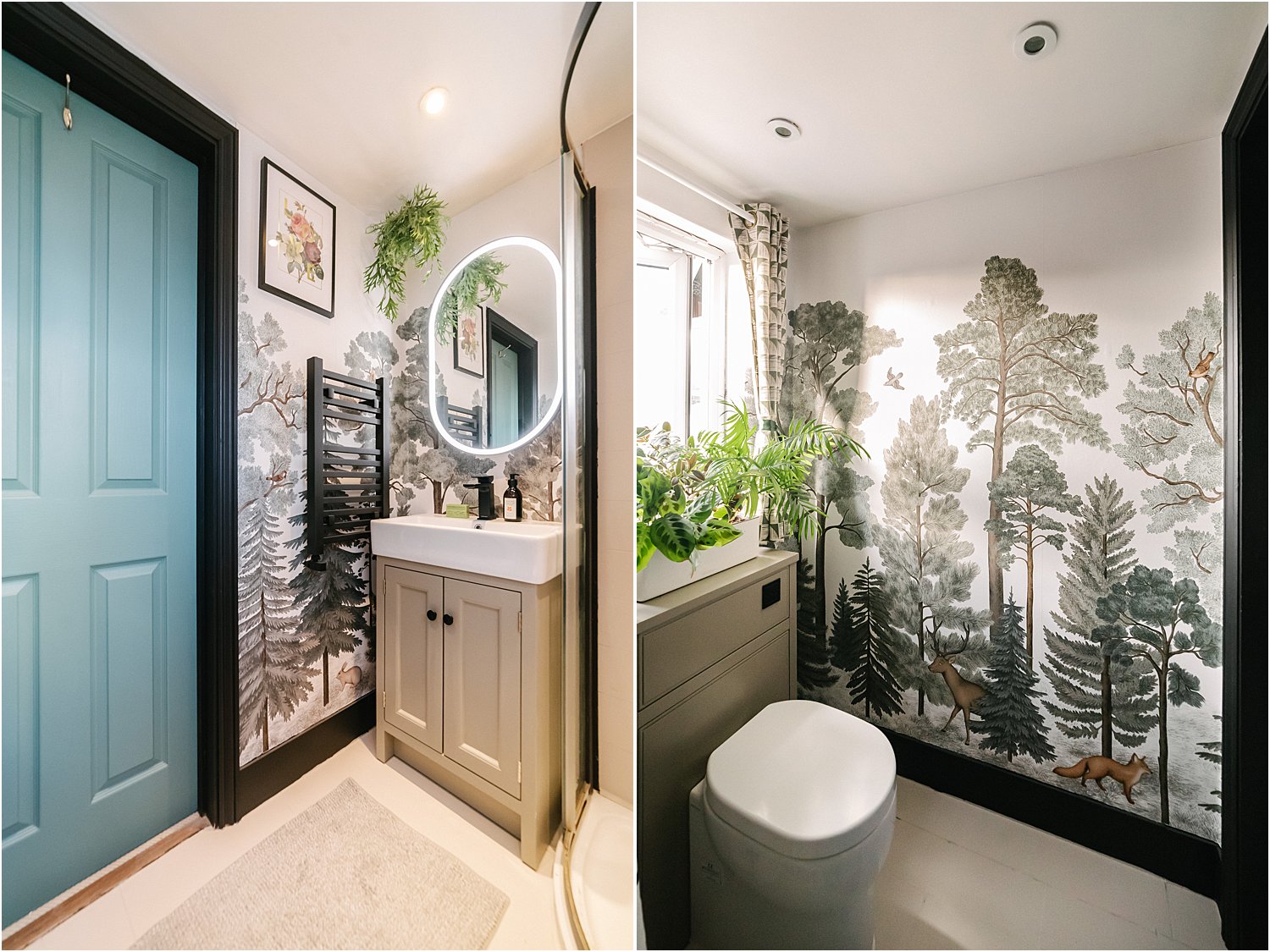
As to the toilet, you might say a toilet is a toilet (although I have to say this one is super sleek and curvaceous at the same time). But definitely not the toilet seat! Our old toilet seats used to break and get replaced every now and again. This Zest toilet seat is the bees knees as far as toilet seats go. Perfect fit as if it’s been moulded into the ceramic, sturdy, sleek and soft-closing.
2. ADD A TOUCH OF WHIMSY
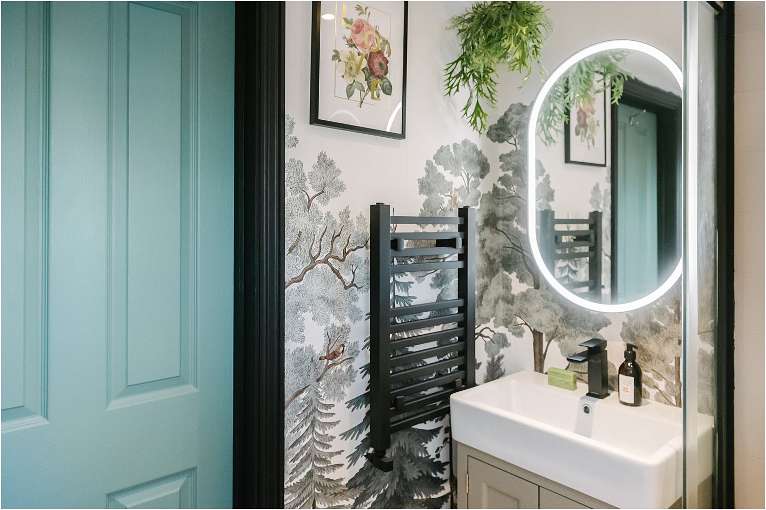
Wallpaper is my thing so it was a no-brainer; I was always going to put a new wallpaper up. This time I chose Rebel Wall’s Scandinavian Bellewood, Animal.
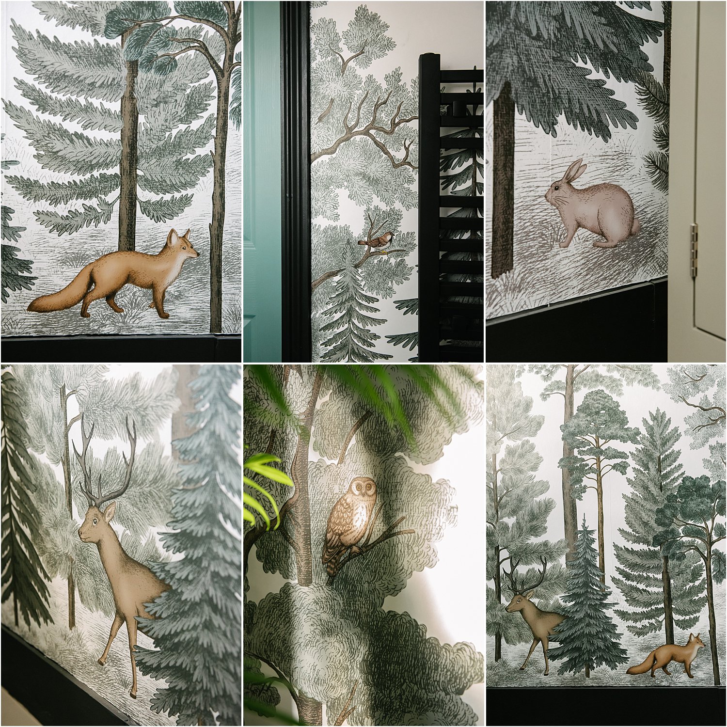
I love the forest design and the whimsical animals dotted around, almost as if waiting to be spotted. I also love that the colours are fairly muted – nothing heavy-handed. I mixed some left-over Rustoleum paint to match the green on the forest and painted the door. Calm and coordinated with a little zing.
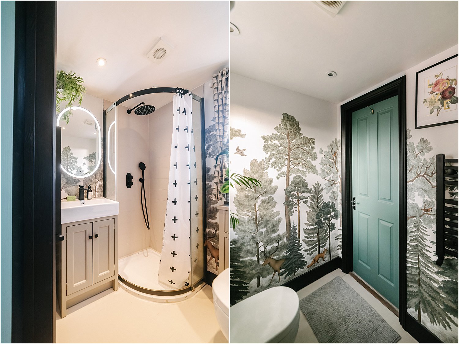
Wondering where the brown tiles went? Well, I just painted them with Frenchic Cool Beans and sealed them with Rustoleum Lacquer Spray which I also used to seal the wallpaper. I also painted all the chrome bits of the shower enclosure black to match the new matt black fittings.
The shower curtain was a great find – I had bought it for my main bathroom and put it away when I revamped it as it no longer matched. It’s now perfect for this Scandi space.
3. AMBER ACCESSORIES
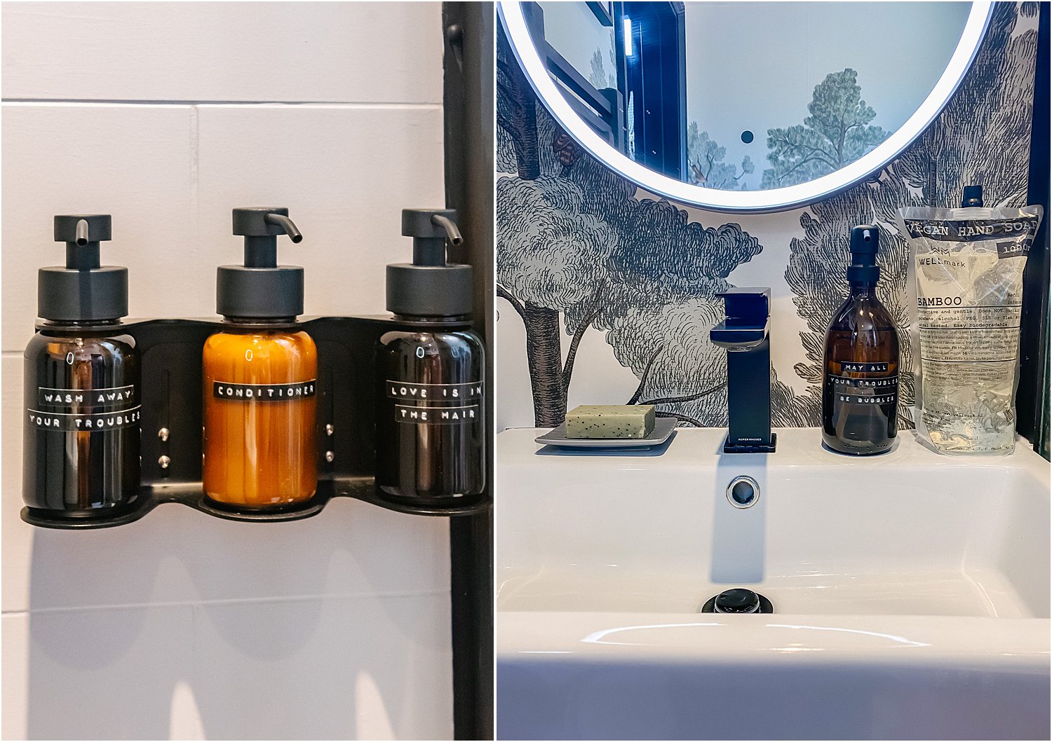
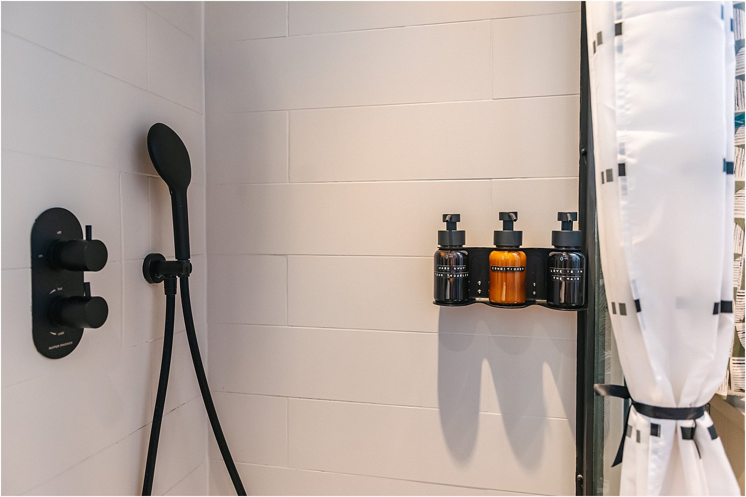
Amber to me spells warmth and vintage. I went for amber bottles with black pumps from Wellmark. As a solution to all the shower clutter of shampoos and suchlike, I chose the 3-bottle holder which is securely installed on the tiles. Not only is it super tidy, it’s also all refillable. Vegan, eco-friendly and sustainable – just what I needed.
I also absolutely love their vintage Dymo labels on their products with fun phrases such as “Love is in the hair” May your troubles be bubbles” “Wash your troubles away”. Definitely added to the cool factor!
One of my decluttering tips, especially when you have a maximalist home, is to group things together and put them in trays. Works a treat in keeping everything tidy.
Up the cosy vibes with scented candles and diffuser sticks.
To carry on with the amber accessories theme, I bought this rust / terracotta coloured ‘Get Naked’ bath mat from Rockett St. George. I know there are other colours of this mat from other places but I was specifically after this rust colour. It’s actually so soft and absorbent. Worth it.
This is my second bathroom revamp using Roper Rhodes just because they are so good, top-notch bathroom specialists. You can read the first one one here: 3 Money-Saving Bathroom Revamp Tips
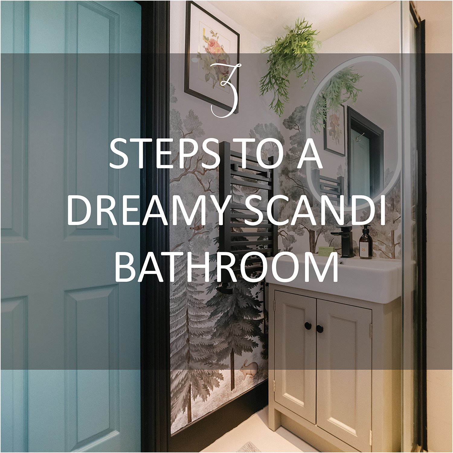
I hope my 3 steps to a dreamy Scandi bathroom has given you some ideas and inspiration. Here’s a little short video of the revamp.
For this shower room revamp, I am very grateful to have worked with Roper Rhodes, Rebel Walls and Rustoleum (all three for the second time), Frenchic, Wellmark and Rockett St. George in a sponsored capacity.
Don’t forget to download my free resources that will help you design your own interiors and grow your Instagram account! Let’s chat on Instagram Layered.Home and together get inspired!


A lovely transformation Lily, I love the choice of wallpaper too. Such a fun and quirky touch