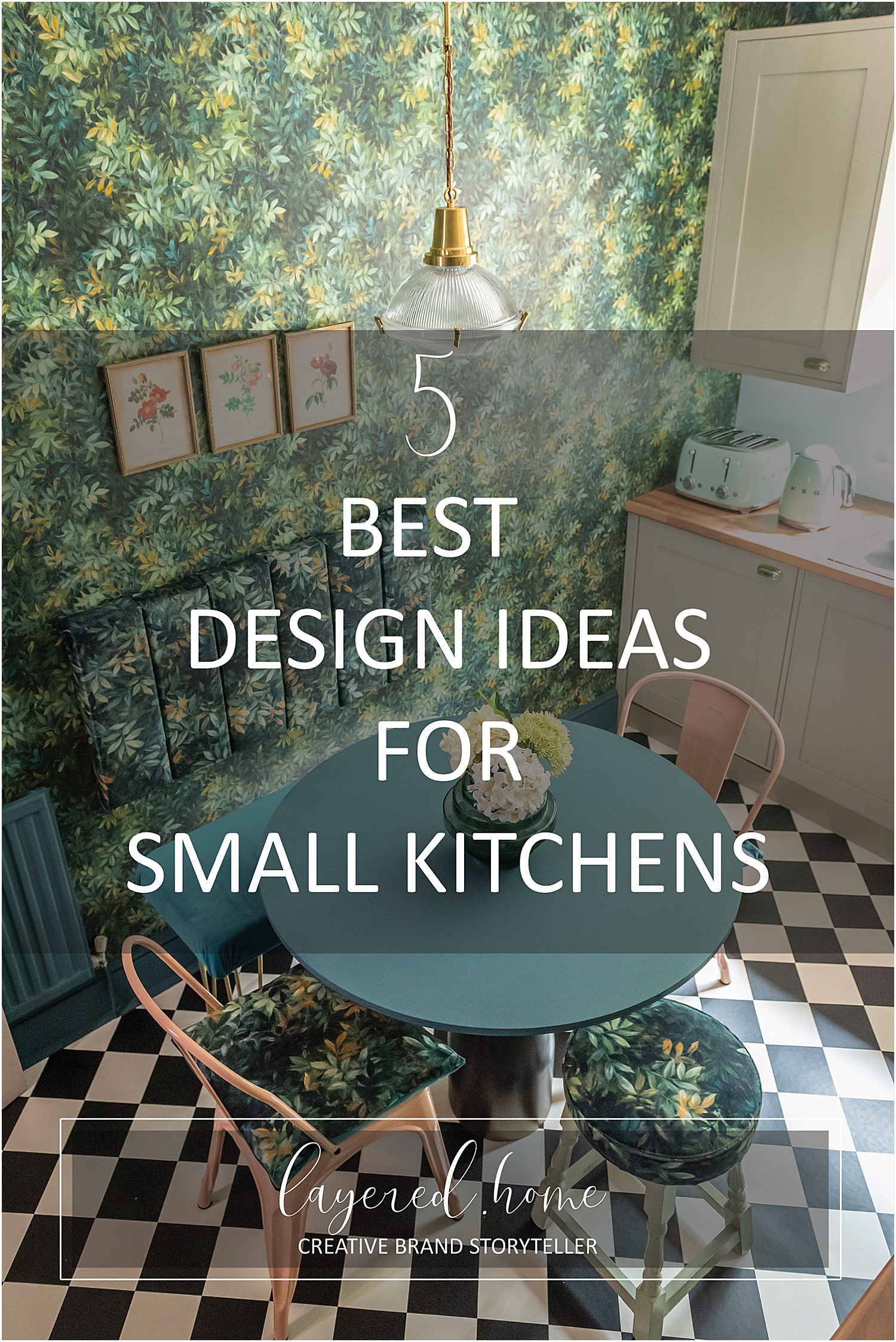
If you follow me on Instagram, you would have seen some photos of my flat kitchen. I am pleased to say I now have a brand spanking new kitchen and here are my 5 Best Design Ideas for Small Kitchens. It has taken me 1.5 years to get to this point!
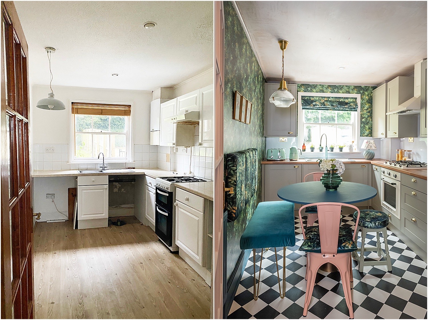
When we bought the flat, the kitchen was whitewashed and very grimy. The old cooker was a stand alone one which was situated in a gap between the cupboards and worktop. It was a bit too small so had gaps on either side.
It had dried up brown food and grime running down the sides of it but the gaps were inaccessible for proper cleaning. Food fell on the floor between the gaps and honestly it was just an embarrassing sight.
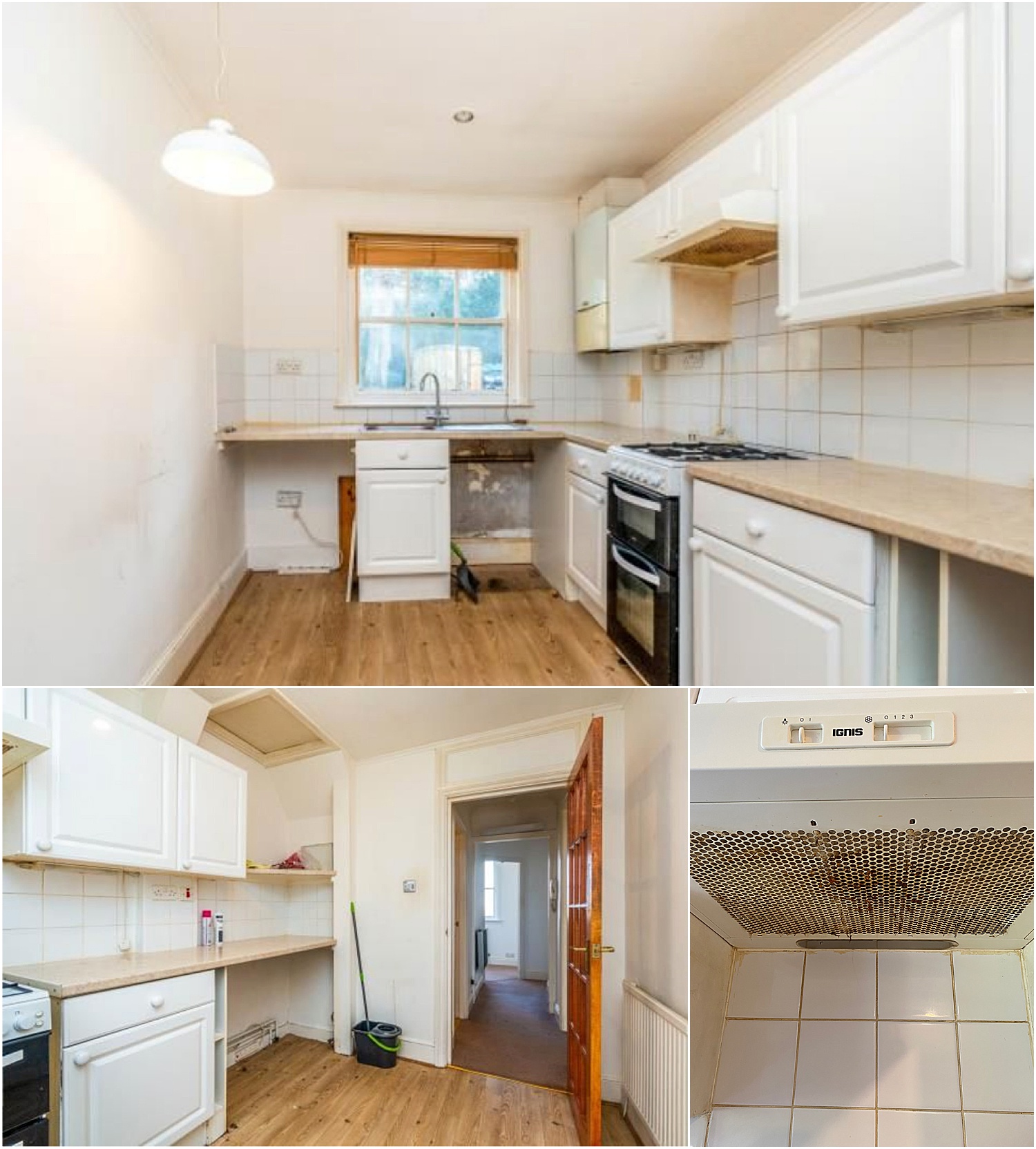
In an effort to do a temporary cosmetic makeover, I scrubbed the cooker and the extractor fan which had sticky brown oil stuck all over the filter, painted the kitchen cupboard doors and added stickers to the tiles and floors. Here you can see my budget interim fix of the kitchen whilst waiting for a new one.
It made the kitchen more welcoming especially when we had friends and family staying. But the experience of using the drawers and cupboard doors was another thing; they were in a desperate state. Drawers didn’t open completely, cupboard doors were wonky and had no efficient shelving inside.
Storage space was not maximised at all and old pipes were visible behind shelves and cupboards. Wires were haphazardly boxed off and unsafe extension leads hidden behind cupboards.
Even though people had said to me it’s okay, I had always felt it was terrible to be honest and I could never be proud of it when having friends and family stay.
Kitchens are a proper investment so it wasn’t something we could just do at the start. We had to wait a bit, live in it, plan the new one and save up for it.
Roll on almost 1.5 years later and we finally have our dream little kitchen! I am in awe of it and still find it incredible that it has turned out the way it did.
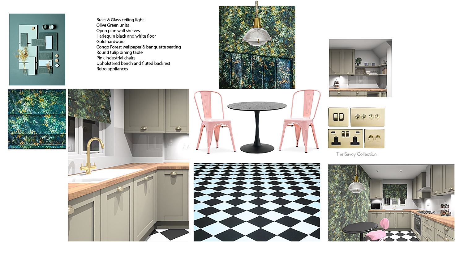
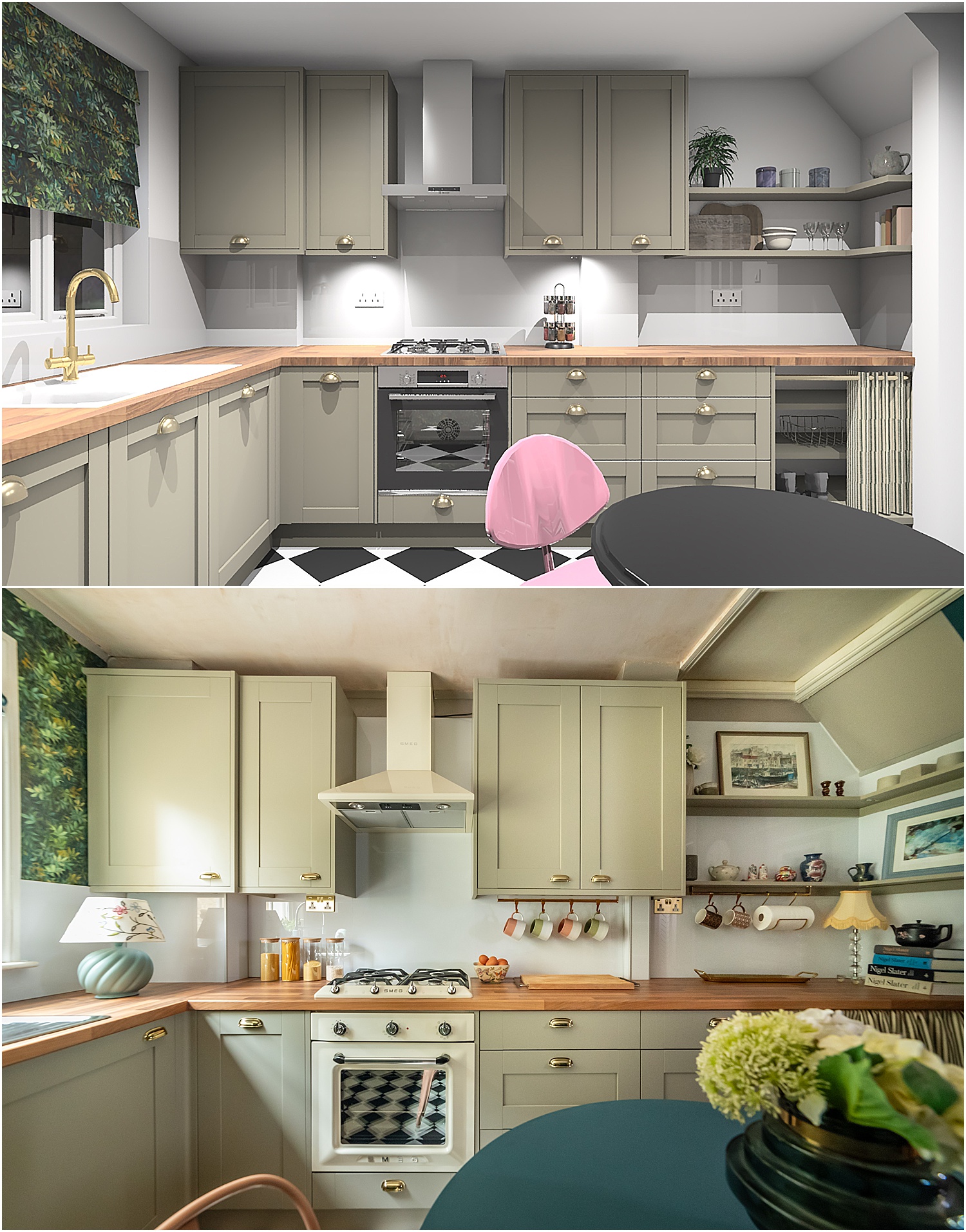
I started off looking at Benchmarx Kitchens for options and making a mood board shown above to help me organise my design ideas and do some initial editing of colours and furniture. It went through various stages until I got it down to how I wanted the kitchen to look. The mood board has the final kitchen design incorporated in it. Below are the designer’s render of my initial kitchen ideas.
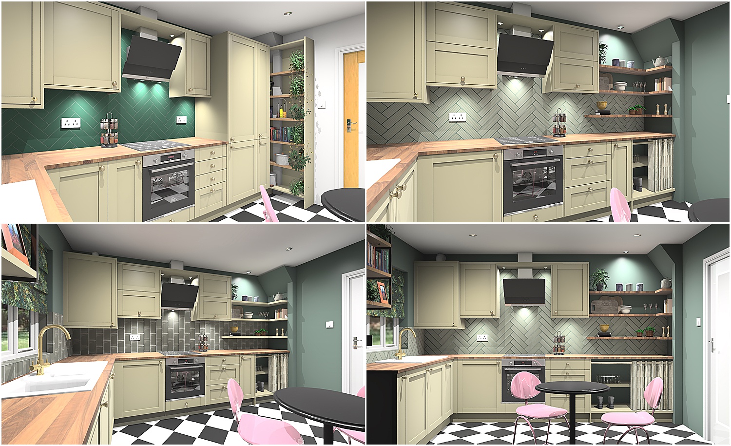
This room is a small space for both dining and kitchen so the kitchen area is limited to the L-shape and the rest of the space is for dining. It measures 243cm W x 365cm L x 243cm H. There is no space for an island or anything else other than a table and a couple of chairs.
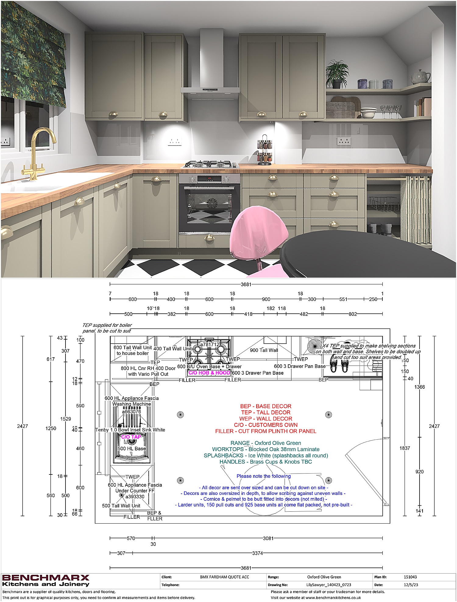
Above is the final design with anotated plan.
So without further ado, here are my 5 Best Design Ideas for Small Kitchens.
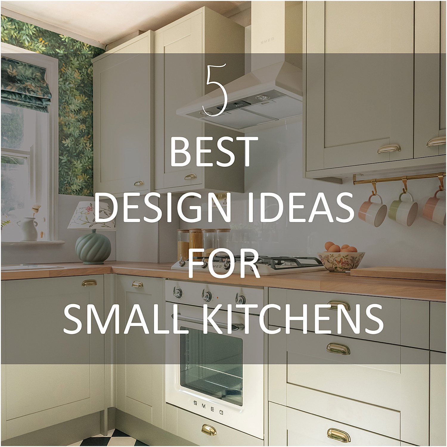
1. SMART BEAUTIFUL STORAGE
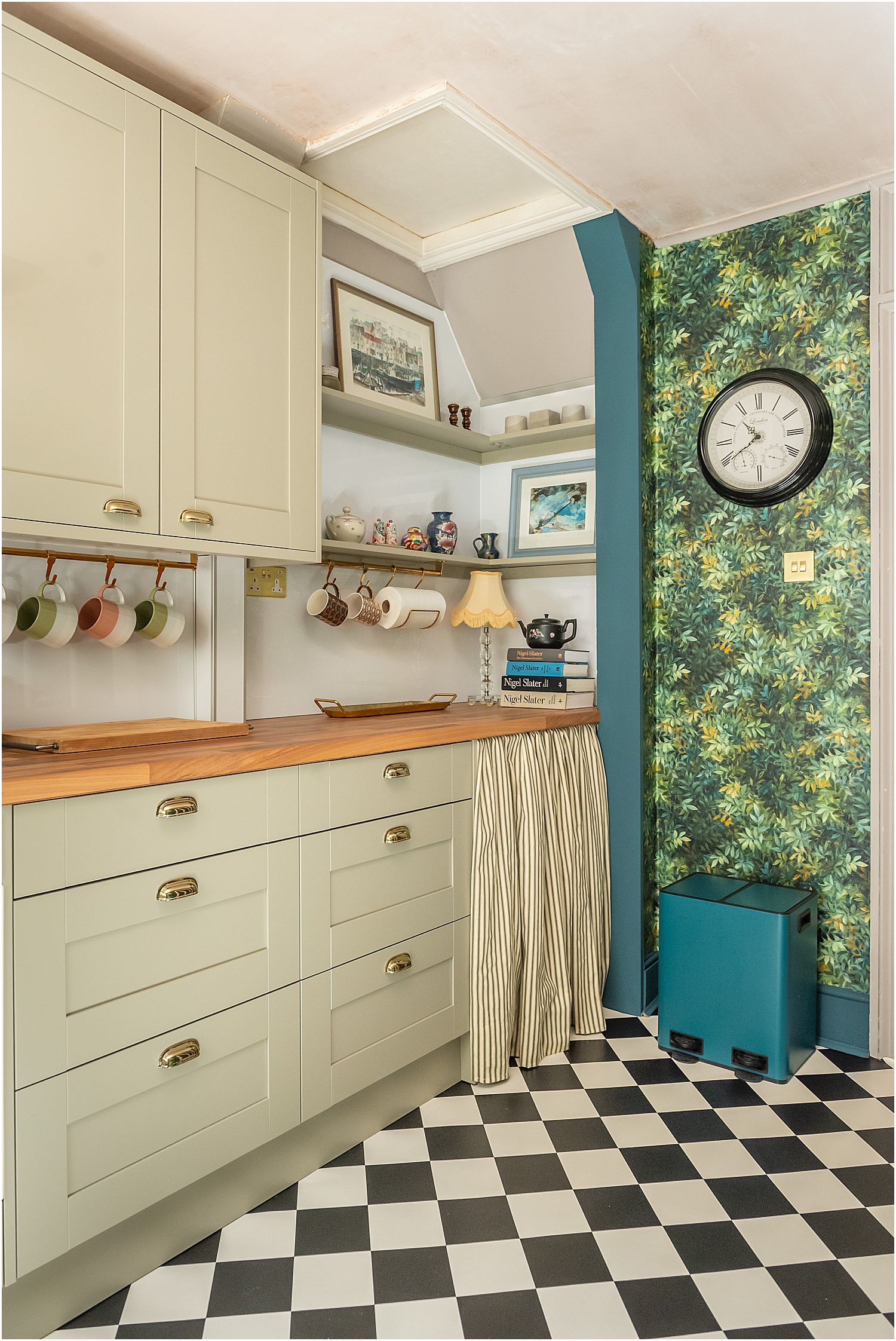
This is where my husband and I couldn’t agree at first. His top priority was to have as many tall cupboards as possible to maximise storage. I as at the opposite side of the spectrum: to have open shelving instead, losing much of storage potential and to keep some open shelves under the worktop as shoe racks.
There was no way I was going to have tall ceiling to floor cupboards hogging an already small space. I wanted it to feel open and spacious and welcoming, not boxed off. It took us a while to reach a compromise.
Enter Benchmarx Kitchens kitchen designer. Antonia came to the flat after having discussed with her my moodboard design ideas over email. She brought samples and measured the space. We discussed the storage dilemma and what I was willing to compromise on. After a few digital design versions as shown above, we came up with, what for me is, the perfect solution: maximising all the cupboard storage plus having some open shelving and shoe racks.
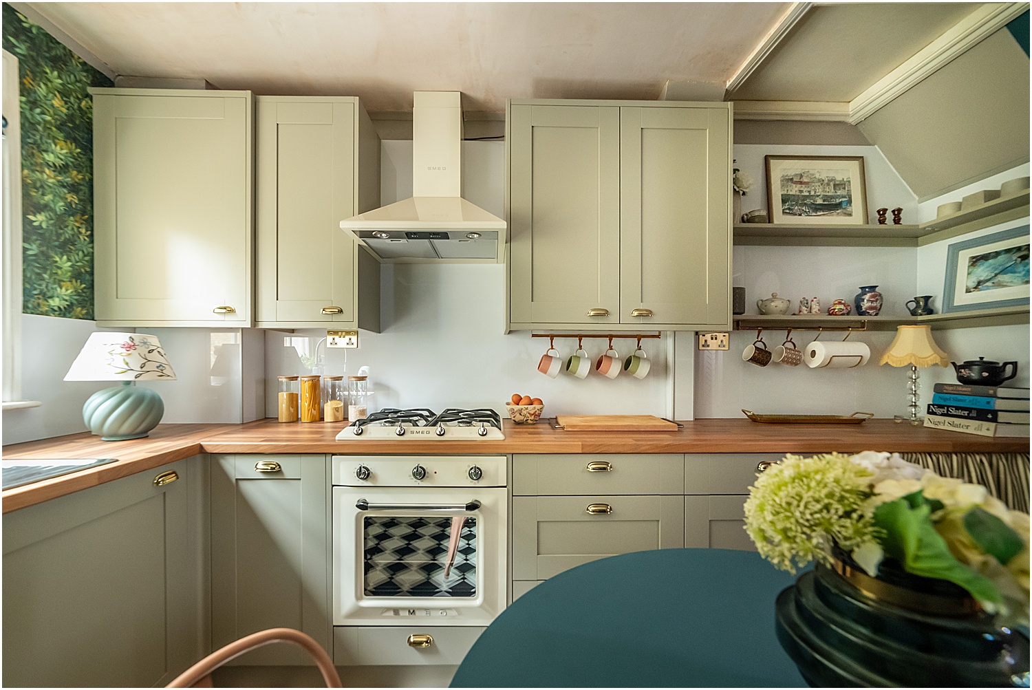
Benchmarx do a variety of cupboard widths, not just the standard 60mm. To make sure there were no dead spaces, some of the units in my kitchen are 40cm, 50cm and 60cm, 80cm and 90cm! This ensured that we used every possible inch and were able to have enough storage AND open shelving!
I chose the classic Shaker style in Oxford Olive Green To maximise the height of the kitchen, we went for taller wall cabinets which are a very handy option.
Prior to this final version, Antonia mocked up some tiles as per my original moodboard. But I couldn’t decide on the tiles. I didn’t want the kitchen to feel heavy as I had already wallpapered the other side of the room and didn’t want the tiles to take away from that. I held off on the tiles and discovered that Benchmarx do splashbacks. The AluSplash in Ice White was perfect.
Using the same panels as the cupboard fronts, I had open shelving built around the corner as we had to keep that area fairly open to access storage above the kitchen ceiling. And I was able to use the same panels to have open shelving underneath the worktop for my shoe rack which I then covered with a curtain.
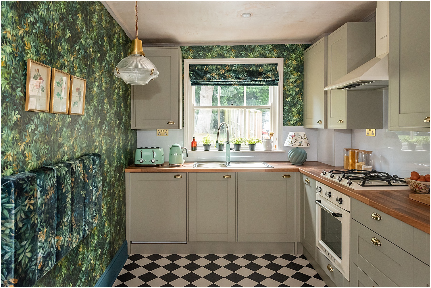
In this small kitchen I only had room for 2 integrated appliances hidden behind the shaker units. I chose the Smeg integrated under worktop fridge with icebox and the Smeg Integrated washing machine which has been impressive! Super quick washes and fast spins and so quiet!
The best storage solution is yet to be revealed. And it is, voila, the genius invention that is the Vario carousel pull out! You literally pull the drawer out and a clever contraption brings out front and corner shelves for easy access. No more sticking heads inside cupboards to access pots and pans shoved in the corner. This is really a game-changer for corner cupboards! You can see a video of how this corner unit works here.
I have now so much more cupboard space compared to the original kitchen despite keeping exactly the same lay-out!
2. MIX TEXTURES TO HEIGHTEN INTEREST
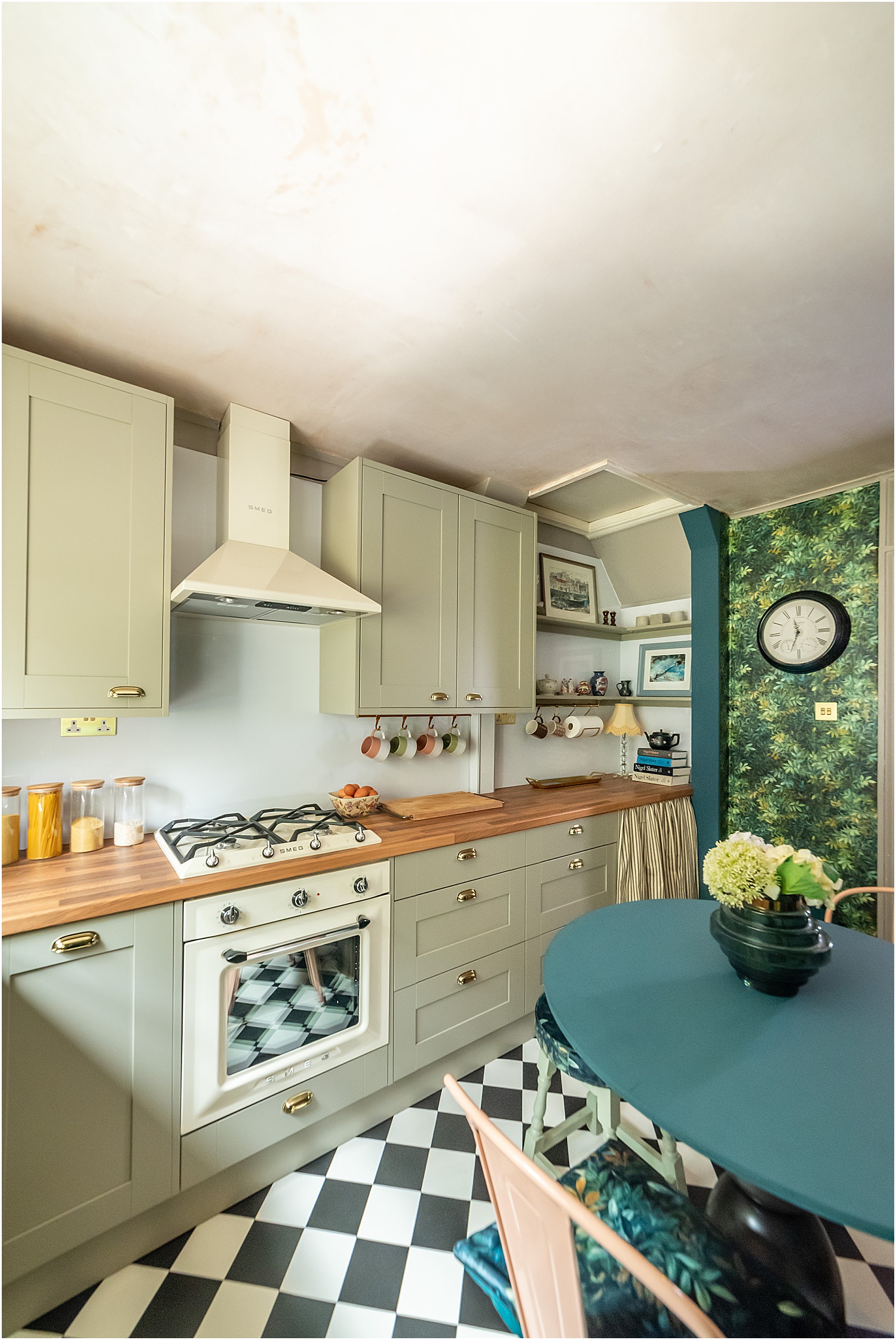
I love wood. I love its natural feel and classic look that’s why I always consider incorporating wood when thinking of best design ideas in interiors. But as a worktop, I know it’s high maintenance which I wasn’t keen on. Benchmarx Oak Laminate worktop looks like real wood without the hassle of oiling and re-oiling and I love it. Super durable and wear-resistant, a quick wipe and it’s clean. It’s warm and brings in the natural feel I am after.
Contrast is important in any interiors. It allows you to emphasise some items and use others as backdrop. It enables you to control the ebb and flow in your design, the troughs and crests, the drama. Contrast makes a space more dynamic.
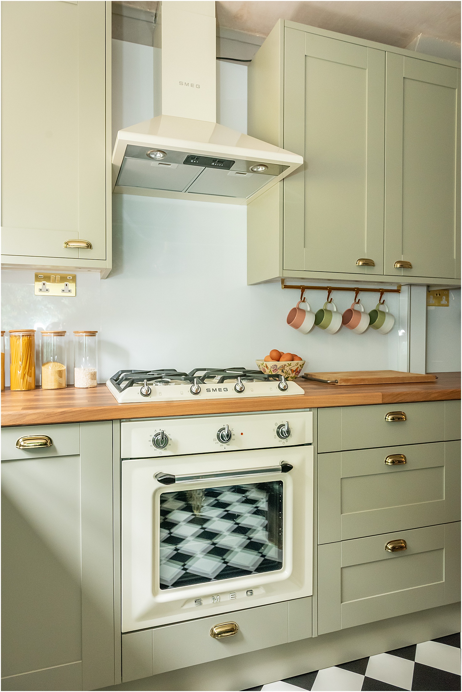
I chose Benchmarx’s AluSplash ice white splashback to contrast against the wood. It’s plain and stays in the background but evokes a clean and calm feeling. It’s an aluminium based wall panel that is eco-friendly, fire resistant and grout-free! Brilliant because I hate scrubbing grout!
The splashback is glossy and contrasts nicely against the matt Oxford Olive Green kitchen units.
Another texture I used in my kitchen is metal: chrome gold and silver and brushed gold. I don’t mind mixing metals especially if appliances are involved. I am absolutely over the moon with my 5os Style Retro and integrated Smeg appliances, all with chrome silver detailing against cream and pastel green.
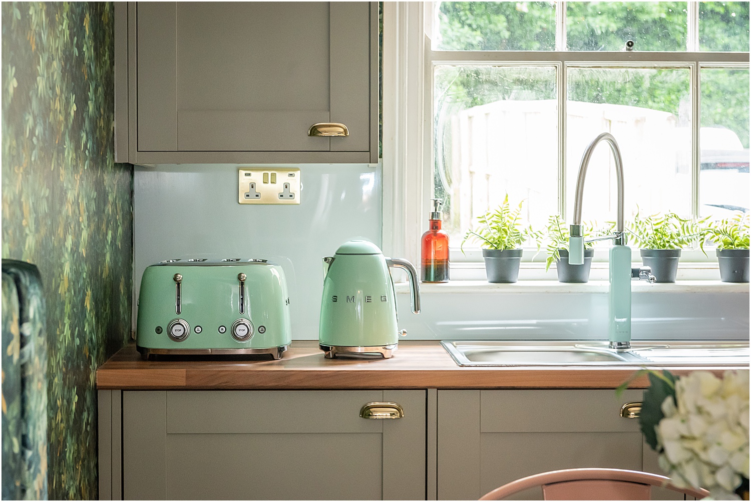
Textures were not limited to the main kitchen units but extended to the accessories as well. I chose brushed brass sockets and switches from Soho Lighting’s Savoy Collection to match the handles and tie in with the main ceiling light above the dining table.
All in all I’ve got at least 6 textures going on in this space: wood, gloss, matt, glass, metal and fabric. Juxtaposing these textures add dynamic to any interior space. I hope that so far this article on 5 Best Design Ideas for Small Kitchens is giving you some useful ideas.
3. THE ALL-IMPORTANT COLOUR SCHEME
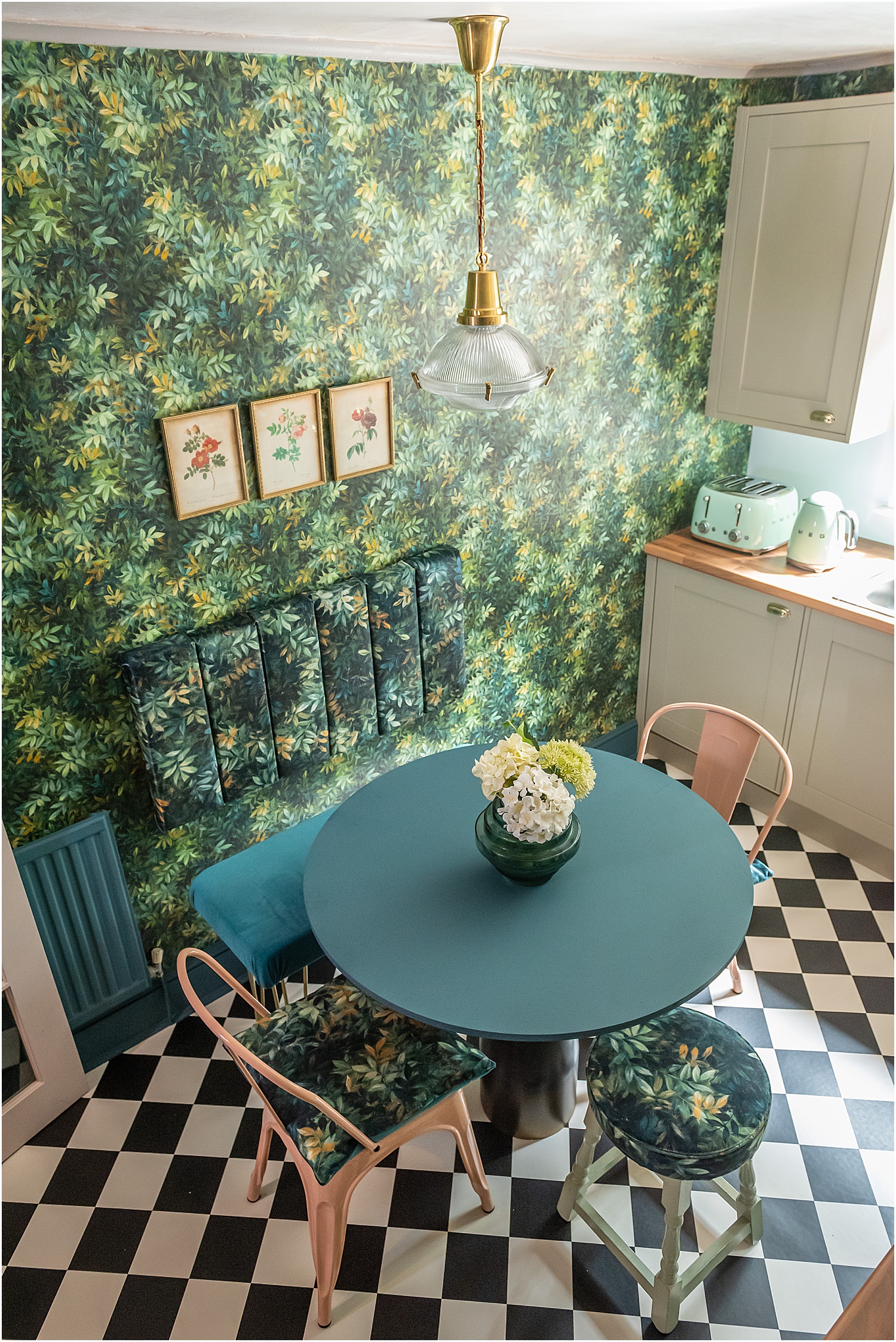
This is what pulls a design together – a coherent colour scheme. In my opinion it’s so important to reign in the colour palette. I usually go for 2 or 3 dominant colours and the rest would be accent colours.
If I limit it to just 2 colours, I find myself in a pickle – having to choose only things that match and for everything to complement only the two colours can snuff out creativity and freedom.
This is the colour formula that I tend to go by:
a. a dominant colour (or two that complement each other) that pulls everything together making the space look cohesive
b. a base colour that complements the dominant colour and acts as a backdrop
c. a contrast colour (or colour family) that makes something jump out and invite the viewer’s eyes to explore the space
d. a colour that brings a natural element like gold, copper, wood or greenery to soften the space
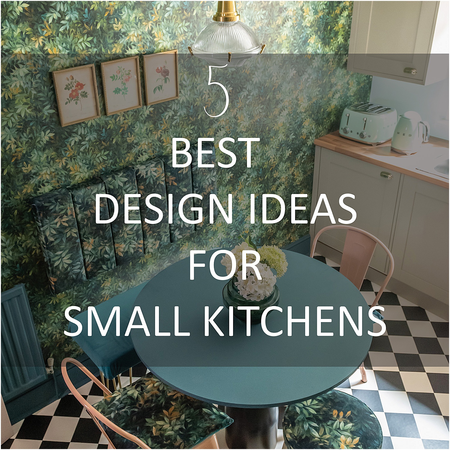
Before the new kitchen was installed, I had already decided on the colour scheme. One of the dominant colours would be green and the other would be of the same family. I wallpapered the dining room wall with Clarke and Clarke’s Congo Forest wallpaper and carried this pattern into the accessories using Congo Forest fabric: fluted backrest, cushions and blinds.
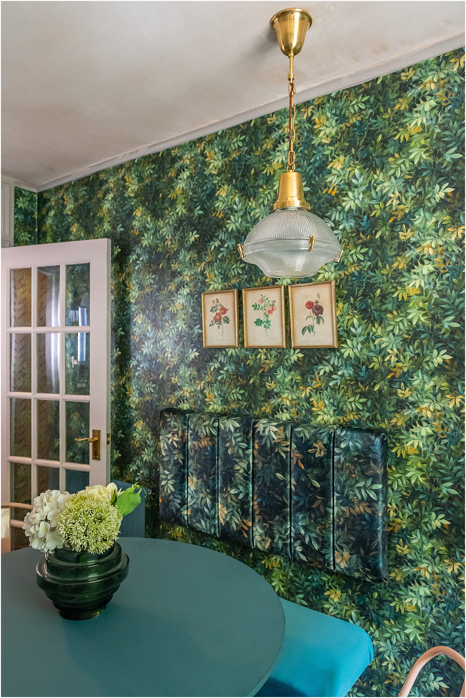
To see how I made the fluted backrest and bench, see my How to make a DIY Fluted Headboard like a pro blogpost.
Given the kitchen units take up more than half of the room, this would be the other dominant colour. I chose olive green which is from the same colour family and complements the dark green Congo Forest wallpaper.
I didn’t want to add any more dominant colour and opted for a plain base colour – ice white to serve as the backdrop colour and not take anything away from the other colours and details in the space. This is why I thought that tiles on the wall would be too much.
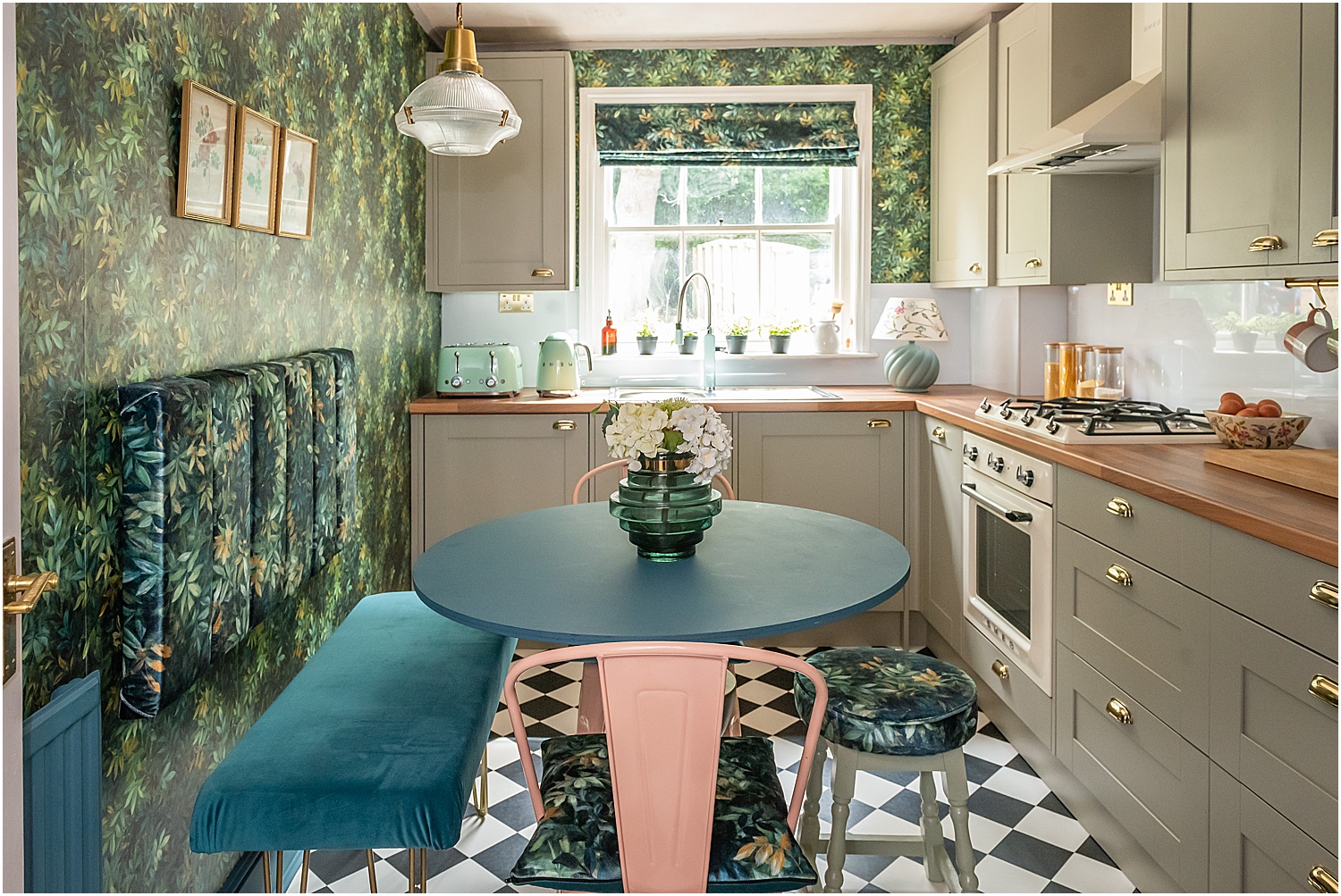
The contrast colours were added in the form of 2 pink industrial chairs and Harlequin pattern black and white flooring.
Finally, natural elements like wooden look worktop, brass light, sockets and switches, and gold handles brought in some sparkle!
4. A TOUCH OF VINTAGE OR RETRO
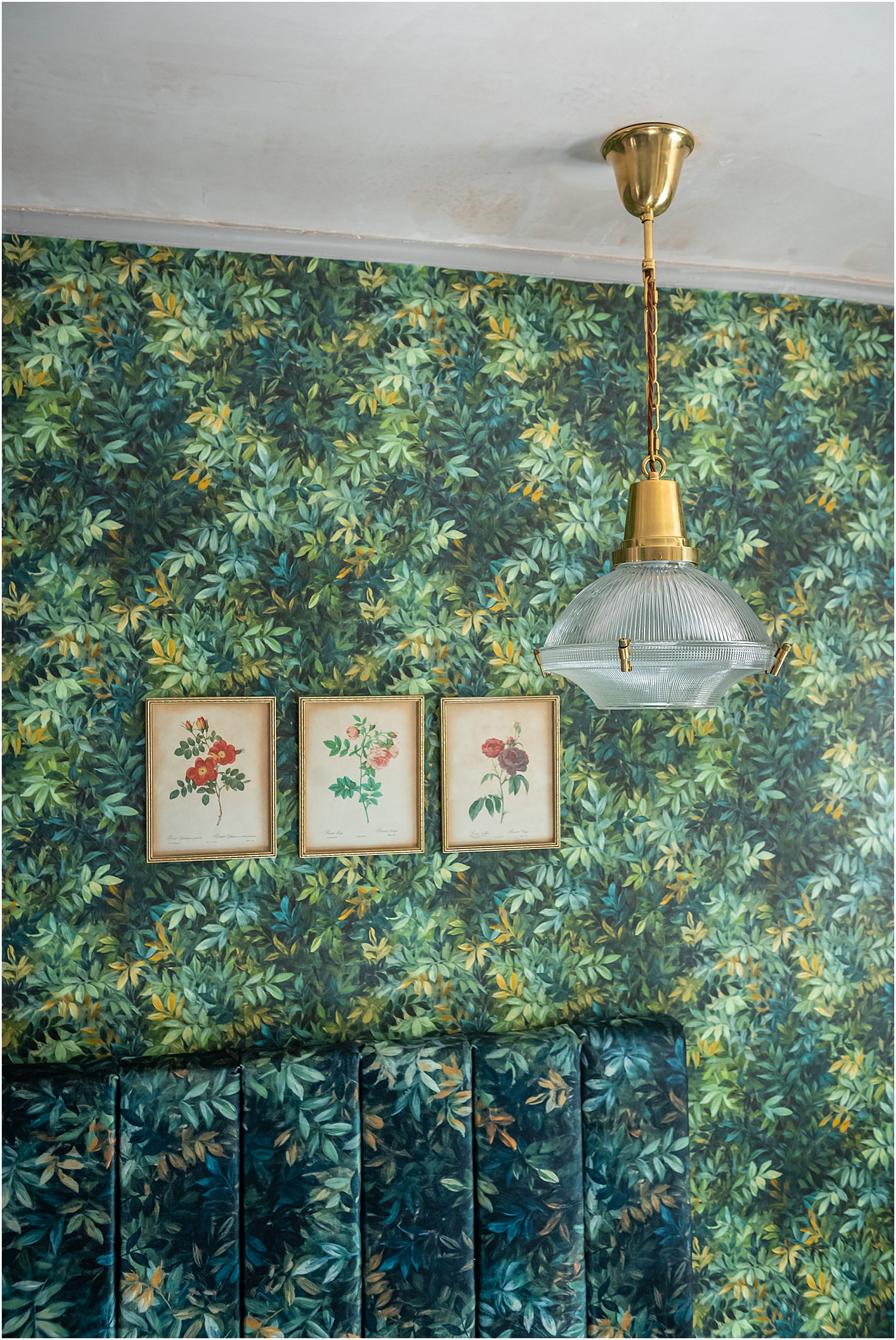
Whether real antiques, retro or vintage style, adding a hint of pre-loved vintage softens any new space especially contemporary styles. Antique, vintage and retro evoke a rich history, things that have a story and a life. They are soulful and bring a hint of drama, mystery and home.
This stunning early 1900s style industrial brimmed domed light is also from Soho Lighting. It’s the Hollen Lacquered Aged Brass Brimmed Dome Pendant Light from their The Schoolhouse Collection. It is absolutely beautiful with its fine ribbed glass detail against the brass. A stunning vintage style statement light.
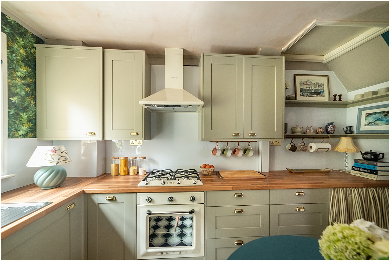
For my main appliances, I went for the Smeg Victoria Gas Hob matched with the Victoria Single Oven and Victoria Chimney Hood all in cream.
Can you tell I was really leaning towards the Smeg Retro 50s style. They add character, are timeless and very simple to use. I don’t need all the extra bells and whistles found in most new appliances. This single oven has multiple cooking modes. The functionality in these appliances are more than enough for me.
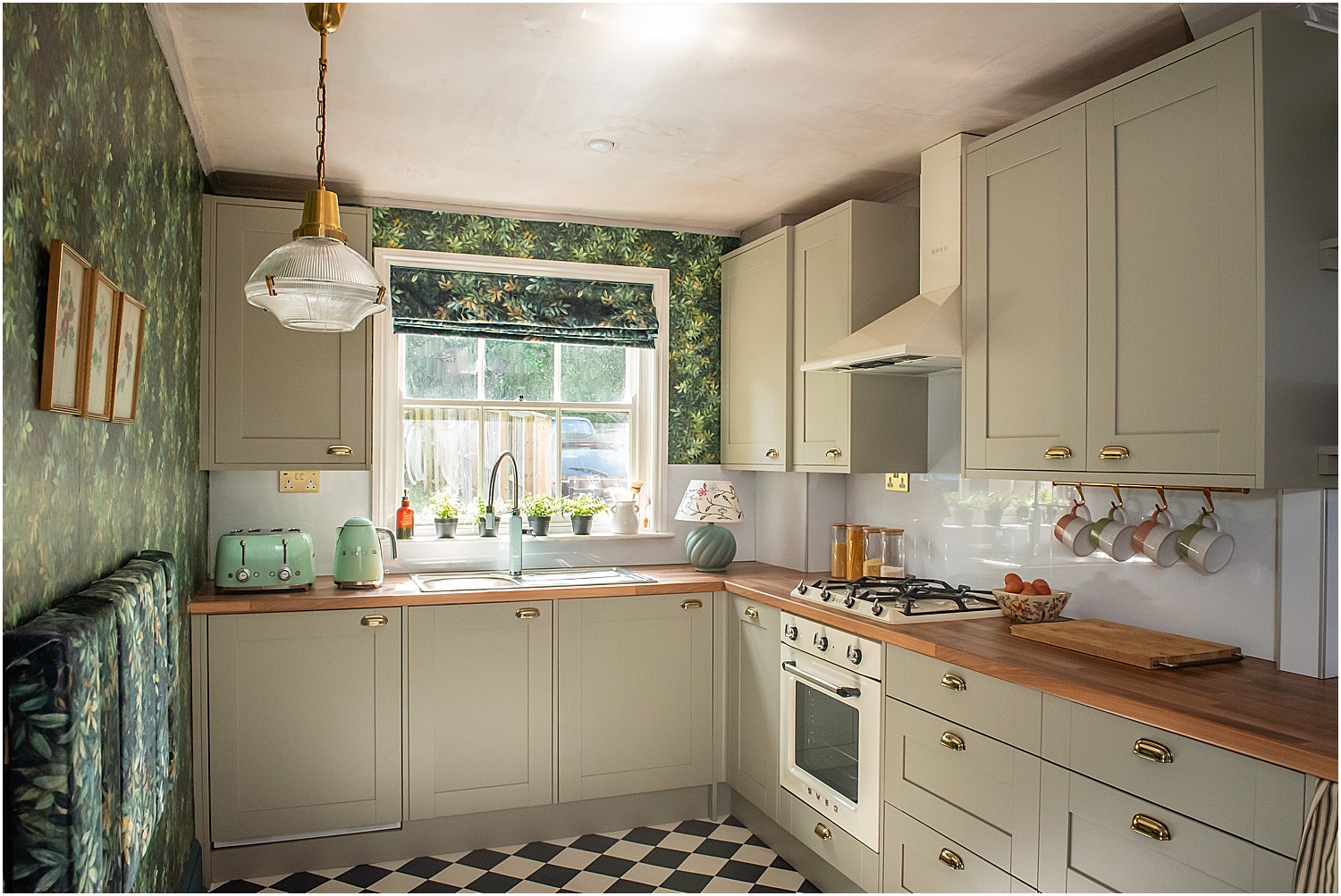
To continue with the retro theme, I also went for a retro tap by Smeg and matching Smeg retro toaster and kettle – this time in pastel green. I decided to have cream retro appliances on the long wall and all pastel green on the adjacent wall for variety. The pastel green appliances bring fresh and vibrant hues of the green colour scheme giving the kitchen a contemporary vibe.
Finally we come to the last of the 5 Best Design Ideas for Small Kitchens.
5. CONSIDER AND EMBRACE PATTERN

Pattern is simply defined as forms that are repeated. These forms can be shapes, illustrations, lines, blocks of colour, anything that is repeated. Pattern can be found everywhere, for example, as designs on walls or items, as shadows and in arrangements. If you’re familiar with my interiors style, you know I love pattern. My home is full of pattern and my new kitchen is no exception.
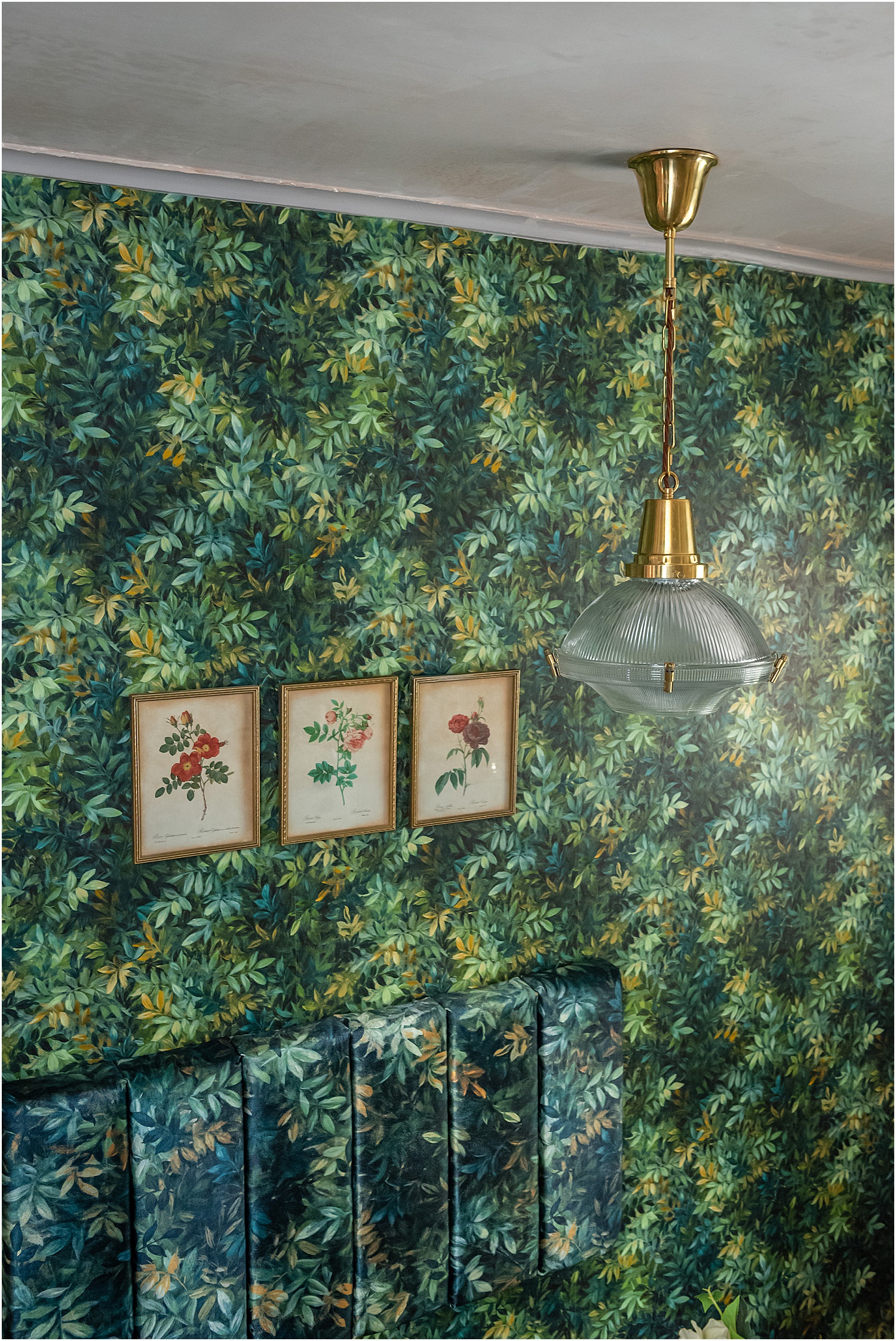
The obvious pattern in this kitchen is the Congo Forest wallpaper. It is a rich maximalist design that covers two walls and is carried into the soft furnishings: cushions, seating, upholstery.
The harlequin design of the floor is bold and provides a solid ground for the kitchen. It also brings in much needed strong geometric contrast to the all-over pattern of the wallpaper and soft furnishings.
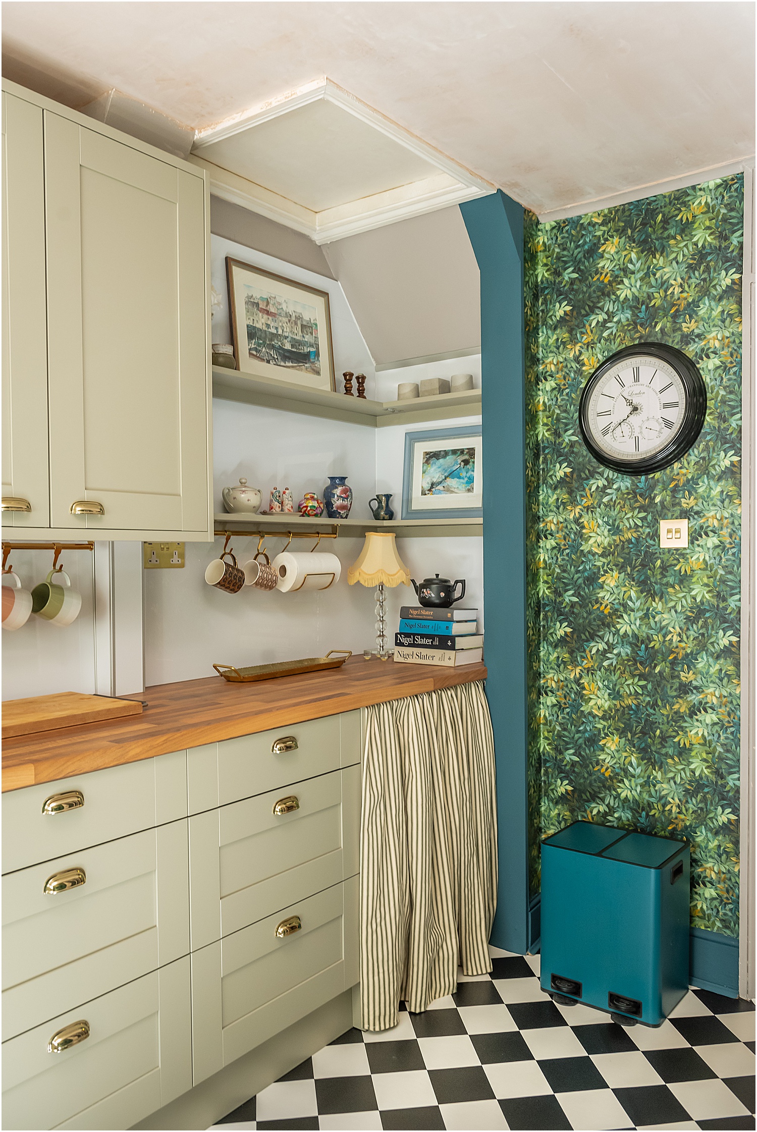
One less obvious pattern in my kitchen is the rectangular design of the shaker Oxford Green units – all uniform, straight and level. This balances the full-on pattern design on the opposite wall. The rectangular shapes are also echoed in the seating backrest and connects the kitchen to the dining area.
Another pattern, which is almost obscure, are the circular shapes dotted around the kitchen in the form of furniture and accessories: table, domed pendant light, stool, case, lamp and clock. This almost unnoticeable pattern brings an invisible flow that although intangible, connects the entire kitchen together so that it feels cohesive and whole.
Here are two side-by-side comparisons of my flat kitchen.
The before and after
The final design and the actual finished Benchmarx kitchen.
What do you think of my new kitchen? Do you think I got it right? I hope you found the process interesting and that these 5 Best Design Ideas for Small Kitchens have been helpful in one way or another.
This blogpost is part of my collaboration with Benchmarx Kitchens. I highly recommend them, both designer and kitchen quality. My independent kitchen fitter Steve of Builders IOW, was very impressed with the quality of the kitchen units. That is saying a lot because Steve has been fitting kitchens for 30 years and he’s done a mighty job with mine.

I hope you enjoyed this post on 5 Best Design Ideas for Small Kitchens and found it helpful. If you have any questions, message me on Instagram and I’d be happy to help if I can. Don’t forget to download my free resources that will help you design your own interiors and grow your Instagram account! Let’s chat on Instagram Layered.Home and together get inspired!
