If you’ve ever wondered how on earth can you choose a wallpaper design from millions of choices out there, then read this short post on 3 easy tests in choosing wallpaper for your home.
Before I talk about the 3 easy tests in choosing wallpaper for your home, I have put up 25 wallpapers of various designs and styles in my current home. Some have stayed for years, others just months.
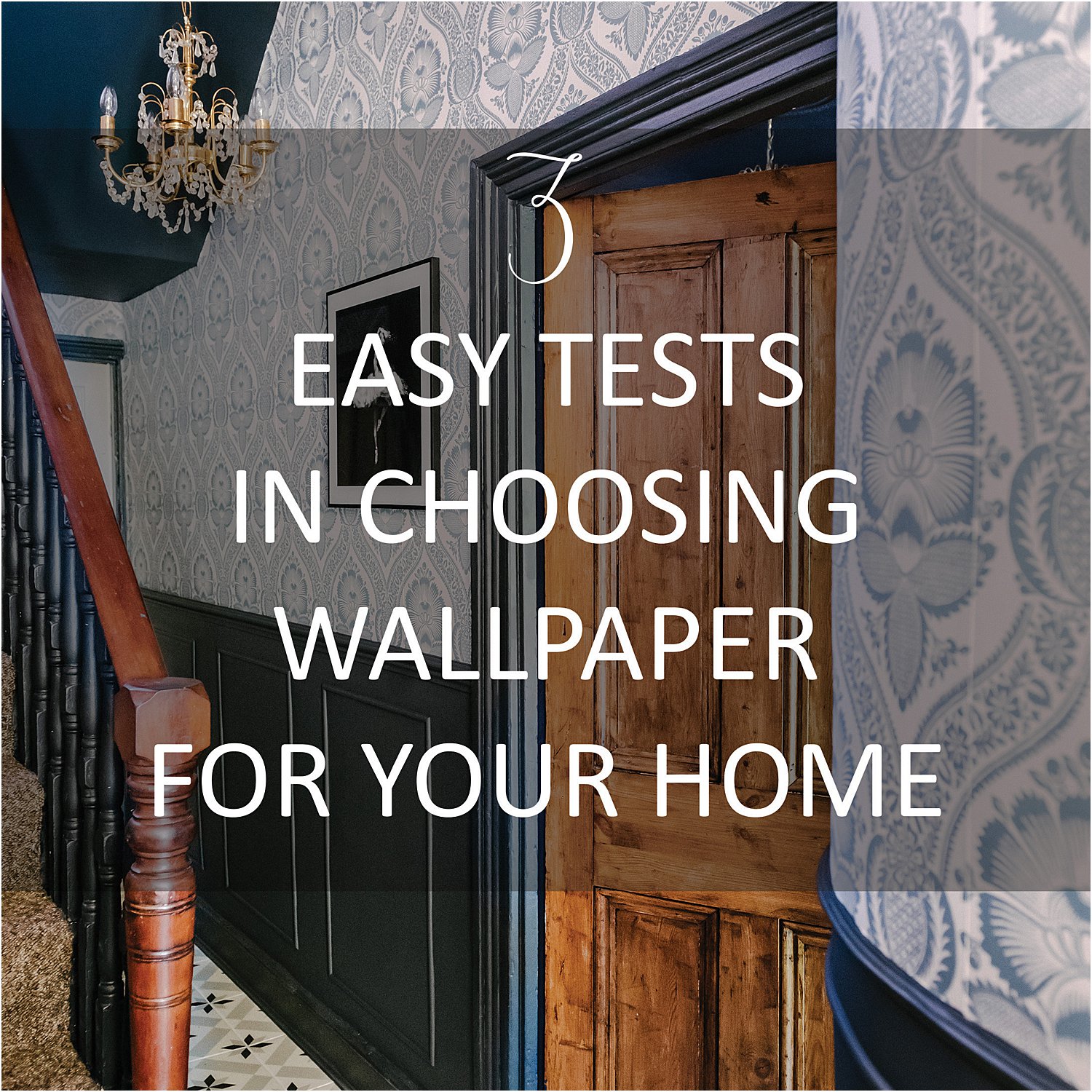
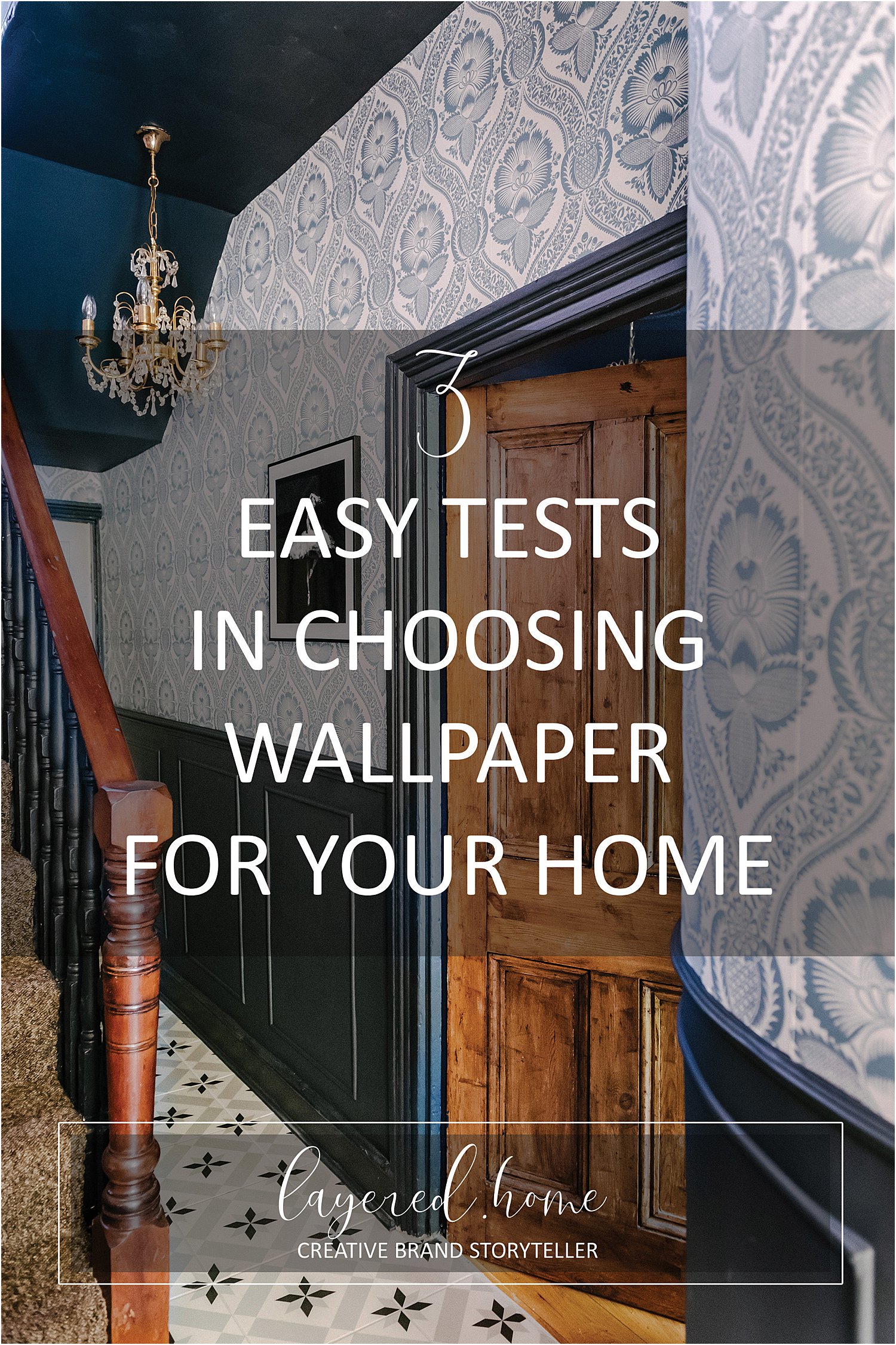
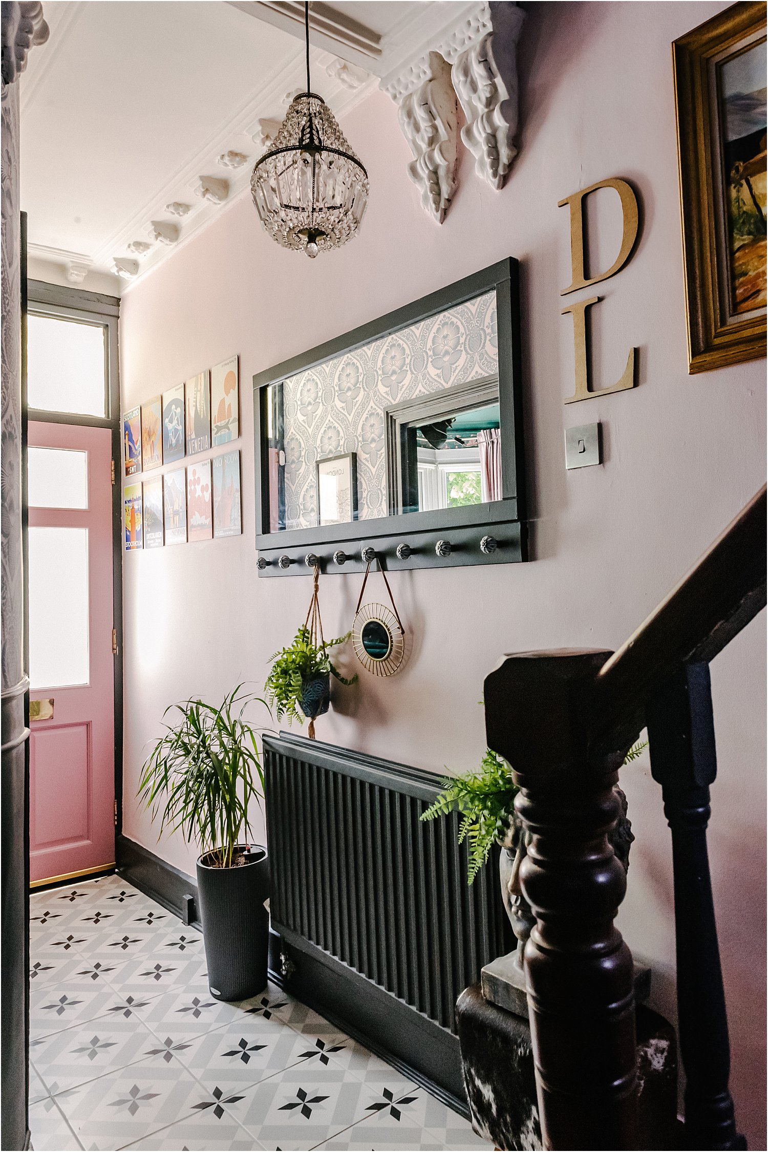
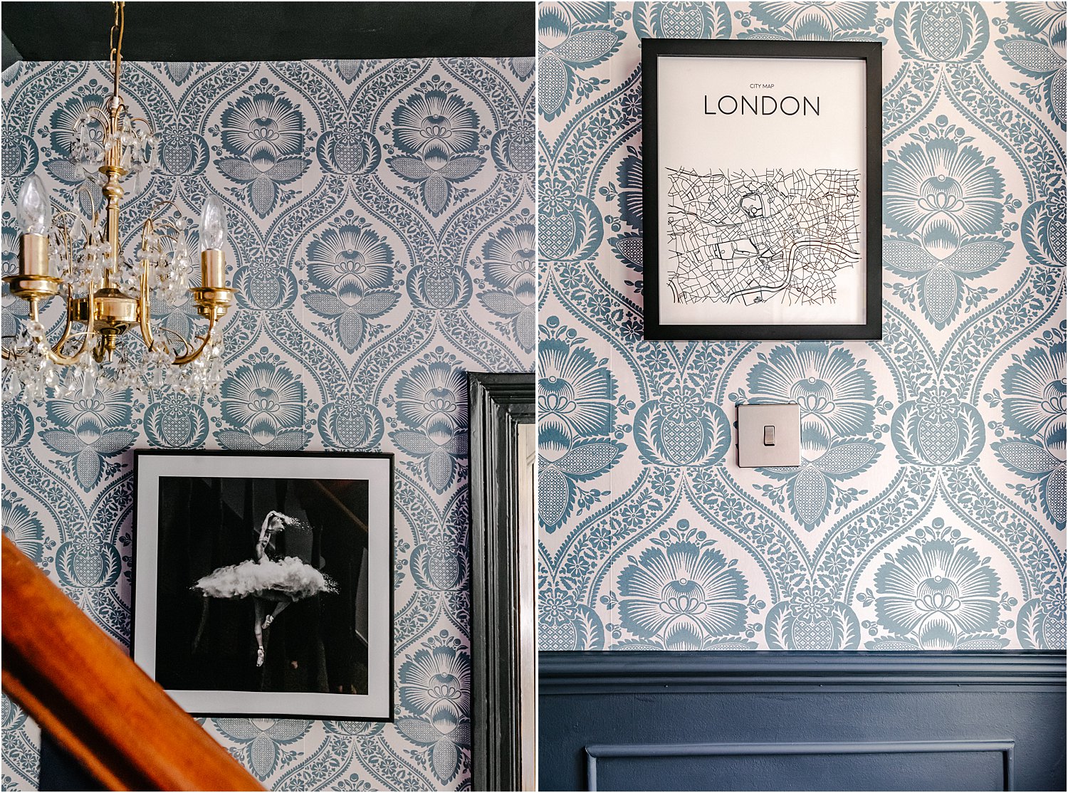
My wallpaper experience has been a learning journey for me to find my style and understand what I truly love and can live with for a long time! Some of these wallpapers have taken me into a deeper confidence of what I want my home to be for the foreseeable future like this Warner House Chartwell Teal wallpaper.
So all those 25 wallpapers I have put up have brought me to this place now where I feel I am able to give you these 3 easy tips in choosing wallpapers so you won’t have to change them as often as I have done!
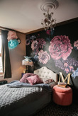
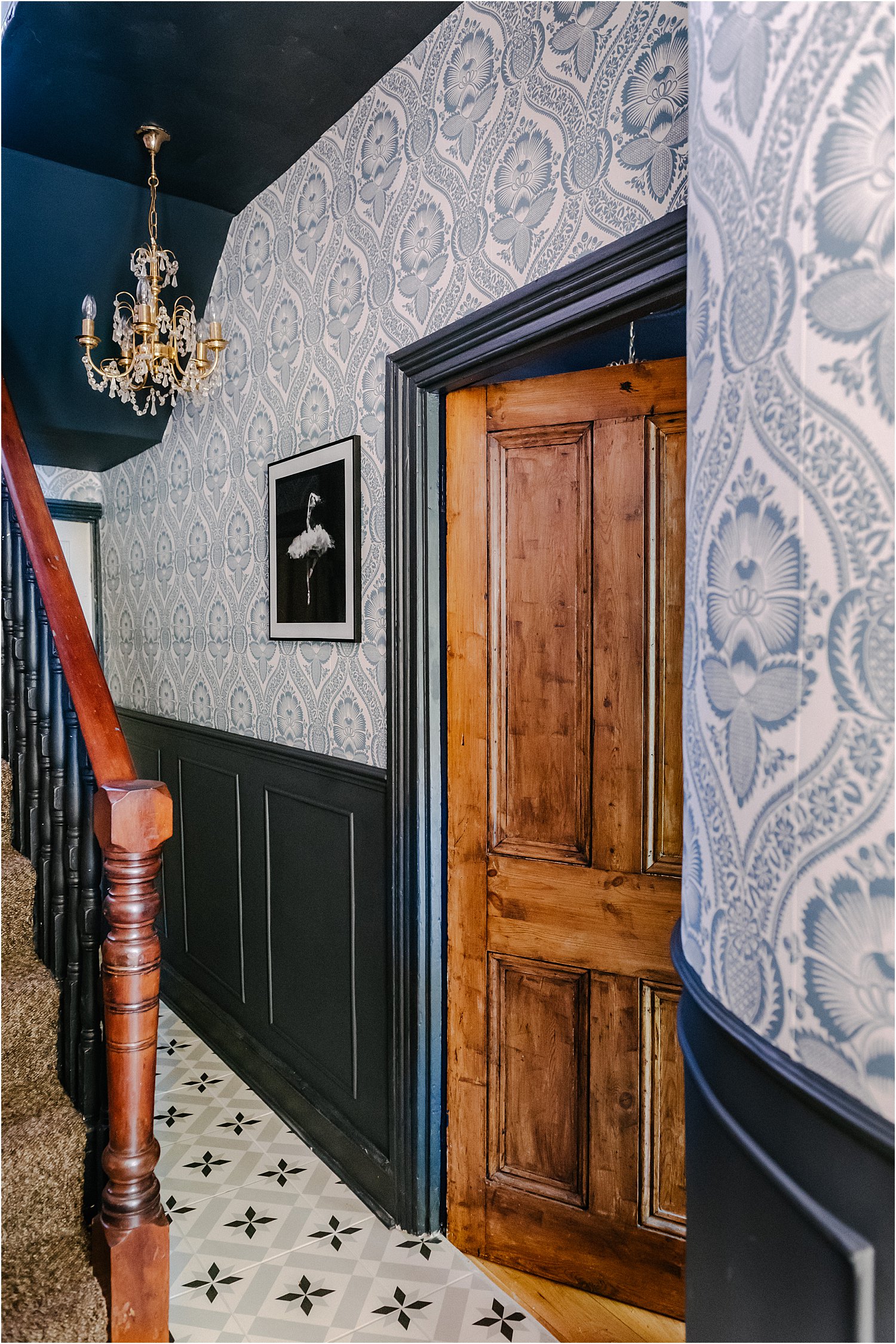
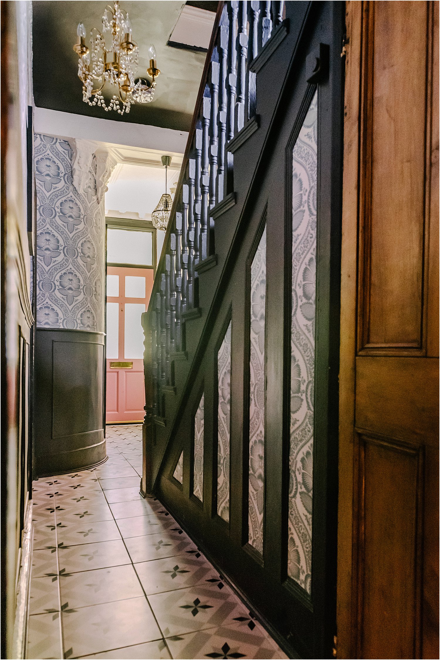
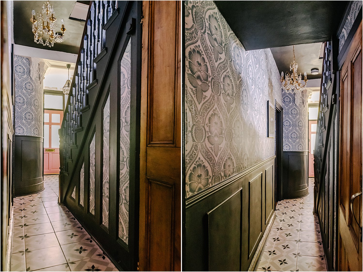
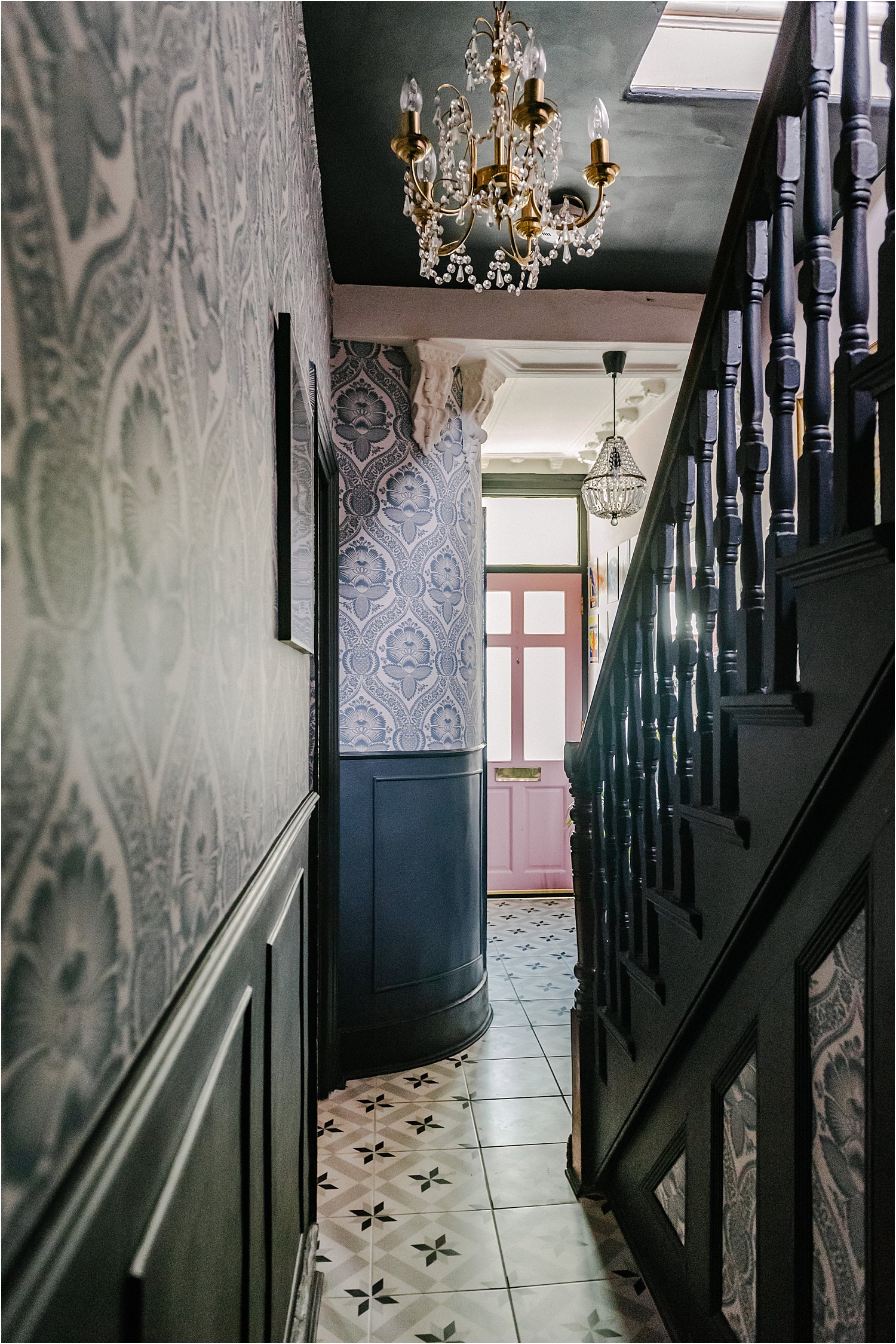
My latest wallpaper project was working with Warner House in my hallway using Chartwell Teal shown on the interior photos in this article. This particular wallpaper has really opened my eyes to how I want my house to look like and feel confident about my choices.
Hopefully, these 3 easy tests in choosing wallpaper will give you a head start as you trawl through design after stunning design of wallpaper that could potentially change the feel of your home interior space for a long time!
3 Easy tests in choosing wallpaper are 3 questions to ask yourself
Test 1. Will you tire of it easily?
Look through some of the options: plain colours, florals, checks, toile de jouy, geometrics, stripes, foliage, tribal, folk, ethnic, ikat, chintz, animals, sealife, classic, traditional, contemporary, panelling, murals to name a few.
Which of the above do you not get tired of? If you don’t get tired of it, it probably means two things: you really absolutely love it and you can live with it for a long time.
If you’re not sure, check your wardrobe! Often what you wear gives you a hint on the types of patterns and colours that you like.
My wardrobe is a mix of plains and florals. In terms of colour, I wear blacks, blues, pinks, greens, teal, taupe. I have the odd mustard colour and orange accent. That’s everything in my wardrobe. And did it surprise me when I realised that these are also the exact colours in my home interiors! It was a revelation.
The wallpapers in my home are all-over florals and foliage and patterns. I find them dynamic and convey a sense of movement and freedom in my interiors. To me, these all-over patterns are uninhibited and inject a sense of flow to the space yet are not screaming at me nor too clashy that they feel jarring.
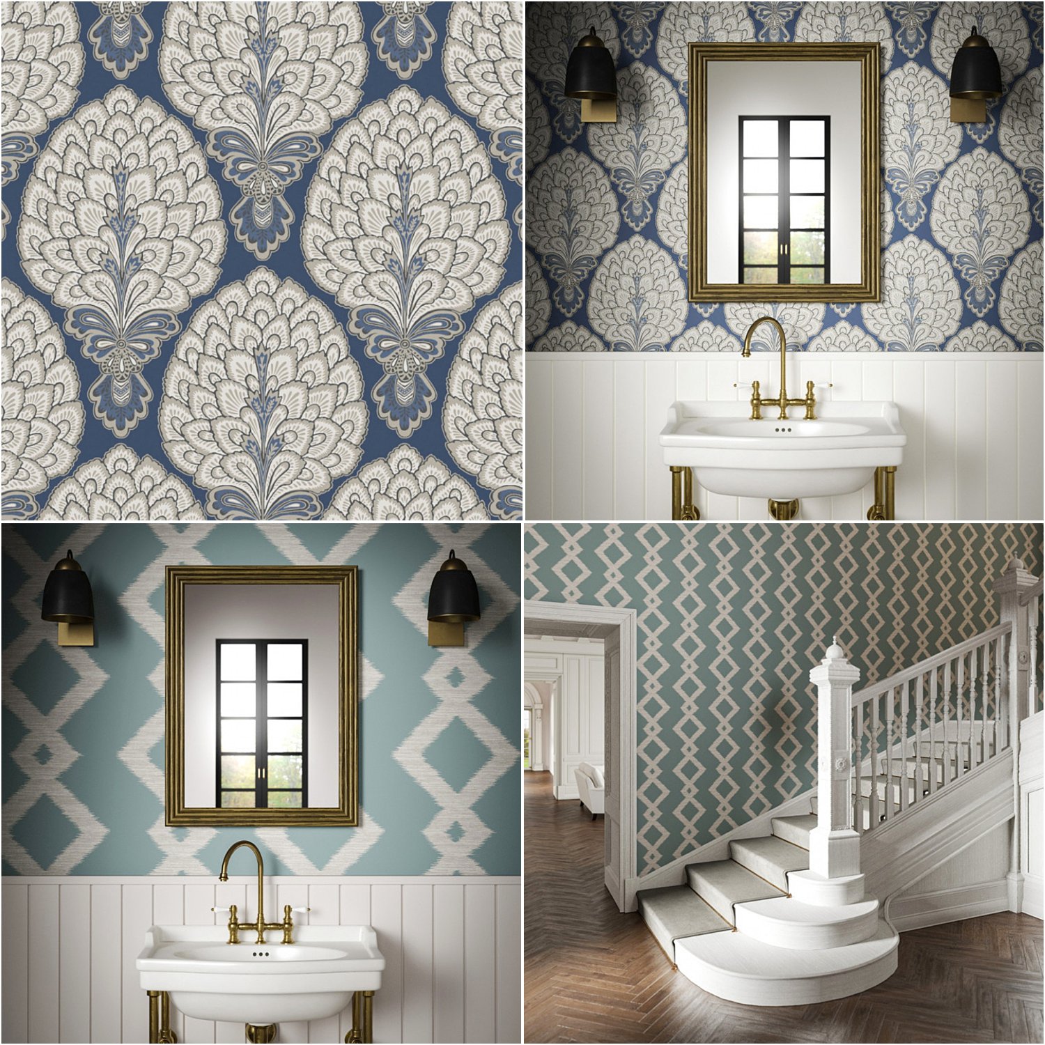
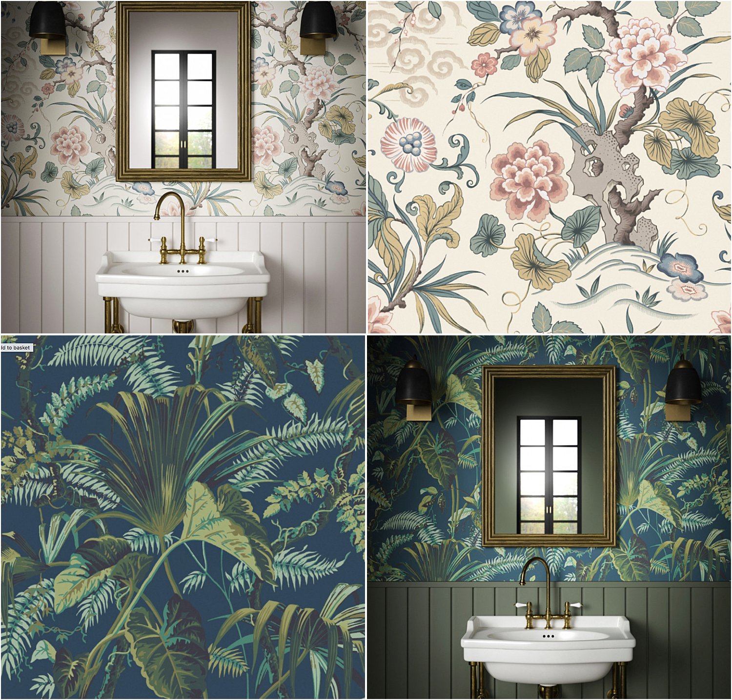
I love these patterns above: the Sultan Navy and Inca Teal. I spent a lot of time considering the Sultan and ultimately decided that this wasn’t the right one for me. The Chartwell Teal which is quite similar in terms of pattern and repetition was more “me” – it has softer tones and a hint of tradition in a fresh, classic and contemporary design.
I do really love a hint of the classics. A nod to the style and aesthetics of olden days incorporated into an interior space with contemporary elements so I have a mix of old and new is my dream style. To me this makes a space feel fresh and yet full of character, conveying a sense of home. And Warner House is a master at doing exactly this!
I appreciate other styles like lines, stripes, geometric and tribal in other spaces and find them so beautiful too. But I can’t see them in my own interiors and that’s totally fine. After all, it’s you who’s living in your space and will be seeing these patterns day in and day out so make sure you can visualise them in your space easily.
Go with you heart when making these decisions and not just with your head. Ask yourself if you really LOVE it rather than just LIKE it. There’s a huge difference between love and like.
If you love something, you are proud of it. You show it off and can easily talk about it without being embarrassed or shy. You don’t regret spending money on it and you know and feel that it has given you more value in enjoyment and pleasure than it’s worth.
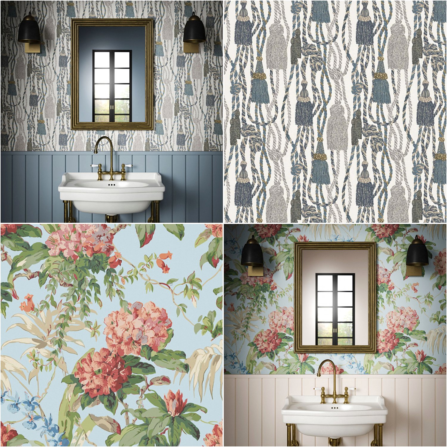
I also considered these two wallpapers: the London Tassels Teal which I love and the Dorchester Sky which I like. But I couldn’t easily visualise these in the space and more crucially, I felt the London Tassel was too “posh” for my style and the Dorchester was too “vintage” for me even though I adore vintage. So these were just slightly outside the zones of what I could see myself as “me”.
Remember, the first of 3 easy tests in choosing wallpaper is asking yourself “Will you tire of it easily?”
Test 2. Are you making a decision based on the colour of your current walls?
Walls can easily be repainted over and over. So I wouldn’t base my wallpaper on the current colour of my walls. In fact, your wall colour could be totally different from the wallpaper and the combo still works.
In this post I touched a little about colour theory and how colour temperature and the proximity of colours on the colour wheel affect the look and feel of your home. Using the colour wheel, you can see how each colour harmonises or contrasts with other colours based on their position on the wheel.
You can have completely contrasting colours between your wallpaper and your painted wall and the whole space is a triumph. Examples of extreme contrasts are blue and orange, red and green yellow and purple. They are contrasting colours but they pair well with each other.
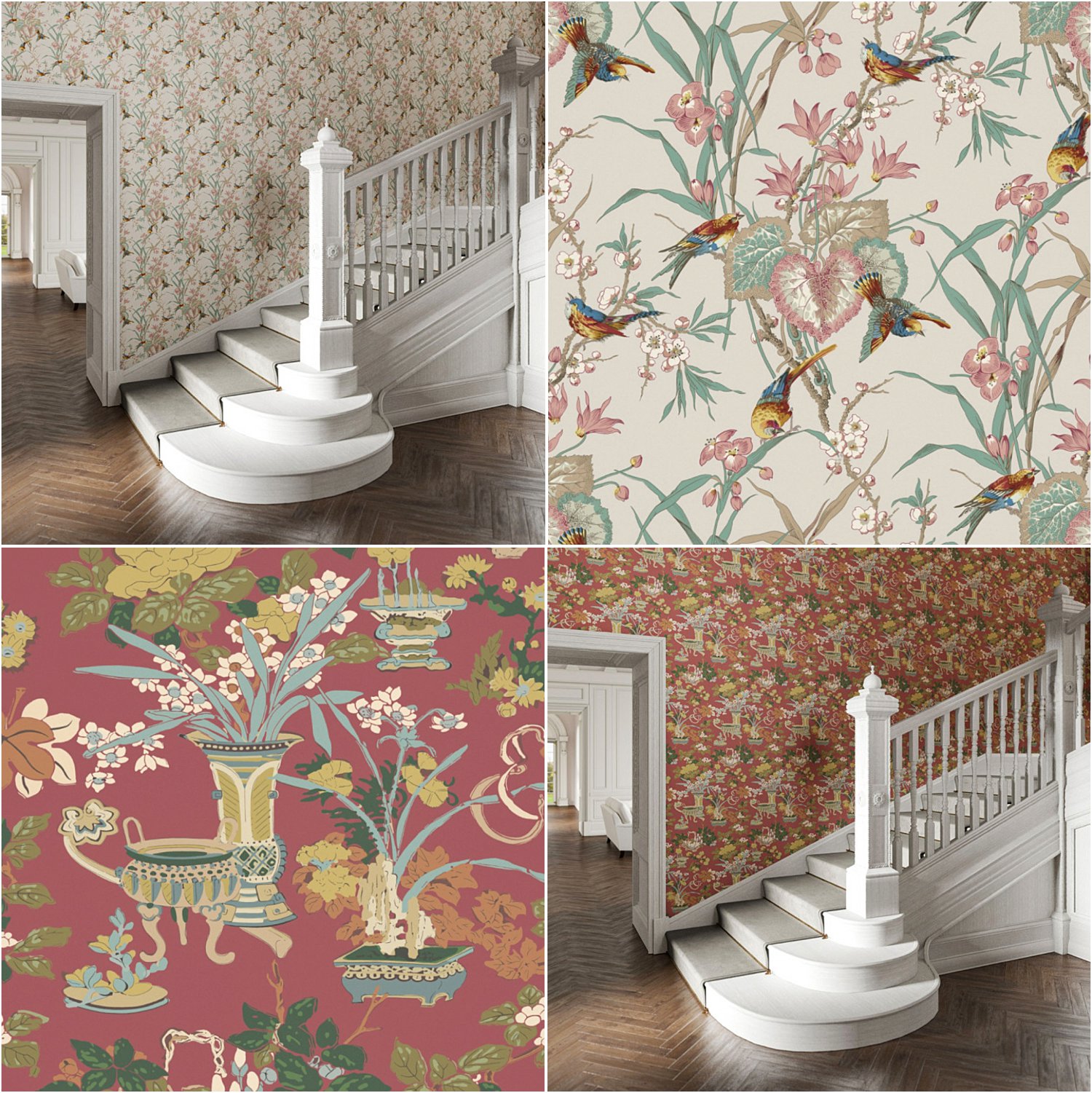
Below are examples of contrasting colours schemes that work well together: Birds and Blossoms Stone and Yentai Spice.
Translate colours into patterns and you can have total pattern clash like geometrics and florals or florals on florals and everything looks like a dream.
Translate patterns into scale and you can have patterns of varying scale juxtaposed against each other and the space looks harmonious.
Conversely, you can go for harmony like yellow, yellow green, green or blue, blue-violet, violet which sit next to each other in the colour wheel and you get a completely harmonious combination which feels calm and soothing. No massive steps to take in. Everything is incremental and combinations flow gently into each other.
Tints and tones also make a difference in the way a design feels. Muted palettes which are often tints of a colour, that is, a colour that has been added with whites, are easy on the eye even when they are meant to be contrasting.
The Fleurs Orientales Cameo below has a soothing tone with pale pinks of various shades and muted teals and ochres. In pure form without the addition of whites or greys, these colours are really simply reds, greens and yellows – which together are contrasting colours.
The Mustique Petrol at the bottom has deep bold blues and greens gradating into yellows and yet still offering a harmonious colour combination because they are all in close proximity to each other on the colour wheel.
The second of 3 easy tests in choosing wallpaper is asking yourself if you’re basing decisions on current wall colours.
Test 3. Where will the wallpaper go?
Consider the space where the wallpaper goes. Context is more important than colour as you can’t change the context easily including size and available natural light whereas you can change the colour of the walls and ceilings with not too much effort compared to any structural work.
Where does your wallpaper go and does it fit or look right in it? For example, does it go above a mantle or a fireplace? Is it to wallpaper a bookshelf or alcove or library space? Is it for a bedroom and how do you want that bedroom to feel? Is it next to a panelled wall, below or above one?
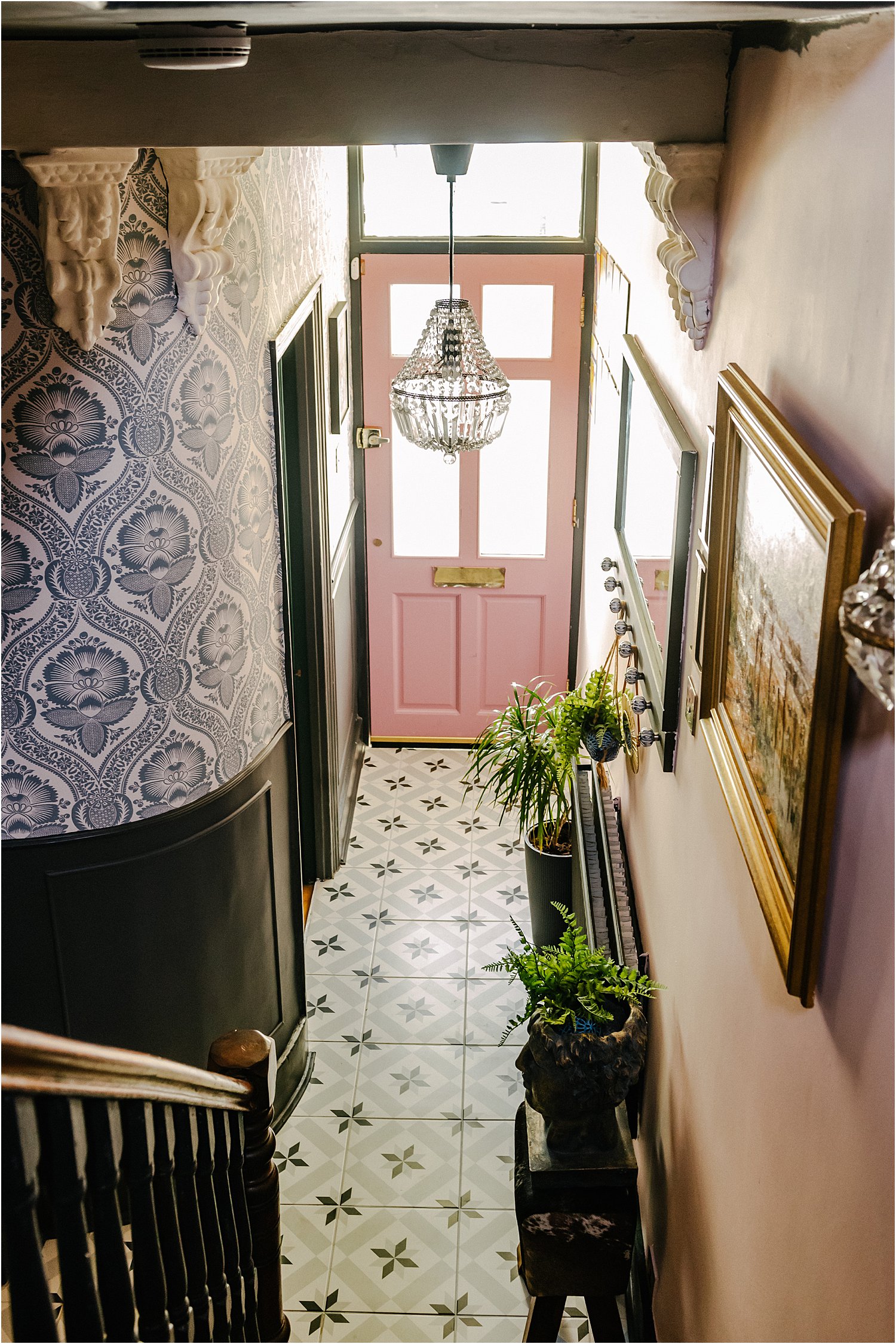
How about the light in the space? Will it have natural light or just artificial. This Chartwell Teal wallpaper would not have been right in my hallway before I had the door glazed as there would have been no natural light coming in thus making this space so dull. Now that there is light from the front door, you can see the contrast between the white and teal and darker panelled walls better.
You can see here what this space looked like before I went lighter on the walls and floors.
Ultimately, the paper will need to “fit” and look right for the space. And for this, you have to go with your instinct after considering space, size, lighting and colours. Being able to visualise it in your mind helps. But being able to see it right in front of you confirms that decision and ensures you have made the right choice.
This makes it all the more important to get samples and put them up so you can see. Most samples are in A4 but if you’re still unsure, then you can request bigger samples for a small fee. This is so helpful especially if the patterns are quite large and you won’t get to see most of it on a tiny sample piece.
If you’re planning to put a wallpaper design with large patterns in a tiny bathroom, will it look right? Will it make the tiny bathroom feel bigger or more cramped? Would it be worth trying if geometrics or one with smaller patterns work better? Either can work but it would depend on the pattern and the space. Don’t be tempted to play it too safe though if you want to put your stamp in your own home.
Considering the space where the wallpaper goes is the third of 3 tests in choosing wallpaper for your home. I hope this short article has been useful to you and has helped you in choosing the right wallpaper for your home.
This post is part of my paid partnership withWarner House along with the Chartwell Teal that they supplied me with. As always, all opinions on this article are mine and are true.
Don’t forget to download my free resources that will help you design your own interiors and grow your Instagram account! Let’s chat on Instagram Layered.Home and together get inspired!