Dark blue and floral pink hallway with dado rail revamp
This time of coronavirus has allowed me to slow down and sometimes just do nothing particularly productive. However, I must admit, I find doing little DIY projects help lift my mood and in so doing takes care of my mental health too. If you are interested in some DIY ideas, my Interiors DIY free training is still available to download here. I have also recently blogged about 5 quick DIY updates you can do on here and 5 biggish interior project to keep busy with on here.
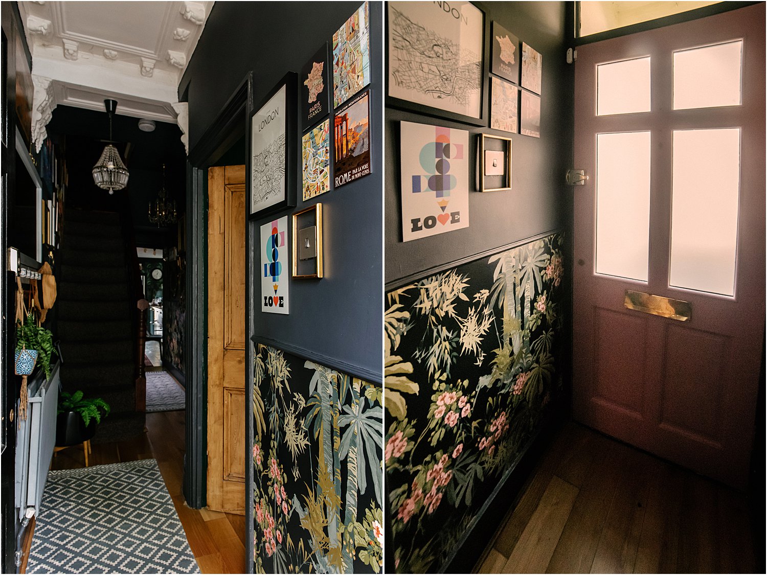
Today I’m sharing how I revamped my hallway into a dark blue floral maximalist space. Here are 4 takeaways from this project:
1. EMBRACE THE DARK
The main reason why I’ve gone for dark interiors is because my house gets very little light in its northeast-facing position. When we moved in, all the walls were light and with the low light, everything looks DULL. And so I decided to embrace the dark. No more dullness and the best thing is that it makes the rooms feel MUCH bigger. Dark colours give the illusion of depth, removing visual boundaries.
The first time I painted my front room all dark green, my son who was 11 at that time walked in and asked me what I’ve done to the room as it felt considerably bigger. Just a couple of days ago, after I painted the magnolia wall by the stairs dark blue, my youngest who is 11, blurted out “Mum, it feels so much wider” – talking about our narrow 68cm hallway.
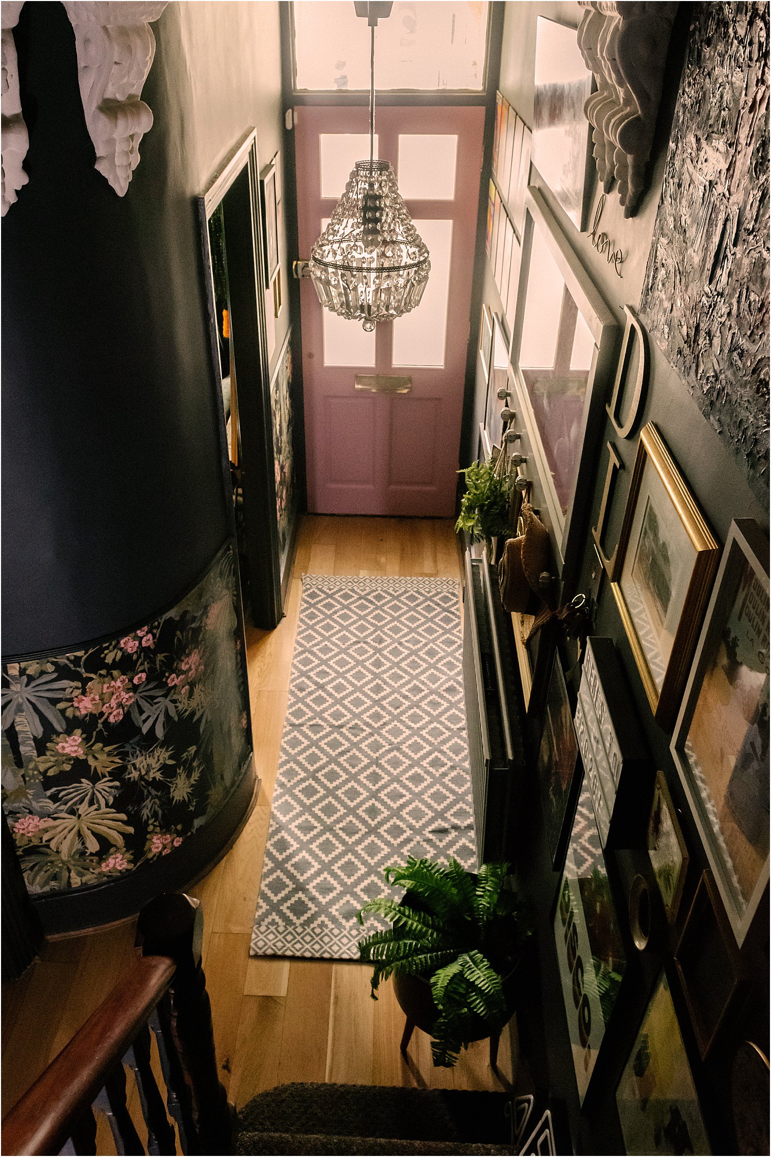
My dark walls feel like a background on which I can then compose / arrange the things I want to feature. It also helps pull everything together.
2. EMPHASISE FEATURES TO AVOID A BLACK HOLE
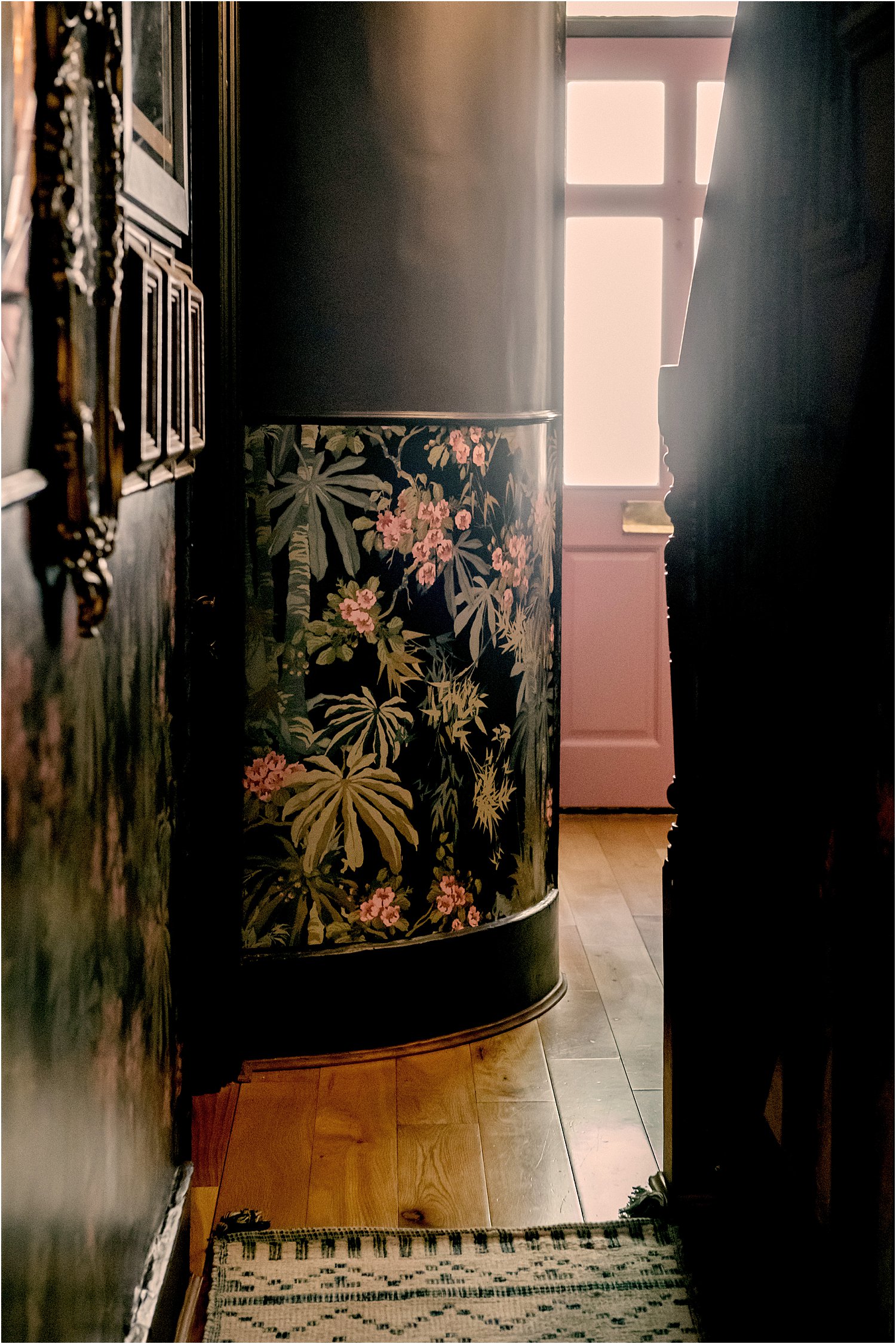
Without features and accessories, a dark space will just feel like a black hole. It is important to emphasise carefully chosen features. In my hallway, I’ve decided to keep the original corbels white in stark contrast to the dark. I also painted the inside of my door pink. I used one of my favourite paint brands Frenchic – it’s a dream to paint with, creamy and easy to use, doesn’t smell, self-priming, self-levelling and no need for waxing. This is what I use for a lot of my interior woodwork. I’ve painted a chest of drawers with it, my dining table, my toilet tiles, my shower room door and trims, a wall mural, my PVC windows!, and some walls. It’s magic in a tin.
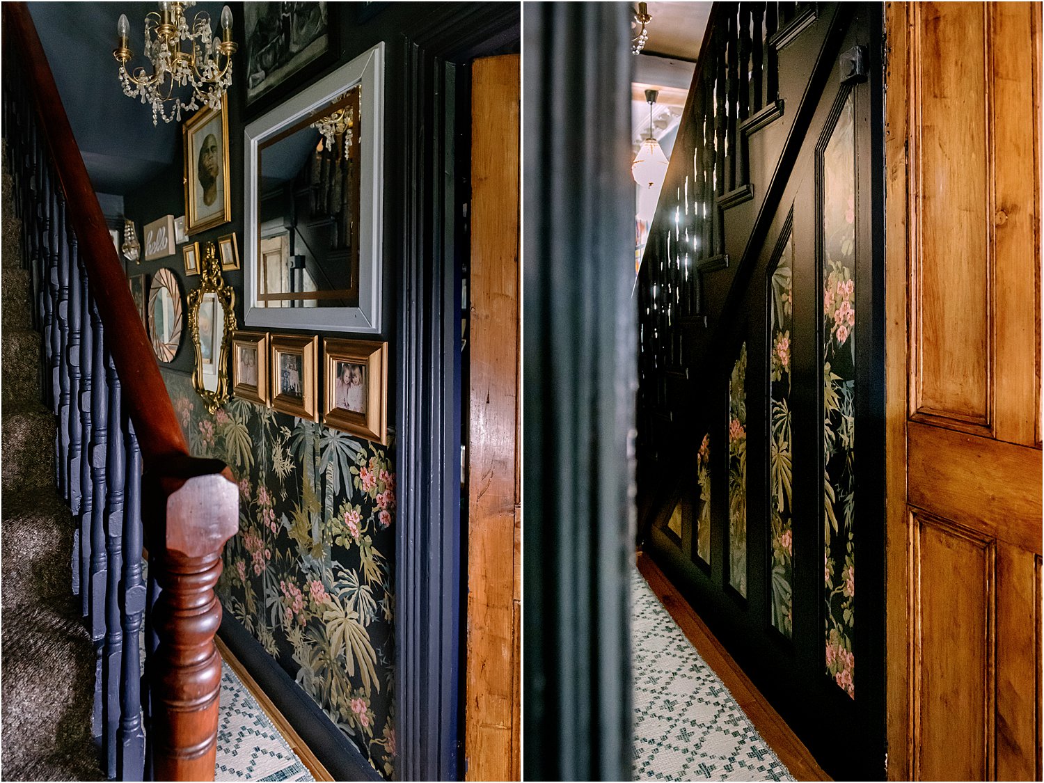
On the long wall that leads from the entrance of the house to the dining room, I added a dado rail painted the same colour as the wall and papered the wall underneath the with Linwood Bamboo Garden in the Navy colourway which was gifted to me.
I’ve had to use a flexible dado rail due to my curved wall. The problem was I only needed under 1 metre of this flexible rail and they only came in 2 metre lengths. I decided getting 2 lengths of the flexi dado to make sure the dado is the same throughout. It’s made from a strong polyurethane material and is as flexible as a garden hose – that would be the closest I can describe it. I’ve had to prime it first as it had a sheen to it and I was painting it with a solvent-based eggshell as it’s going up in a high-traffic area.
There are mouldings on the wall under the stairs so I decided to use these to frame the wallpaper. It finished the hall really well and looks smart too.
3. COHESIVE COLOUR SCHEME
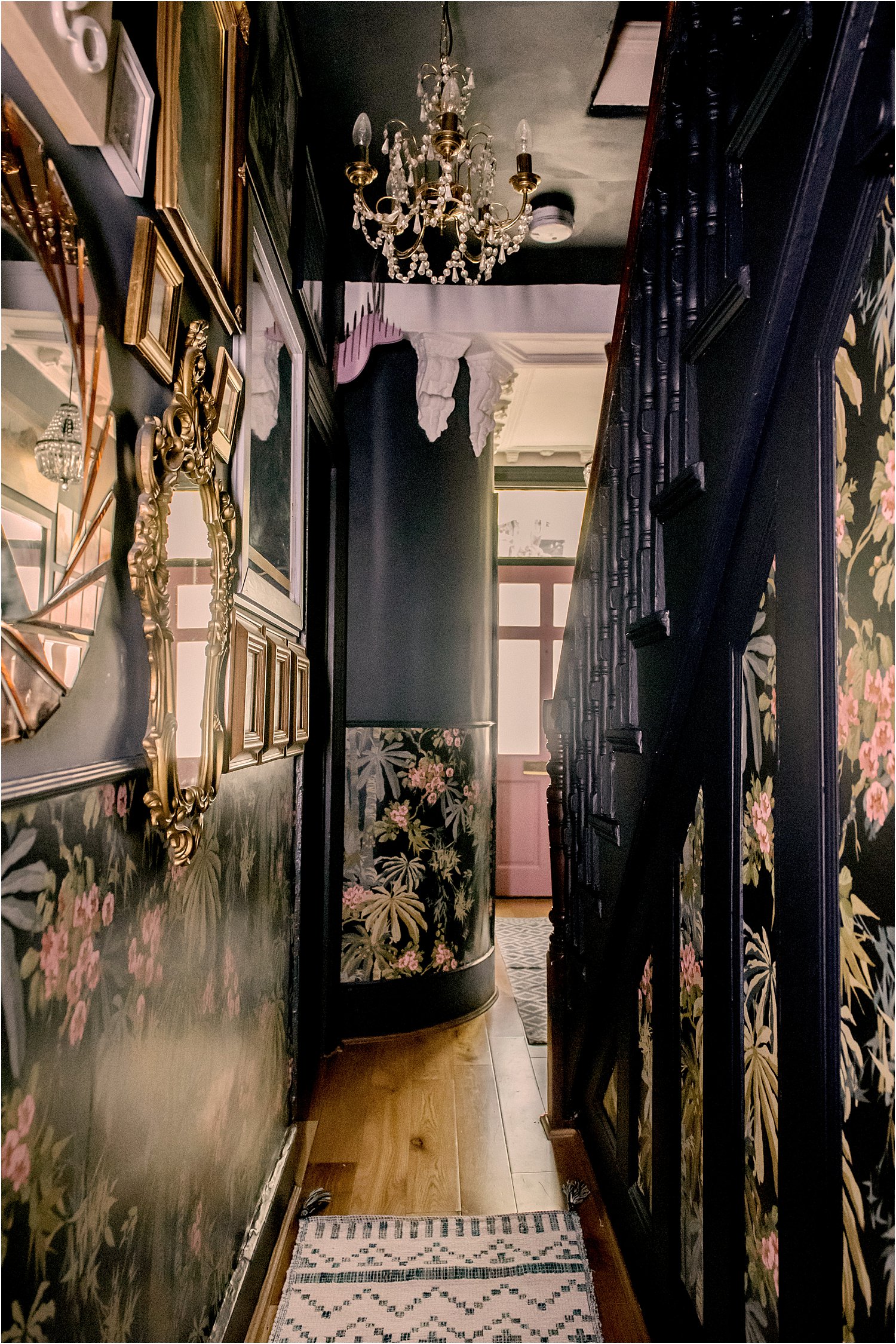
The short stretch of corridor from the living area leading to the dining room at the back of the house is such a narrow area. When areas are so small, I suggest reining in the colour palette. With only 68cm width to play with, I have 3 main colours: dark blue background (with some shades of the blue family), pink accents on the wallpaper and gold frames. Having a limited palette makes an area look more cohesive and calm. The stair spindles used to be magnolia but I painted it dark blue to keep the main colours down to three.
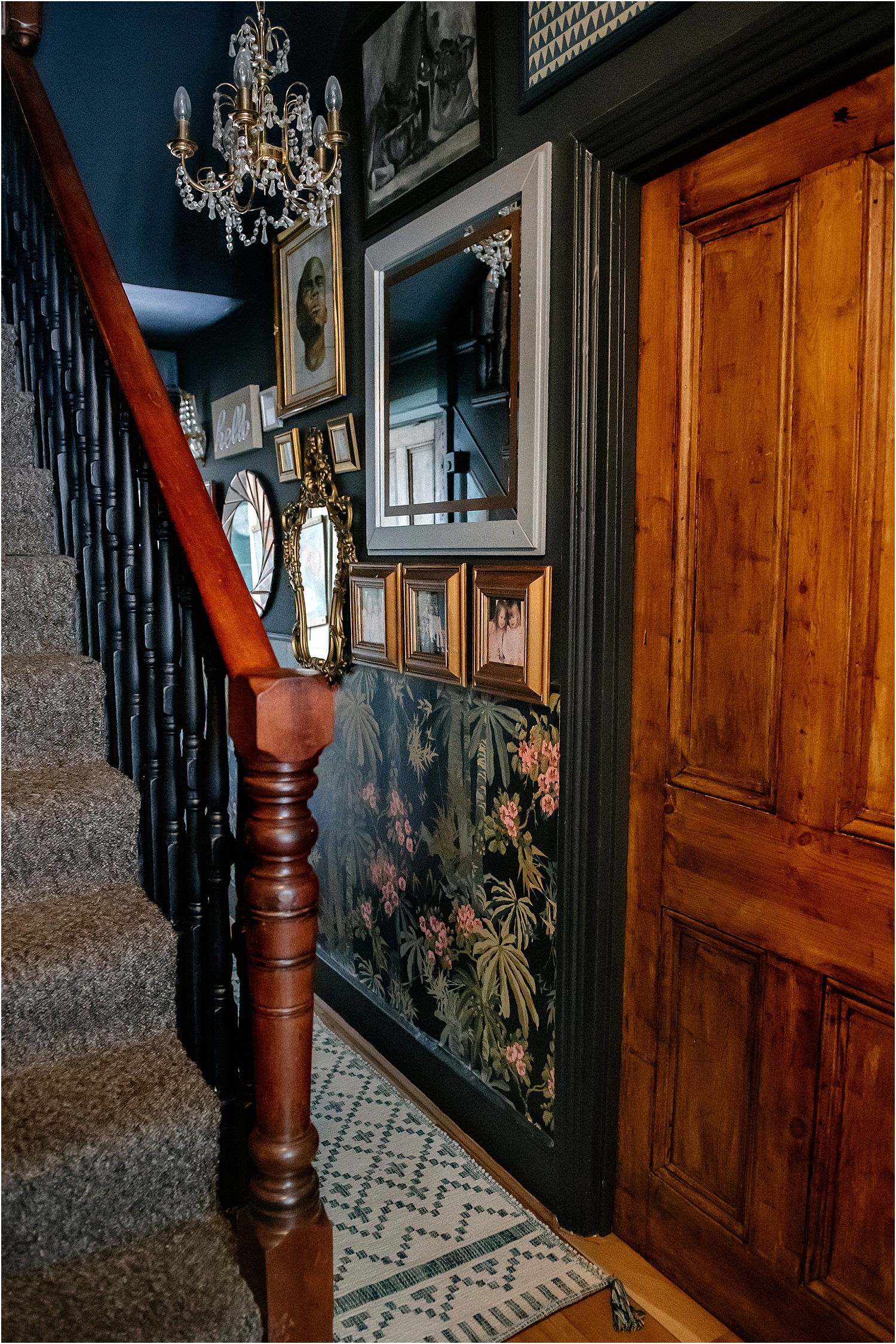
I added a Dunelm reversible runner rug on the floor in white and blue to emphasise the floor space. I have learnt that white light floors go perfectly with dark walls!
If you’re not sure of what colours to use, I talk about finding your personal style in my free training Interiors DIY so check it out and start learning about yourself!
4. MIXED ART
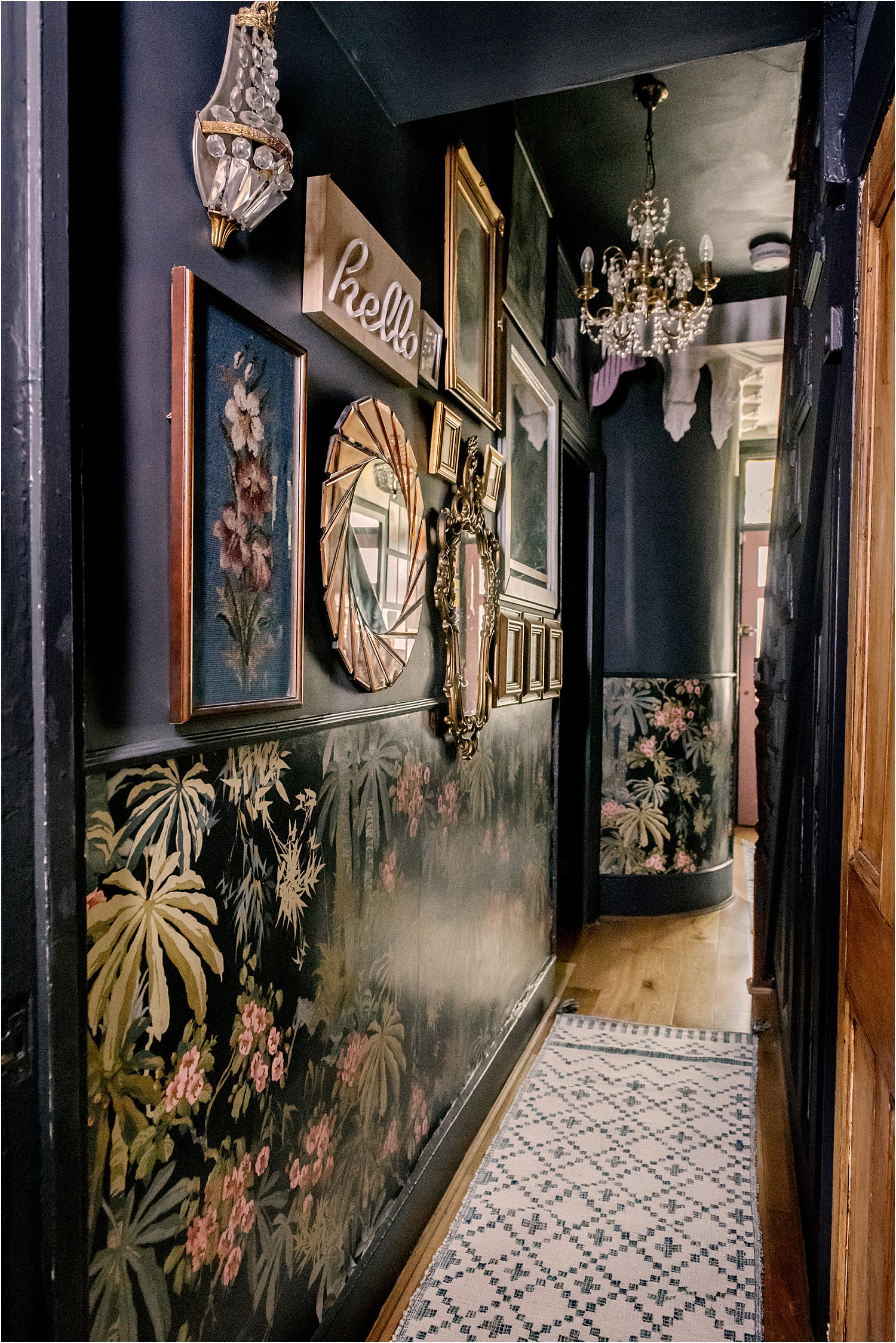
Anything put up on the wall is a part of the gallery that make up the overall art in the walls. On the narrowest side of my hall, I put up my old painting and photographs and included big mirrors sourced from a variety of places. The mirrors help bounce light that comes all the way from the front door and the kitchen window in this narrowest and darkest of hallways. They also reflect the space opposite which makes you think the actual space is much wider than it is.
On the left wall where the stairs go up to the first floor, the area widens and doubles in size so I put up a gallery wall of various artwork: it’s a mixed bag of own paintings, prints, tiles, frames, mirrors, drawings, posters, plates, typography. For me, putting up an eclectic mix of art brings your story and personality into your home. These art pieces have come from our travels, upcycles, attempts at DIYs etc. I didn’t want to lose that history by using mainly new and bought items for the purposes of decorating.
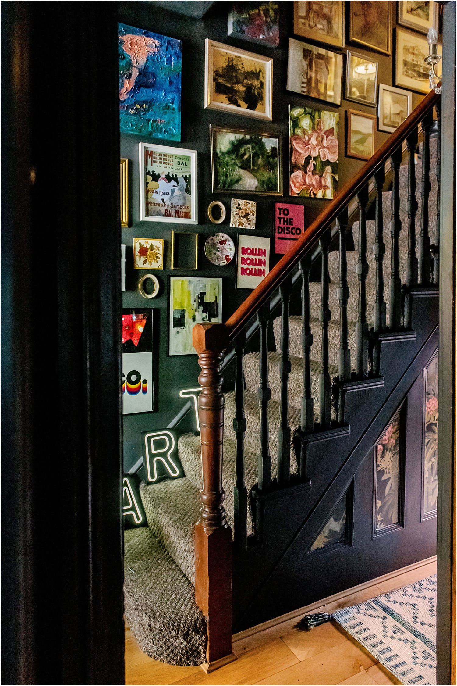
Art for me is something so personal so don’t be afraid to put the pieces you love on the wall. Expand the choices from just squares and rectangles to other curved shapes to heighten interest.
I hope you found this article on Dark blue and floral pink hallway with dado rail revamp useful.
If you want to dig deeper into what makes you happy in terms of your home interiors, download my free Interiors DIY training here. Let me know what you think.
This is not a sponsored blogpost but wallpaper, paint and runner rug were gifted. I have used an affiliate link for Frenchic paint on this post. Let’s chat on Instagram and follow me on layered.home for more inspiration.
Don’t forget to download my free resources that will help you design your own interiors and grow your Instagram account! Let’s chat on Instagram and follow me on layered.home for more inspiration.




Your hallway looks stunning Lily, its so well put together and thoughtout. I love how you put everything together, it truly is an amazing place. Xx
Thank you so much Pauline! It’s satisfying to get it all done! x
Absolutely beautiful!
Thank you so much!!!
Love your work. We’ve chosen this wallpaper, can I ask what colour paint you have used? It matches so well.
I’ve used two colours that match well actually. This is is Dulux Noble Grey. But I’ve also use Craig and Rose Lido Blue elsewhere with it. Hope this helps!